Windows still has well over 80% of the desktop market and IT WASN'T TESTED? How can that be? It's not like this is an obscure Windows issue. View any page on your site and it would have been glaringly obvious...
Thanks for the fun write-up though. Overboard rage aside, it's a good reminder that we all should double-check our QC processes.
Yes, we should all test our software better. But let's look at the cost/benefit here for a second.
Back in the days when "system" was a reasonable font choice, fixing a bug after shipping would take weeks, months, or years, and could cost $10^4 to $10^8. You might have had to pull actual boxes off actual shelves somewhere!
In this story as it actually happened, the bug was fixed and the fix was deployed in a single day, at the cost of a few laughs.
I'm sure they tested on Windows when they added Segoe to the list, so the problem is that they didn't test again after fiddling with other fonts that they (incorrectly) thought would be irrelevant to Windows. And remember, nothing was broken in a way that a machine would notice, so automated acceptance tests wouldn't have caught this regression.
I think it's worth considering the possibility that this is a story of Medium acting more or less in their economic interest (maybe even in the economic interest of their users?) rather than a story of a bunch of hipsters with a hilariously broken QC policy.
> And remember, nothing was broken in a way that a machine would notice, so automated acceptance tests wouldn't have caught this regression.
I'd like to nit here that visual regression test harnesses for web application development do exist. [1] [2] [3] Using something like Sauce Labs you could conceptually have these tests run on Windows machines in the cloud.
However, having implemented visual regression testing in the past in various projects, I can personally vouch that it's a huge waste of time. Your tools will break all the time, your tests will break all the time, and you'll generally have a bad time.
Thanks for this perspective. I've never tried this kind of automated visual regression testing except in very specialized circumstances, but I've sometimes thought that I should.
In analogy with scientific modeling, there's a risk of over-fitting your tests against the exact circumstances of your product as it exists today. You want tests to capture the important aspects of your product, while having a little bit of flexibility for the "noise" related to differences between platforms, and changes to mostly but not entirely unrelated parts of the product.
The first time I did visual regression testing, I generated a bunch of screenshots on my Mac, chucked them into version control, and then ran the tests on CI. They broke because of the font rendering differences between OS X and Ubuntu.
The tool I used, PhantomCSS, did allow for a threshold underneath which pixel differences would not get picked up, but I opted instead to run my tests locally in vagrant so that the environment would be closer to identical to CI.
So yes, platform noise is just one of the myriad of challenges you have to solve when implementing such tooling.
It's important to also consider that while Windows may represent ~80% of the desktop market, it may not represent that much of a majority for the Medium market. I'd be surprised, honestly, if 80% of Medium readers used Windows...
To note: I wrote "~80%" because I was too lazy to look up current statistics and accepted the parent comment at face value, while also allowing a slushy figure. The general presupposition of my comment remains the same regardless: it's unwise to assume that the desktop computer market reflects a website's visitor segmentation.
Testing windows? As basically the lone user of Safari on the various teams I've worked on, I've learned that you're lucky if people test on anything but Chrome for Mac.
Sadly Apple stopped updating Safari for windows a while back, and there never was a Safari for Linux. I am certain a sizable fraction of organizations/people are not prepared to buy a Mac for the sake of testing in Safari (depends on size of org & target demographics)
Overall web browsing is already 60/40 in favour of mobile though, and mobile is high 90% using WebKit or some flavour of it.
Not that this justifies skipping testing on Windows, but it's not impossible to see how it's no longer a top priority, since all of the growth is sitting on the mobile side.
I'm sure a couple years ago almost all mobile ran WebKit, but aren't a huge chunk of new android phones running some flavor of chromium these days? I'd be surprised if WebKit was still in the high 90% range.
Microsoft recently folded their test engineers into the general population. I.e. everybody is supposed to test their own code. Which means, testing dropped to negligible levels. That's why our IT dept has to vet every update now; some of them break your machine.
It's not on Microsoft to test Mediums web font rendering changes for them. Medium should have tested on a windows desktop with a multiple browsers. If they had they would have caught this before shipping to consumers.
"That's why our IT dept has to vet every update now; some of them break your machine."
Uh, what? That's what your IT dept should have been doing from day one. Are they also in the habit of just immediately applying kernel updates on production boxes?
Not to mention, I have no idea why folding test engineers into the general population would have you give up writing tests? How can you know your code is ... right? How could you not try the thing you wrote yourself? Or did you mean QA?
The main takeaway for me is the lack of testing before releasing a new major version. I know that the market is pretty fragmented between desktop and mobile, but you should expect that some people will access from a Windows machine. Maybe I misunderstood but it was launched without being rendered once on Windows ?
I'm cynical enough to believe that this was caught in testing and someone thought it would make an interesting blog post so wrote it up as if it went live.
This tells us that they didn't manually test Windows, or have automated tests that compared bitmaps. We don't know whether or not they ran automated tests. I'm guessing very few automated tests take font rendering into account. Although for a site that is so focused on typography, you'd hope it'd be a focal point.
I'd assume that there is some automated testing happening to make sure things are working, and I bet there's some manual testing too -- but I also bet that the automated testing doesn't do visual comparisons (I've never seen a company do it), and I bet that standard issue computers were macs. You visit the page on your dev computer, your phone, check Jenkins -- everything looks good, publish.
Oh, but then production notices how not-good it is.
It's really easy to miss these kinds of things, and the solution always seems obvious in hind-sight, otherwise clients would never find bugs.
Can someone who does more UI work than me explain why you would want to future proof css like this in the first place?
Even forgetting the undesired outcome and lack of testing, it's css...if browsers implement this feature, release it when the time comes. Not sure what's to be gained from adding something like this now. Feels like over thinking the issue a little.
Today's browser development preference/"wisdom" is to always include the unprefixed CSS even if you include a vendor prefixed version. The reasoning for this is the realization that maybe vendor prefixes were a bad idea all along. For better or worse, there are a bunch of -webkit prefixed CSS terms that will likely live on the web "forever". So the decision has been (by Edge and Blink [Chrome, Opera], at least) that instead of vendor prefixes browsers should use experimental flags (that are off by default) and unprefixed CSS. (This way devs can still test and evaluate new features, but are much less likely to litter the web in the wild with such experimental features as they'd have to explain to users how to turn the flags on.)
Of course today's wisdom may also be tomorrow's folly and the winds could change again, but I think a lot of us would prefer to forget that vendor prefixes ever happened and not worry about prefixing/autoprefixing/prefix-fixing ever again, so I for one appreciate today's wisdom. Even if we do find weird edge cases in Apple's choices with regards to vendor prefixed CSS.
I don’t understand this perspective at all. If transitions and transforms had been introduced this way, it would have taken many years longer for them to bleed into commonplace use. No normal user is going to jump through the hoops necessary to turn experimental flags on.
The blink tag disappeared, table-driven design disappeared, unnecessary vendor prefixes will gradually disappear too. That's a small price to pay for progress.
> No normal user is going to jump through the hoops necessary to turn experimental flags on.
That's the feature, it's not a bug.
It's a technical debt issue for the web. Some of those early -webkit prefixed CSS features changed between when the prefixed version was introduced to Webkit and the final spec. Because enough of the old version exists in the wild on the web, the nonstandard versions effectively have to be supported forever or someone's aunt's favorite website mysteriously breaks.
Ultimately the change here is to trust in the standardization process. We, as the web development community, can solve the root cause problem: standards take too long from proposal to "recommendation". We don't need to use the hack of using experimental/prototypal/unfinished features for years, if we can speed up the process for features the web wants.
The benefit of a little bit of patience (or the usage of smart polyfills) with respect to the latest and greatest features is hope for a better web where we can all spend less time worrying about cross-browser quirks like which vendor prefixes are supported/not-supported and whether or not they use some ancient nonstandard form.
After all it's just a text file that can be edited and re-deployed rapidly. It's not like a library that needs to be compiled or linked or forcing re-compilation of other dependent software.
Their fix to the problem after all was just to edit the self same stylesheet and re-deploy!
I think the future-proofing was just a "why not?" bonus. The real goal was just to render with system fonts so the page felt as native as possible and they got to take advantage of all the person-hours put into the choice by the OS vendors.
But the fonts do change on occasion, so it makes sense to me, for forwards and backwards compatibility, you'd ideally just want to be able to say "render whatever font the rest of the system is using".
No mention of the fact that CSS actually has a mechanism to use OS system fonts? 'caption', 'menu', 'message-box' are all, for example, available system fonts.
This is actually a bit of a quirk in the syntax of the CSS 'font' property - http://www.w3.org/TR/CSS21/fonts.html#font-shorthand - in that it's not strictly only a shorthand for size/style/family properties, because you can use 'message-box' as a complete font specification, but you can't use '20pt bold message-box'. On the other hand, you can stack 'font: message-box; font-weight: bold; font-size:20px;', so thats not actually a limitation.
Not sure what the browser support situation is, as 'caniuse' and 'quirksmode' haven't dug into the details of support for the CSS 'font' property, but it looks to be doing what you'd expect in chrome on OS X. YMMV.
And, somewhere within the depths of modern versions of Windows, there lay, dormant, an old-fashioned System font from 1990 — alongside some vintage software routines necessary to render it.
I mean it's hardly hidden in the depths of Windows - it's right there in every single font selection menu.
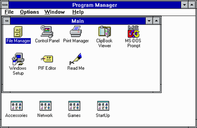
I always quite liked the Windows 3.1 fonts. They were nicely put together - very crisp, and easy to read. Good use of the grid.
None of the screen grabs show them at their best, though, because they've been scaled unevenly. Zoom in on the Program Manager shot - if you can't spot them as-is - and you'll see the telltale signs. Tastes differ, but it makes my eyes slightly uncomfortable just looking at it.
Well, I hope you're not using Windows 8.1, because you don't get the option any more. Luckily, the default - 8pt Segoe UI on mine, I think? - looks decent even with ClearType off and antialiasing disabled.
Does it mean that none of the devs/designers in medium.com use Windows?
IMHO it's just interesting coincidence, nothing more. Even though I am not Windows user and I am not for eternal software backwards compatibility (this topic can evolve into a huge rant). Though somehow medium.com staff tries to prove, that having old font is a bad thing and shouldn't be installed today. They released a major update (even calling it version 2.0) and have not it tested it with users (remember that the goal was to use native fonts, so they must have tested it with Android, iOS, OS X, Windows, Windows Phone, Chrome OS, etc.)?
Article was very interesting, showing how can long history of computing produce interesting outcomes. But I felt that author is very annoyed by this coincidence, and somehow this is Microsoft's fault and not medium's and IMHO author is not right.
Are you really surprised that none of the developers or designers at a hip startup in San Francisco are running Windows? I'm sure even the receptionist is on a Mac.
I'm a bit confused about the use of "just give me a system font", then several named fonts and then "sans-serif". Isn't that exactly what "sans-serif" does, giving you a sans-serif system font?
It's a browser setting. For example, I'm using Firefox 41 on Windows 7 and in Options->Content->Fonts&Colors/Advanced... it has "Times New Roman", "Arial", and "Courier New" as the defaults for Serif, Sans-serif, and Monospace respectively.
In Chrome, it's under Settings->+Show advanced settings->Web content/Customize fonts... (Times New Roman, Arial, Consolas on mine.)
In IE 11 under Tools (gear icon)->General->Appearance/Fonts it has "Webpage font" and "Plain text font" (Times New Roman and Courier New on mine). It's weird that they don't let you pick the default sans-serif font.
The 'sans-serif' font is an alias for the default sans-serif font, which is simply a system setting just like the default browser or the default whatever. Therefore the system doesn't need to know which fonts are sans-serif and which aren't.
So, there's obviously a miss on testing this here [1], but I wanted to make another point about the wisdom of embedding code that you cannot test, thinking that it would have no effect, with the expectation that at some arbitrary date in the future (which you don't control) it will change the visual appearance of your landing page to something else... that you haven't tested. When iOS 9 came out, it wasn't like people were just resubmitting their apps without ever running them once.
[1] I'm willing to buy that Windows represents a minority of browser share to Medium, although it still seems doubtful that it's such a small share that making visual changes to your global CSS doesn't merit testing on that OS. Was this just a line in some larger diff? "By the way, I changed all the fonts; works on localhost"?
Do not take this as snark. Not meant as such. Just observation, begrudging admiration is as negative as it gets :)
My guess is that trendy internet start-ups have a Mac culture. I'm not sure, I'm not in trendy internet start-up land. The same is true in academia though, which is my land. Go to an academic conference and we're talking predominantly Mac.
I love the way they spin the "did not test on Windows, the most popular desktop OS" fail to "isn't System so cool and retor, isn't it awesome?". That takes a fair amount of chutzpah and a serious inability for stuff like this to faze you. Which is probably a great character quality for a dev team whose software touches millions.
> I love the way they spin the "did not test on Windows, the most popular desktop OS" fail to "isn't System so cool and retor, isn't it awesome?". That takes a fair amount of chutzpah and a serious inability for stuff like this to faze you.
I don't understand. Why should this faze anyone? The website still worked, no harm was done. It barely registers as a bug!
In this case it certainly wasn't a serious bug. However it suggests that they did no testing at all on Windows, so in the future they may not be quite as lucky.
I took the "rich white people" term to refer to people instinctively unaware of their privileged position, to the extent that they don't see that things might be different for others. (For full rhetorical effect, to my mind, this requires both riches and whiteness, since one without the other doesn't have quite the same implication of breezy unthinking carelessness.)
Obviously having a Mac and working in San Francisco and treating Windows users like they don't really exist is not quite the same as being rich and white and never thinking of people who are poor and black (or whatever). But the parallels seemed pretty obvious to me.
I hope the poster doesn't get banned for their flagged post. It's good to see people fighting for social justice by calling out oppression where they see it - but I really didn't see it there myself.
You're being disingenuous. For starters, from the second paragraph: "In between Roboto on Android, San Francisco on iPhones and Macs, and Segoe UI on Windows..." Clearly, they're targeting all major platforms. Not to mention, retina MacBooks start at $1299—which is on par with other HiDPI PC laptops, mind you—and I can buy a car on Craigslist here in the first world for like $500. (And I have.)
If you don't like Apple, that's fine, but don't disguise your displeasure as a stand against class warfare.
The cheapest Macbook you can find with a retina display costs $3200 in Brazil. That's more than double the price you quote, and we're not even accounting for purchase-power differences in the currency itself.
To put it in perspective, the minimum wage is $300, and I don't know anyone making more than $1500 over there – including developers.
You could literally make a living off of buying Macbooks in the US and selling them in Brazil for double the price; it'd still be much cheaper than in the stores.
[Edit] I'll be less terse. Yes, I know computers are more expensive in some countries. Are you accusing the author of being, in some way, discriminatory towards people with lower incomes? Did he say they were only designing for Retina displays? (Or only for Apple hardware?) This response feels like an even larger straw man than the parent comment I responded to, and even less about the article itself.
He was replying to a post that matches the price of a computer to a car, with the implication that that's expensive. He replied saying that a rMBP "starts at $1299", and he was disagreeing with the post he was replying. Thus his implication was that this is a cheap price.
I'm willing to retract that entire line of thinking, because the author never ever actually said anything about designing for Retina hardware, so why are we talking about it in the first place? Their explicit approach was to make Medium's typography work on as many platforms and devices as possible, and this OS X (not Retina, just OS X) bug was an edge case that they missed.
Apple don't bother arbitraging away taxes most places I've looked.
They also seem to have started doing USD<->Local Currency pricing 'adjustment' far more regularly than I would have expected. I have watched the base price for an App in Australia fluctuate between $0.99 and $1.29 over the last two years. They are always slower to change the price 'down' than 'up'. So I'm not surprised at the fact they would just 'pass on the full cost' to an entire country. I'm pretty sure even with the import tax they are probably adding a 'nuisance surcharge' to the price of the laptops, because of the 'costs of tax compliance' and other typical corporate excuses.
From the article - There’s something delightful in perusing Medium this way: the awkwardness with which the modern retina pixels need to accommodate the blocky, jagged font
They're certainly talking about their own experience, obviously on a retina display, but they don't include a picture. Which in a very image-heavy article implies that anyone should be able to imagine what that looks like. I can't, because I've never used a rMBP.
Yep, everyone has high-res screens on their smartphones these days.
On big screens, the ones available in Brazil are retina MBP, and they are very expensive.
That’s exactly the reason why those vendor prefixes exist, right? You test the waters in a way that can’t (or is at least unlikely to) screw things up for everyone else.
The functionality provided here is obviously useful and should probably become part of CSS – but through incidents like this we just found out that using only system is probably a bad idea and things should be changed.
You've got this completely backwards. The article itself has a strong agist tone ("whoever could have predicted the emergence of this font from the mists of time...") but you may have a hard time perceiving it. That's because, to the extent there is an agist problem here, the problem is you.
The offset pixel on that look horrible, but they also look like a lot of the web fonts I see day-to-day when I have font smoothing disabled. Are modern fonts actually being designed like that for some reason?
I suspect the author (and possibly everyone in their office) is younger than this font. What was that discussion we were having the other day about ahistoricity? https://news.ycombinator.com/item?id=10412284
By Marcin Wichary. That name brings back memories... I recognize his name from a site he ran called the GUIdebook [0], which documented a number of GUIs in screenshot form going back decades. Unfortunately, he stopped updating it in 2006, but the site is still up for anyone who wants to check it out.
This is reassuring. Designers choosing system fonts. As a non-designer, I opted for site-wide Georgia usage recently and was really happy with the result. I was doing it initially partly for performance reasons, and to stop external calls on a HTTPS-only site, in the end it felt like it was more fitting and more characterful than the (pretty, but generic) Source Sans Pro.
As of Windows 7, Windows still likes to fall back to System font if it is running low on UI resources. I see this on a regular basis in the "Find in Files" results in Visual Studio.
Further down the rabbit hole:
On Win2k, if you used non-default DPI settings, programs using System font looked particularly atrocious.
Sometimes it doesn't pay to overthink things and do more than is necessary. It doesn't seem likely that without the vendor extension "system" is going to become an official or defacto cross browser standard any time soon. Without that font name being reserved by either a standard or common usage a collision would seem inevitable.
Windows 3 PCs running Adobe Type Manager could use all the Adobe vector fonts. I built the Windows port of ATM - patched into some GDI calls systemwide and rendered the Adobe fonts into a GDI bitmap on the fly as you used them. Fun stuff.
Nobody in the Windows 3 era used vector fonts for UI (menus, dialogs, etc.)
Windows 3.1 and (I think) System 7 added support for TrueType, but only for documents, not for UI. Windows 3.0 and System 6 (which would have still been fairly common for a while after 3.1 and 7 were introduced) were all-raster, all-the-time.
Not to mention alternative desktops like GEM and the Amiga Workbench, although I guess those don't really count as "most" personal computers.
I only know of SGI workstations using vector fonts and icons at that time; I believe they had cheaper models, such as the Indy, which according to wikipedia came out in '93.
I'm not 100% sure how ATM for the Mac worked, but I seem to recall it was the same as ATM for Windows (which I worked on). It didn't actually create raster fonts, but instead rasterized on the fly the glyphs that each app was actually using.
Wow, that's a good question. I see that I have the font here on a clean-install of Windows 8.1, but if I use the element inspector in Chrome to try to change the font on some of the text here on the screen, it seems to render as Times New Roman. And I have to eliminate the fallbacks. It will fall-through System, but it won't pick up the body font.
Thanks for the fun write-up though. Overboard rage aside, it's a good reminder that we all should double-check our QC processes.