There is a small irony that when reading an article about mobile UX, the website has disabled zoom meaning I can't actually see any of the images in the article.
I do a lot of responsive design, and I turn zooming off So I CAN give you a proper responsive design that you can read and interact with on a small touchscreen.
Why on earth would you prefer to pan around a desktop site designed for a big screen with a tiny cursor when you've got a tiny screen and a massive cursor (fingertip)?
You are making the world worse, what do I care if your site looks nice if I can't read the text? I happened across such a site when I tried to buy a train ticket from my phone a couple of weeks ago, absolutely horrible.
I simply don't get the calculus, people who don't need to zoom won't and they get to see a nice site. What on earth do you win by preventing people that need to zoom from doing that? That they get to see a nice design that they can't use? And that is supposed to be better than seeing a usable site that needs panning? That's insane. I certainly hope your kind of thinking will go away quickly.
> If I try to zoom, it is already a demonstration that your design does not work for me on my device.
THIS! This is how I feel exactly! When you load up a site I do it is as well designed as a mobile app. Surely people don't complain about the inability to zoom in their iOS settings app, or in the clocks app. Why would my site be any different?
> When you load up a site I do it is as well designed as a mobile app. Surely people don't complain about the inability to zoom in their iOS settings app, or in the clocks app. Why would my site be any different?
They have that ability (at least on iOS. Don't know about Android, but I assume it has similar settings). It's under the Accessibility options.
Why don't you allow users the ability to zoom your sites?
I do allow zoom when it's appropriate: usually when I'm either targeting desktop users and don't plan (or don't have budget) to specifically target mobile users with their own experience, or when user scaling of the viewport makes sense to the project.
It's FAR better to pan and zoom around a working desktop layout than to have a broken responsive layout, so I only disable user-scaling on sites with a specifically targeted mobile experience where I can deliver a better experience by disabling user scaling than leaving it on.
Here's an example where disabling user zoom vastly improves user experience: a tool I built for myself with the purpose of allowing me to test other websites responsively at different widths while using a device with a fixed-width screen.
I.E. this tool lets me test websites at different browser widths while on a phone with a fixed-width.
Now, if I were to have had user scaling enabled do you think the experience on that site would be better?
Clearly not! But on the other hand, here's a chart with all of the values in hexadecimal plotted in a grid so I can understand and visualize the relationships between values in hexadecimal colour notation (like #1166aa). This page is an illustration, and though I do have some crude responsive styles to help it fit on narrower screens, I intentionally left user-scaling on to make a better user-experience, until/unless I decide to go in and give it a better mobile-specific experience:
Now, if I were to have had user scaling enabled do you think the experience on that site would be better?
Clearly not! There's no right or wrong answer for every. single. website. You have to look at how it will be used, who will use it, on which hardware, and what will provide the most value to them. That decision happens case-by-case and there's always a trade-off happening.
I wonder if the group of people that can't manage to browse with user-scaling turned off on their modern, high-end mobile phones are the same who can't seem to load any website posted to HN that uses JavaScript because not everybody uses a browser with JS enabled…
Thank you for proving the point that you can't design to meet everyones need in a way that removes the need for zoom.
Yes, your examples absolutely need zoom, or they will be totally unusable for a large number of people.
I have close to perfect sight, but big fingers, and even on my 5.5" phone the buttons in the first ones were annoyingly small.
In the second one, the text was annoying small. Again on a 5.5" phone. A lot of people wouldn't be able to read it at all without zoom.
> I wonder if the group of people that can't manage to browse with user-scaling turned off on their modern, high-end mobile phones are the same who can't seem to load any website posted to HN that uses JavaScript because not everybody uses a browser with JS enabled…
No, they are people who far to often run into designers who assumes everyone has perfect eye-sight and dainty little fingers and so thinks it's ok to disable zoom.
The only time it is acceptable to disable zoom is if you provide your own, context-aware zooming mechanism and make very, very sure it does a better job than the generic browser zoom.
Yes, both of those sites benefit from zoomability. The first one, I just tested (by visiting "water.com" in your tool). When I tested #5 (500 x 477), the viewport disappears off the end of the right edge of my screen. I can't see the whole thing at once, no matter what I do. I have to scroll, and that's confusing because my scroll swipe will move the content inside the viewport before moving the site itself, and thus the viewport itself. If I could pinch out on it, I'd see the whole thing at once.
As an aside, the Android I used to test this allowed me to turn on Force Zoom, and that allowed me to use the site better.
The second site (grid.html) can appear very small. I think you intended to say it should be zoomable, as I was able to zoom in and out on that one.
My point is, even when you yourself cannot conceive of a reason a user would like to zoom the site, trust me, there probably is one. In another reply, you mentioned the 300ms delay that turning on zoom control introduces. I hadn't thought of that before, and that is a good point for disabling zoom control. Maybe Apple can follow Google's lead, and give their users the option to override it. That would allow the majority of your users the faster touch-responsiveness that you're trying to give them, while still letting the rest of us have the control we'd like over our browsers.
I can say for a fact that zooming on the grid would have been a better experience. As-is it is currently only usable if I use my phone as landscape rather than portrait as there is no space between each item. For most sites I don't bother rotating my phone - scrolling down is worse than zooming in/out. Especially when trying to read a grid or chart reliant on seeing all the information at once and not 4 rows at a time.
> THIS! This is how I feel exactly! When you load up a site I do it is as well designed as a mobile app.
You appear to have missed my entire point, which is that if I try to zoom, there is no reason to prevent me from doing so, as the fact that I have tried to zoom is proof your attempt at design to meet my needs failed, and zoom might make it better, and certainly won't make it worse, while denying me will make me annoyed or angry and potentially mean I can't use your site.
I can tell you with 100% certainty that you are unable to find a font-size, for example, that will satisfy everyone, as e.g. what is comfortable for me is too small to be readable for a lot of people.
Arguably, disabling zoom might even violate disabilities protections in some jurisdictions. E.g. in the UK you are required to take reasonable steps to make your site available to people with disabilities. Disabling zoom does the opposite, by making it harder to access your site for weak sighted people.
> Surely people don't complain about the inability to zoom in their iOS settings app, or in the clocks app. Why would my site be any different?
Why do you think people won't complain if they can't zoom? The first screen magnifying application I saw was ca. 1986. And that was on a home computer where font sizes etc. could be freely adjusted up to very large sizes. People still wanted the ability to zoom to make their usage easier.
I don't know about iOS, but on Android you can turn on "magnification gestures" and zoom any app everywhere by triple-tapping the screen. At least in my version.
But for e.g. the browser, assuming you've done your job properly, then zooming in a way that allows re-layout would save a lot of weak-sighted people a lot of panning that they are forced to do if they use the built in magnification since the latter doesn't have any knowledge of the page structure.
  Are you able to articulate 5
  or more of those plentiful reasons?
The reasons I can think you would desire to zoom in on a legible, functional, accessible website would be for curiosity, or to see a detail closer and admire the layout. There are details like this in apps all the time and I screenshot it and zoom in on my screenshot. Those are interests (I want to see that closer) that are separate concerns from me using the app.
I'm curious what reasons you might give that would interrupt or prevent a person from using the site as intended because of their desire to zoom in without screenshotting.
Are you able to articulate 5
or more of those plentiful reasons?
At times I have zoomed in or out because:
1. I'm further away from the screen, because my screen is large.
2. I'm further away from the screen, because I am showing a website to a friend or colleague.
3. I'm displaying the site on a projector, and people at the back of the room say they can't see.
4. I'm viewing a website on my colleague's high-dpi display, which she uses at native resolution.
5. I'm viewing a website on my phone while being driven somewhere, and the ride's a bit bumpy so I don't want the text too small.
6. I have a comparatively low-end phone, that most people don't seem to test for; sometimes the live suggestion dropdown for a text box is obscured by my on-screen keyboard.
7. I have a comparatively high-end phone, and I'm not moving around, and I'd like to have more of the article on my screen.
8. I have a comparatively high-end phone, with a high-dpi display, and the page I'm reading just seems to have rendered everything quite small.
9. The website designer has opted for a skinny font I'm having trouble reading.
10. The website designer has decided a feature is unimportant and should be visually unimportant (maybe a link to some terms and conditions, or an EULA or something like that) but I want to be the judge of that.
11. My eyes are tired.
12. My eyes are fine, but I've had a few drinks and things aren't quite as crisp as they usually are.
TLDR: if a user in a test group says "I'm having trouble reading that text" would you say "No you're not"? Of course you wouldn't, it would be ridiculous to do that, the user has first-hand perfectly accurate information you don't have access to. And yet, when a user expresses that they're having trouble reading the text by zooming, and you disable zooming, that's exactly what you're doing.
I feel like a lot of these complaints are endemic to defining things in CSS using 'px' as units instead of more sensible (and repsonsive) modern techniques like defining type in 'pt' and widths in more complex units (percents, or mixed units).
It's possible to avoid a lot of these pitfalls with better design.
1. User far from big screen: You can zoom much faster and easier with your forearm than a pinch gesture
2. User far from screen, unusual viewing angle: how much time to you spend browsing at awkward angles versus dead-on? This seems like a small consideration that would affect some types of sites more than others. I doubt a banking website would feel the same way about this as a social media website project for example…
3. Classroom projection is decidedly not the use-case nearly any mobile website is designed to work under, unless the website is cloud-based projection software, but that's a specialty thing in itself.
4. This is why we define font sizes in PT and no PX, this isn't a mobile or responsive issue, but rather a design choice in CSS
5. Does your mobile browser include a 'reader' mode that isolates text content and provides the ability to make it more legible in these conditions?
6. Ah yes, and what's even more surprising for people is how differently Mobile Safari calculates screen dimensions between iPhone and iPad! Then the difference between how iOS and Android handle keyboards, and then the difference at how those OS's handle browser verus web-app mode. There is currently no good solution to keyboard control.
Anecdotally, we ran into an issue on Friday where an email field was autofocused and the keyboard was popping up and obscuring what you were entering. I didn't make it that way, but I did provide the solution: remove autofocus for touchscreen users: http://staticresource.com/autofocuser.html This is a way that we can have one feature for desktop users where it speeds up entry, but target mobile users separately and provide a better targeted experience for them.
    <script>
      // Block autofocus for touchscreen users
      onload = function(){
        if(('ontouchstart' in window)||(navigator.msMaxTouchPoints>0)){
          var field = document.querySelectorAll('[autofocus]');
          for(var i=0;i<field.length;i++) {
            field[i].blur();
          }
        }
      }
    </script>
7. I hear you there, I've felt the same way when reading long texts. Any easy workaround would be to allow the user to adjust the font size of the article text on the site within reasonable limits!
8. That's usually a problem with the difference between 'pixels' on your screen and CSS 'px' units. Defining layout in other units in CSS can avoid this problem on HiDPI displays.
9. Testing, testing, testing. I make sure to supply well-made fonts, I use a special set of CSS rules that control the rendering of text display so that the same font renders the same thickness in all browser's and OSes, and with those differences out of the way I can move forward using only weights that work (usually no lower than 400 weight unless the size being displayed is very large) and be sure that they are legible everywhere. Here's my snippet (and honestly, this cuts out SO many other common text rendering bugs):
10. My job is to make sure that the experience of the desktop site, with all of its abilities, functionality, and information, are displayed in an equally recognizable, usable way on mobile. I don't cut features, I don't ever assume a mobile user or desktop user won't want anything. My job is to make it just as great everywhere.
11. Turn your brightness down, you only have one set of eyeballs.
12. I'm not sure panning and zooming will help you feel better when the room is spinning so fast you can't read.
I'm not dismissing these reasons, I believe many of them are small or fleeting and to change an entire project for one of these whims seems short-sighted. Other reasons listed here are 100% valid, and workaround can be found without enabling zooming.
For projects where zooming makes sense I wouldn't have it any other way, but I don't see a compelling case listed here to always have zoom enabled.
> I feel like a lot of these complaints are endemic to defining things in CSS using 'px' as units instead of more sensible (and repsonsive) modern techniques like defining type in 'pt' and widths in more complex units (percents, or mixed units).
What? Isn't px a fixed multiple of pt, with an actual size that varies by platform?
CSS 3 defines pixels that way (1/96 inch, pt is 1/72 inch), but the previous definition was rather different, and had no fixed relation to either inches or ems.
But I thought the change in CSS 3 was because pretty much every actual implementation of CSS 2.1 had taken the definition, chucked it out the window, and used 1/96 inch anyway. So, I don't see how any problems could arise in practice from using px instead of pt.
If the site can render responsively, is there a reason it can't be zoomed?
Both the reasons looking for zoom, and your reasons for not providing it seem reasonable. Is there some technical barrier for not enabling zoom?
Zoom is a first-class gesture on mobile, it is the second one after scrolling that you always expect to be there. On a desktop, you generally have more desktop than you need for a window, so it is possible to resize the window to adjust the size of the viewport. Responsive sites work nicely in the case. On mobile, there is no "window" and the device's dimensions themselves are the viewport. You can reorient the device to enable changing the width, but without zoom, you are taking away any ability to change the viewport.
Maybe zoom isn't a critical feature, but it is part of how the devices work. As a result, it is an expected interaction for those on mobile. Have you ever used a piece of desktop software where you couldn't resize the window - it drives you crazy. Ignoring expected behavior is contrary to good usability.
> Is there some technical barrier for not enabling zoom?
“Safari on iOS displays webpages at a scale that works for most web content originally designed for the desktop. If these default settings don’t work for your webpages, it is highly recommended that you change the settings by configuring the viewport. You especially need to configure the viewport if you are designing webpages specifically for iOS.”
Zooming is enabled by default on Mobile Safari as a feature to help mobile users navigate sites not designed for mobile.
Apple intentionally added many different ways to control the viewport, including the ability to disable zoom.
“Setting the viewport width should be the first task when designing web applications for iOS to avoid the user zooming in before using your application.”
So it very much sounds like Apple has added this functionality as a usability feature to help mobile users navigate sites designed without regard to their specific hardware, Apply strongly recommends setting the viewport specifically for the pages you design with iOS in mind. Also note, when looking through Apple's documentation that they refer to the gesture as 'zooming' and the feature in Mobile Safari as 'user scaling.
OK, so you're suggesting that we not enable a "usability feature" because Apple's guidelines suggest that there are alternative ways to specify the correct viewport?
I get the design angle, and I don't disagree that setting the correct viewport is a good idea, but you shouldn't assume that good design and correctly setting the viewport will work for everybody. The fact remains that the zoom gesture is critical on mobile, and disabling it does not help anybody use your site.
On responsive sites, the idea behind them is that the site does its best guess of being responsive based on the size of the viewport. However, sometimes it doesn't work out, sometimes the websites behavior isn't as intended, sometimes the designer didn't test with my exact device, size, eyesight, etc. It is nice in those cases that I can make up for the site not being designed for my mobile by using the zoom feature as intended.
> K, so you're suggesting that we not enable a "usability feature" because Apple's guidelines suggest that there are alternative ways to specify the correct viewport?
No that's the opposite of what I'm saying. Apple has created a usability feature called 'User Scaling' and enabled it by default for usability purposes. Apple also added the <meta> tags that control the viewport, including disabling User Scaling, and strongly urges designers & developers to do two things:
1) Design your site with iOS users and hardware in mind
2) Use the correct viewport tag that gives the best experience
> On responsive sites, the idea behind them is that the site does its best guess of being responsive based on the size of the viewport.
I'm not sure what you're trying to say here. There's not much guessing going on here, you are either able to define the viewport, or it will render the page at the widths specified in the page styles. If you have defined the viewport there is no guessing involved and it will render the same way from device to device.
> sometimes the websites behavior isn't as intended, sometimes the designer didn't test with my exact device, size, eyesight, etc.
Chances are I didn't test with your exact device, but when I style things I have a set of rules and tools that help ensure that the same content renders the same way anywhere. If I tested only against released hardware then my sites wouldn't be future-proof. I design my stuff to work on all screen sizes smaller and larger than would be in use today so it not only shows up the same everywhere, but will continue to show up the same on devices released years from today.
I also regularly test on quirky hardware like PS Vita, and anything else with a browser that I can get my hands on just to make sure there aren't any weird bugs or edge cases.
Here's a real-world case study: a friend had a sign up funnel and was tracking 900 different mobile devices on his site. On my main gig we have 1,300+ different devices a month! I put my responsive and mobile polish on top of his existing site and we moved the needle on signups 2% since then, and that change has lasted. Clearly, whatever I'm doing it making it easier for mobile users to get in the door with their dollars, and I have the numbers to vouch for that!
> Clearly, whatever I'm doing it making it easier for mobile users to get in the door with their dollars, and I have the numbers to vouch for that!
The flaw in this argument is that you are measuring across the total population, and totally ignoring that while your overall changes may help some proportion, some parts of it may actively prevent others from using the site at all.
Great for you if all you care about is the money. Not so great if you want to e.g. ensure people with disabilities have a good experience too.
Screenshotting is something that almost nobody knows how to do. And even if everybody did know how to screenshot, it's so much slower and inefficient that it's a completely unacceptable replacement for the natural, and designed zoom interface.
> Screenshotting is something that almost nobody knows how to do
I got a really good laugh at this one, a cursory glance of user-generated content online shows tons of people not only know how to screenshot their devices, but are quite adept at figuring out how to share those screenshots with each other and the world.
The people that are taking those screenshots to generate that content make up a tiny minority of users. Most people don't know how to screenshot, and the basic point that you shouldn't have to take a screenshot to zoom into a page is still a good one.
Looking at social media, it seems like lots more people know how to screenshot than directly download an image, leading to screenshots of images being shared. Strange phenomenon.
User-scaling of the viewport is thankfully not the only way of enlarging text inside of a web page. It's possible to design a site that allows the user to change the font-size of relevant UI controls without rendering the layout wider than the device screen (causing the user to have to pan around to read it).
If you're not providing a better experience than a fully working desktop site, then you shouldn't attempt responsive design at all and let mobile users use a non-targeted but working site. I only shut of user-scaling on sites where the targeted mobile experience is better than a scaled fully-working desktop layout.
If you e.g. can't read it because the text is too small, the design is not perfect (for that user at that time), and zoom should not be disabled.
My point was that the moment a user is trying to zoom, for whatever reason, they have already decided that the design is not perfect for them in the present circumstances on the device they're currently using.
And so the only thing disabling zoom is going to achieve is annoying the user by artificially preventing them from trying to improve a situation they've already deemed is suboptimal.
If zooming is better than having a properly designed layout for the device you are using, how did all the app developers get it wrong? Nearly every app on my phone is formatted for a small touchscreen, and not simply a desktop-sized program on a desktop shrunk to fit my phone screen (allowing me to zoom in and push a tiny cursor around). Form follows function, and so an app designed for a mobile device would look different than an app designed for a desktop computer. The hardware and capabilities are very different.
The great part is, with recent support in CSS we can build one site and target desktop users and mobile users with entirely different hardware, and give them a unified experience and layout that's tailored to their device. When they use the desktop it's the same website, fit to their screen and ready to be used with a mouse and keyboard. When it's from a mobile device - all of the same information and actions are still there, just presented in a way that's intuitive and natural to users of a mobile device.
If you've ever used a mobile simulator on a computer you'll know how awkward it is to emulate the most natural and smooth fingertip gestures with a mouse. It's clunky! Well trying to pretend you're a desktop with a mouse when youve got a tiny screen and a big mouse (fingertip) is just as awkward and useless.
With zooming enabled, every tap you make takes 300ms longer to register because it's listening to see if that tap is a tap or going to be part of a zooming gesture.
I design my stuff to look good well beyond normal tolerances for screen sizes, and trust me - I am not your enemy here. I do what I do to give the best experience and if zooming ended with an easier-to-use experience then for sure I would enable it.
I do a lot of other things to make it easy for mobile users too:
- use tel inputs for numerical entry (mobile users get a keypad instead of a keyboard)
- user email inputs for emails and turn off autocapitlize (mobile users get a keyboard with an '@' symbol)
- use retina graphics, or render imagery in code for retina and pixel-dense displays
- every layout I create works from 300px-1500px, and some of the more important elements in the layout I may get working from 200px-2000px to be certain they will work everywhere.
- I use a massive wish-list of fonts that includes great defaults for OS X, Windows, Linux, Android, and iOS
- I use the least amount of JavaScript that makes sense to accomplish what I need to do (I hate sites that constantly crash the tab on mobile)
- I add offline and web-app tags according to the project to help users who may add the site to home screen have the best experience (not all sites are built for web app mod)
- I also add in special icons just for mobile users so if they bookmark the site they will have a nice icon as well
- I disable text-selection or pointer-events for items that may be errantly tapped on, or to help you be able to more easily select text you are trying to select on mobile. Text selection, copy, and paste on mobile is a magnitude more difficult than for a desktop user
So I'm not just disabling it because somebody told me to, or showed me that's how it's done. I work hard and develop, and use these devices, and building a desktop site you can pan around does not provide as good an experience as a properly designed responsive site.
I'm a mobile user too, trust me when I say I fight for your experience to be the best there is!
Nothing in my list was meant to be a justification for disabling zoom. My justifcation for that is: I am a formally trained designer and I design UI properly for the devices and hardware my projects are intended to be accessed with.
The other stuff I mentioned were just other examples of things 'from the frontline' that I do to optionally enhance the site for mobile users with no effect on desktop. I design everything with two very different targets in mind.
Please please stop disabling zoom. I beg of you, I have to abandon sooo many sites because they are unreadable because I can't zoom.
>I am a formally trained designer and I design UI properly for the devices and hardware my projects are intended to be accessed with.
If designers were actually licensed, I think that disabling zoom should be an offense that results in a 2-year revocation of design license. It's so user hostile that it's unacceptable. That you are trotting out your "formal training" in response to user pleas shows that you really don't have many legs to stand on.
> any low-vision users have software-based screen magnifiers. Sometimes they augment the magnifier with text-to-speech software when reading longer passages of text.
[...]
> to be truly accessible, a website must allow individual preferences in colour, size and typeface to override the author’s suggested design.
The website you provide to support your position tells you not to do what you're doing.
(Ironically, the accessibility guidelines are in an unaccessible PDF).
>Does it change your mind at all that you linked to a zoomable site?
No, I said I decide based on the needs of the project and which devices will be supported which META tag makes the most sense. Not 100% of my projects disable zooming, and I don't believe 100% of sites should disable zooming. Zooming is a useful feature added to mobile browser that does serve a purpose: to allow the user to navigate a site that was designed without their device/hardware in mind. It's good at what it does, but it's not better than a properly designed site (whatever that means). My job is to figure out for each project what a properly designed site means, and for the big web-app type projects that make the most money, having zooming disabled allows me to deliver a better experience I couldn't with zooming enabled.
But I didn't link to the RGD.ca site to help prove my case, my learning comes from actually doing web development, not what an organization says is best practice. Mine comes from hundreds of hours of specializing in making sites that dont support mobile convert more users. People hire me because I help them reach more mobile customers, and I make a fraction of the money I make for my clients by supporting mobile better.
I posted the link to the Registered Graphic Designers site because the commenter above me said:
> If designers were actually licensed, I think that disabling zoom should be an offense that results in a 2-year revocation of design license.
Here where I live if you're RGD you get letters after your name like a dentist or reverend. So a little education before speaking can help keep the conversation on a contructive path.
I listen to my users and none have complained about zooming where zooming has been disabled. There are voices here offering opinions and I do actually care about their reasons.
Please, tell me the reasons why zooming on a legible, usable design is necessary. Explain your side of things, downvotes and ad hominems aren't constructive, and there is value in this conversation being had. Why is this conversation being treated like spam? Here's your chance to tell the guy who makes mobile sites the way they are how you wish they were different and all you want to do is stop others from seeing that I'm listening here on HN?
I'd appreciate any constructive input on the pain points of using mobile sites. Today's work includes taking a credit card form designes in 2009 and making it work on mobile. Seriously, if there's valuable insight you have that I can use to make this easier for you I'm all ears.
> Please, tell me the reasons why zooming on a legible, usable design is necessary
Because what is "legible, usable" to most users still isn't to some. Not all of us have good eyesight. Some of us have horrendous eyesight. You may think that 16pt text is "legible", but for some users, nothing less than 32pt is readable.
I have no idea why you would add css that diasbles zoom.
Do everything you currently do, but don't add "user-scalable=0" to the css. Doing so provides no benefit to anyone, but does make your pages harder to use for a large section of users.
You still haven't listed the benefits of disabling zoom.
User scaling is more than just the zoom gesture, it's a different way of controlling the web page in Mobile Safari, and because of these differences the user experience is quite different. With User Scaling enabled, you can use the zoom gesture, pinch gesture, or double-tap gesture to scale the viewport.
But how does Mobile Safari know the difference between a single-tap and a double-tap? By waiting 300ms after the first tap to see if you tap again!
By disabling user scaling, yes the zoom gesture (and pinch gesture) no longer scale the viewport, BUT Mobile Safari also stops delaying all tap input 300ms to wait for a double-tap. that means every link you tap, every button you press, every field you highlight, and every other interaction with the site goes much faster and smoother.
Faster tap response time = a better user experience. Even if the site was 100% responsive, when I turn user scaling off Mobile Safari just works faster than with a fully responsive, scaled and accurately displayed site where Mobile Safari is waiting to tell single-taps from double-taps.
I know for some people 300ms doesn't sound like a lot, but for us it would translate into a loss of at least $,$$$ annually if not $$,$$$ due to the loss of those mobile users due to a 'non-responsive' site in a different way: time.
Stop being user hostile. It's illegal in your jurisdiction; your customers do not know what you're doing and almost certainly wouldn't want you to do it if they did understand; and the users hate it.
I am aware of this, but most iOS users do not use Chrome. I am also aware of FastClick and Google's FastButton as well, and I have even used them where the need applied.
You seem to not accept that what is usable for you may not be usable for others.
By disabling zoom you are actively chosing to exclude people from your products. Depending where you are that's illegal, but where ever you are it's a really unpleasant thing to do.
Further: you are actively preventing people using assistive technology.
Do you have any examples of your websites?
Do you have any sources that say disabling zoom is a good idea?
My training was in graphic design, and the web training we got in college was behind where I was self-taught in web before getting to college, they only covered the basics.
By leaving the User Scaling on, the browser slows down all of your taps 300ms to wait and see if your single-tap is really a double-tap to scale the page. By disabling User Scaling, your interactions are read as soon as you make them, leaving you a much improved experience due to 'page reposnsiveness'. With user-scaling on, and a proper responsive design, there's no need to slow down every tap every user makes on the site 300ms just in case some users want to occasionally scale the page instead of finding another way to accomplish what they want.
> and the web training we got in college was behind where I was self-taught in web before getting to college, they only covered the basics.
As I thought so no formal training in design for screens.
Screens are not paper. Please be responsive yourself, be a life long learner and stop disabling zoom. Can google analytics or somesuch look for failed pinch to zoom events followed by someone leaving your website?
P.S. responsive means that the website responds to the screen size and looks fine on a 40" wide screen or on a 4" smart phone. It does not mean anything about speed of response (which is a nice thing to have obviously but not at the expense of basic function).
P.P.S. there are two responses to a non-zooming website:
1. That of someone that knows what the web-designer did: "Why on earth did the * web developer disable zooming. I'm closing the tab."
2. Non-techy people: "Grunt aaahhh why is this * website not working. I'm closing the tab and never coming back".
The assertion "responsive = 300ms = no zoom" discredits any resume with written "responsive" on it. Because, if you remain stubborn even after a crowd tells you they need to zoom, then you lack the basic skills to drive user interviews.
Even on a proper responsive design, sometimes the images are too small to read (like this article for example, which has screenshots of other phones).
Furthermore, even on my desktop I'll use zoom sometimes (you know you can zoom on the desktop too right?) because I can't read something, and it's a lot easier to zoom than to try and screenshot it and then enhance in some other program.
Further down you said you've been on sites where you wish zoom was disabled. Can you show me even a single example? Did you mean that you wish the designer hadn't relied on zoom for their page to work? Because that's a very different thing than "the site was perfectly ok on mobile but they had zoom on and I didn't want it on". In fact, if their design was good enough for zoom to be off, how did you even know they had it on?
You really need to stop disabling zoom. It's hostile to a wide range of users. This includes far more people than those with a traditional visual impairment.
Have I been on sites where I wished zoom was enabled? Yes
Have I been on sites where I wished zoom was DISabled? Yes
The point is, I design my stuff so it feels like a native app. I design my stuff so it is as accessible as the apps that came with the device. Zooming is a feature added to mobile browsers so mobile users have a fallback to view websites that dont support mobile screen sizes, but designing websites for mobile intentionally to make use of a fallback for non-mobile support isn't using the mobile device to its fullest potential?
Without zooming, how do you all use things on your phones that ARENT websites? They don't zoom either...
If I enable zooming for users, every tap on every mobile device is going to get slower for every user. Is that in the interest of better UI?
Do you think users tap more, or zoom more when using web apps?
Would you rather fill out a desktop Credit Card subscription form by zooming and panning around, or using a form designed to be input with a thumb where all of the fields are fit to the screen width?
I can tell you right now, if I designed our sites like some of these HN commenters want it would be comfy for them to browse and we would lose thousands of dollars revenue. As others have noticed, there are browsers that have a zoom override, as well as bookmarklets and other ways you can bypass the no-zoom thing if you're a mobile user with special needs or who likes zooming. YOU can enabled that device-wide for yourself if that's how you like it, but it doesn't make sense for all projects to be built the same way when the goals and intended support for projects varies widely.
>> To enable Zoom, use three fingers and double-tap the screen.
>> To increase the level of Zoom, use three fingers to double-tap and hold, then move your fingers up or down on the screen to increase or decrease magnification.
> If I enable zooming for users, every tap on every mobile device is going to get slower for every user. Is that in the interest of better UI?
> Without zooming, how do you all use things on your phones that ARENT websites? They don't zoom either...
yes they do. I have it enabled on my phone. Here' the iOS Reddit app, first[1] the way I normally use it, and second[2] they way it would look on a default phone.
I've yet to see a web-app designed to look native, that worked better for me than the normal website would have on my phone. This is why I'm so skeptical
It's not about looking native, it's about being as easy to use as a native app instead of feeling like you're controlling a desktop website with a touchscreen interface.
I use VNC on my iOS devices all the time - I pan and zoom around and use actual desktop apps and browsers from mobile devices. I guarantee this is not the most optimal way to control things from a mobile device!
- You're not enlarging the font size, you're scaling the entire viewport. When thew viewport is larger than the screen things like modals (or other UI elements) may not appear where they are supposed to, if at all for the user
- slows down the time browsers respond to a tap by 300ms
- makes text difficult to read by the time the font is large enough because line lengths and line breaks happen off the screen now, so you're constantly panning to read your text
- users don't complete as many forms when they can scale the viewport, completing out forms is an integral step of nearly all online business models in some capacity
- without scaling disabled, a second tap within 300ms of an initial tap will zoom in on that section of the page. When developing web apps with game features I want to be sure that if the user taps too fast the page stays put
- User-scaling was not intended as a feature for mobile websites, but rather as a stop-gap to allow smartphone users to view desktop sites written by designers who had not prepared their site for mobile visitors. It's never been the plan or roadmap for mobile sites to use the zooming feature, and Apple provided developers a way to turn it off and encouraged them to do so if they add targeted support for mobile
The images look great in landscape mode. But it's still an absolute crime to disable zoom.
Skype has the most egregious dropdown - country code with 200 menu items - when it would be so much easier to type the country code along with the number.
But this article is specifically about design for mobile, and it contains a design element that is hostile to mobile use; and we are unable to talk about the content of the article because a lot of it is in the images, which are unreadably small.
It's also a bit disturbing that a comment asking for a wide section of society to not be excluded from some content is met with "just ignore it".
Edit: changed "your" to "some". Also, I don't think parent comment deserves downvotes. I upvoted it.
It's not my content, I don't know what made you think that. And mobile users aren't a "section of society", they're everyone. This isn't about exclusionism.
Yes, having an article about mobile UX design that isn't available on mobiles isn't good for mobile users, but it's no more hypocritical than a journal article about mobile UX design not being available on mobile, it's just the article being on a different form than the form being discussed. That happens, but it doesn't need to be the focus of discussion.
Actually, in this particular case, I'd argue that this is incredibly relevant: Preacher preaches against UX sin. Commits UX sin with a non-zooming harlot.
Absolutely. Meta comments are often more important than the article they comment on, especially when they place the worthiness of an article in proper context.
It's not a dumb rant against dropdowns: it's a well written piece with lots of examples and arguments that show which UX patterns are better than a dropdown for specific usecases. That's not preaching, it's explaining.
Finding a small flaw in his site and using that to downplay the quality of the article and the competence of the author is shortsighted, rude and unfair. Nobody's perfect. Everybody makes mistakes. Bragging about it on Hacker News doesn't help anyone.
Good point. I will say, though, that disabled zoom is a for more prevalent, annoying, and chronic problem than dropdowns.
It's orders of magnitude difference. Like, years to days. As in, maybe once or twice a year I get annoyed by a misplaced dropdown, whereas every couple of days I get annoyed by disabled zoom. One can make a solid critique of the wine at dinner but it's not irrelevant to point out the restaurant is on fire.
It isn't really a small flaw when your article about mobile faux pas doesn't work on mobile for many.
It's just people making a comment about that fact and other people agreeing or responding with an opinion. That discussion isn't stopping anyone from discussing anything else.
To zoom on the first picture, i tried pinch zoom --> didnt work --> tried clicking --> took me to twitter --> again had to click on the image --> again didnt work.
Finally read the article by guessing what is happening in the image.
Yes, the internet is full of these so called experts. How do they end up being upvoted here is telling about the quality of the average reader unfortunately.
Sorry if I am hurting feelings here but it is true. You have to be a special flake if you think this is quality content. So please, go ahead with your reactions, they speak volumes about who exactly is the gross of HN.
You're talking about yourself.
If you had the opportunity to actually read HN for some time, you'd know there is no "average" here.
None of us can be an expert in every field, but the level of knowledge you can find on HN is something I've never seen before
If you want to see the images in actual 1:1 resolution, here is how:
* Click on the image in the text.
* Click on the image in the tweet.
* Right-click on the image in the pop-up.
* Open image in new tab.
* Change the "large" at the end of the URL to "orig". Load that URL.
Congrats, you now see a huge (blurry upscaled) image that you can actually read. You are out 3 times the network traffic that was needed. Why would anyone link to their own tweet just to show an (already thumbnailed) image in an article is beyond me. And don't even ask me about my thoughts on Twitter's UI, showing a tiny version of images when you click on them is not sane.
While I completely agree with you - it's an ridiculous choice - you can just right click and click "Open Image in New Tab" in Chrome. Which ironically is located on the authors own domain.
shrug I can read the text in the images just fine on my 96dpi laptop screen. I suspect that I'm not the only one. :)
Edit: Hell, they're even easier to read at the same view distance on my 216dpi Gen 1 Nexus 7. I'm using Firefox on the laptop and Mobile Firefox on the tablet.
IMHO the best option for inputting a small integer value is the combination of a text field and a stepper, which has been around for a long time and has its own name (for touchscreen operation, the +/- buttons could be made larger and horizontally, like the steppers shown):
For dates, a calendar control would probably be appropriate.
I'm a bit puzzled as to why dropdowns are a "4 tap operation" - once to dropdown and once to select, with possibly some intervening scrolling if it's a lengthy list. Where are the extra 2 taps coming from...?
Calendars are certainly not appropriate for dates of birth, lest anyone get that idea …
Calendars are useful when entering recent dates you may not perfectly remember (i.e. you might know that the day you want was a Monday last week, but you might not know the exact date) or for planning (i.e. you might know that you want to depart on some Saturday in September), especially when either days of the week or dates might be relevant points of reference for you.
For dates very far in the past that tends to break down a bit, though, depending on the exact use case. Calendars are cumbersome to navigate if you want to go back years and years.
For either, you can just enlarge the widgets to enlarge the click areas.
For spinners, one can often scroll one's mousewheel (or equivalent gesture) with the pointer inside the spinner to rapidly increase or decrease the value contained within.
The best calendar widgets I've seen also permit you to click a part of the widget -say the displayed date- to type in a desired date.
>I'm a bit puzzled as to why dropdowns are a "4 tap operation"
Either they count 'moving on' as a tap, or they just assume that on average you scroll at least twice: "First tap the control, then scroll (usually more than once), find & select your target, and finally move on."
It might depend on the length of list, and phone and browser, but a quick swipe usually starts it scrolling down, and a quick tap will stop it (there's usually some momentum, it'll stop itself eventually too).
For a short scroll then a single hold and swipe will work.
IMO the best choice for a calendar is three separate boxes clearly labeled "MM", "DD", and "YYYY" in some order, preferably with the property that once the second (or fourth) character is typed, the cursor is automatically tabbed over to the next box.
On iOS I could three steps:
1. tap dropdown to select
2. scroll list
3. tap 'Done'
But with any list of significant length (the reason you would use a dropdown in the first place) you'll probably need a few actions to scroll to the right item.
Only if you know the options in advance as the sibling comment says.
And mostly for very significant length (e.g. "all my songs") E.g. for up to 20-30 items dropdown is still better, and you can select with one finger without much concetration.
Of course there's also the "searchable dropdown", or a dropdown where you can type the first letter(s) of an options to jump there.
Not really. If you don't know what you're looking for, search with instant feedback wont work, because while you might find something, you don't know if you missed a better option (under another starting letter or substring).
I dislike the way mobile has become the new lowest common denominator for web development. It used to be IE6 because it was antiquated but now it's anything with a touch screen - mainly thinking how hover has been relegated to visual effects even though it's fine on non-touchscreens.
It's not about lowest common denominator. It's about what devices users are actually using to browse your site. If you make an awesome desktop version of the site at the expense of mobile, but majority are visiting on a small device, then you are alienating the majority. You have to keep perspective of why your are building something; if it is not for the users, then it is pointless.
It seems like a step backwards in sophistication all because these mobile devices were grouped into the same category as desktop. We go from tools that look like they were aimed at adults to simplistic toys. I see it all the time in user comments when websites switch to responsive designs. It's like we don't give a damn about desktop users because they are no longer fashionable.
So true. I hate it when CMS administration areas are rewritten to be responsive and end up wasting a huge amount of space on the screen. A CMS admin area is a power user , that most people us on their computer.
Yet characteristics such as high information density and very accurate mouse interaction are all thrown out of the window, because of how the admin looks like on a phone.
How is it responsive to ALL devices, when mobile first enforces such restrictions on a design.
> mainly thinking how hover has been relegated to visual effects even though it's fine on non-touchscreens.
It's fine to make it (hover effects) functional for desktop users rather than just using it for visuals, but you need to make sure that said functionality exists in another form for mobile. Otherwise, you're just giving a be "F* You!" to mobile users since the experience on your site is broken.
It's a matter of resources. If you get a lot of business from different devices, you can do it the Netflix way, and build customized experiences for everyone and everything.
In practice, we often have to choose between providing a bad mobile experience, or making the desktop experience weaker, by not using many tricks that are not available in the small touchscreen environment. It's not an issue of design, but dollars and cents.
In the case of hover-based UIs is it more about common functionality? You can tap/click on both platforms, so is it easier to develop a single UI? One that uses the capabilities they have in common vs developing a unique interface for each device type?
It feels like desktop is taking a hit for the team because a less sophisticated member is tagging along. I watch all these websites convert over to responsive designs and very few of them are a step forward. It's like they've gone from tools aimed at adults to toys for children.
What's happened is that they've gone to "sites with smaller viewports and less precise input methods because they don't have a mouse and keyboard attached". And in case it had also passed you by, mobile is the predominant method of browsing for a huge number of sites all over the world.
Consider Google, which says that mobile search outnumbers desktop in 10 major countries. Do you hear Larry Page moaning about how people are using the "wrong" method to access the site? Nope. Instead, Google rejigged its algorithm to favour "mobile-friendly" sites. So let's see, that ranges you, preferring desktop, against Google, monitoring the direction of travel. Think I'd bet with the latter.
You can bemoan the way that mobile input has to adapt. Or you can revel in the way that smart UX designers figure the best way to adapt, as outlined in the original post. I know which I prefer.
Every smartphone sold in America in the last four years has a far higher screen resolution than the machine on which I first browsed the internet back in the 1990s. Indeed, most of them have a higher screen resolution than the laptop on which I regularly browse the internet today!
So, no, the viewports on mobile devices aren't really smaller.
It is -however- very true that one's input method is substantially less precise than when using a mouse. But, it's not that much less precise than when using a pen or stylus. :)
> Instead, Google rejigged its algorithm to favour "mobile-friendly" sites.
Sure. But, OP is not talking about Google's search ranking algorithm. Google didn't make dumbed-down versions of the UI of their sites because folks are mostly visiting with finger-navigated devices. Until recently, Google worked hard to make UIs that are both full-featured and useful for folks navigating with a mouse and with their finger.
> Every smartphone sold in America in the last four years has a far higher screen resolution than the machine on which I first browsed the internet back in the 1990s. Indeed, most of them have a higher screen resolution than the laptop on which I regularly browse the internet today!
A good point, and important to keep in mind.
> So, no, the viewports on mobile devices aren't really smaller.
Except, in the ways that they are. A 5" 4K display is still literally a smaller viewport than a 13" 1366x768 display or a 20" 1920x1080 display, and this is quite important in design.
Hnnh. Everywhere I've seen the word "viewport" used, it has referred to the number of pixels on the screen, along with the aspect ratios of both the pixels, and the screen itself. I dabbled in OpenGL a long way back; this is probably where I was first introduced to the term.
I would call the concept which you are calling "viewport", "screen". e.g. "This phone has a much smaller screen than this nice desktop monitor."
This reminds me of one of my pet peeves about the iOS UI - the date picker control. Yes, the scrolly spinners are a very cute UI and look awesome. But it'd be 10x faster if they'd just give me a number pad and let me hit the 8 digits rather than scroll up and down to get it just right.
I don't know of the specifics on this one, but in the UI/UX world it's rarely a good idea to "support both". They generally lead to bad looking UIs that "almost" work for everyone, but aren't a good fit for anyone.
GUI's embody micromanagement as a virtue. GUI's in general should be a last resort. Computers are supposed to do our work automatically. Barring that, by delegation. Making rounded corners and gradients is easier than making something useful. that's why it gets so much attention.
While I agree with your point that computers should do the most they can to take the work out of things for the user, the flight search example used in the article is exactly the sort of thing that at some point you're likely to need to input. It's a plan that the user has that they want to action. While you could use voice recognition or call a person to do the same, some people are probably going to want to type it into a flight search or calendar app or similar, so the GUI for that is necessary.
"Making rounded corners and gradients is easier than making something useful. that's why it gets so much attention"
It's not about it being easier, it's about making it obvious that the user can use it. Following established design conventions for buttons by gradating backgrounds or rounding borders, however right or wrong they may be, can help a user to know the intention behind something without needing to think about it.
Look at the last frame, "Title Your Guide". The website/app doesn't provide it's own keyboard wudgut. Why the fuck does it have 3 wudguts to enter a date?
I don't think it's a matter of last resort, rather correct use.
GUIs are inevitable.
You basically should only ask from the user what a computer can't possibly know, for example what date you want to travel for your holidays and how many units of that product do you want.
That is a user interface, one that (1) requires the user to enter many keystrokes instead of click a mouse a few times, (2) requires the user to guess at the formats your program can accept, and (3) doesn't provide any supplementary hints about which calendar days correspond to which days of the week.
It's not a GUI [1]. While in the abstract a machine could just click a mouse a few times, a human has a read, interpret, click, wait cycle attached to each click. GUI's require users to work in whatever some designer thought was a good language.
There's friction against changing such languages because GUI elements have spatial dependencies that are unrelated to the user's needs (e.g. the size of the screen, the length of labels, etc.). Adding an option can require adjusting unrelated items. It's no accident Google has focused their user interface on developing better "intellisense" - they can improve the code and let the interface remain familiar.
[1] A counter example supporting the evitability of GUI's.
Why can I use a cookie rather than a GUI to log into HackerNews? Why can I use Oauth to log into StackOverflow? Would it be better if we all had to use a keyboard wudgut?
The idea that GUI's are great was good forty years ago when men worried about catching typing-pool-koodies from keyboards; college students would hire typists to turn longhand drafts into print on a page; and the only form of search was query and that query happened over a circuit based network on a mainframe running a non-relational database. Now we've all got a Cray in our pocket yet the industry is breeding faster horses.
You suggest that we use CLIs for pretty much every task?
I -happily- spend most of my day in one CLI or another, but there are many, many things for which interactive graphical display of information is just the best choice.
If you never have done so, find a copy of Edward Tufte's "The Visual Display of Quantitative Information". You really need to find a professionally-printed dead-tree version; computer screens still can't do the book justice.
I bought my copy of Tufte almost 25 years ago (11th printing 1991). I see the $34.00 price sticker is still on the rear of the dust jacket and living within is the Graphics Press advertising collateral. Tufte is a good starting point, remove what is unnecessary. One "7/19/15" is a better user experience than three wudguts with 12-31 items each.
["Koodies" alliterates better with "keyboard" more Carrollingean like "wudguts".]
7/19/15 is immediately and irredeemably ugly to me, because I'm not in the U.S. Quick, someone from Europe types in 9/10/15, do they want to travel in September or October?
This isn't an overnight batch process on a paper tape: It's the 21st century not 1962. Return both sets of results and let The user choose. Search is better than query.
If your solution to ambiguity of date input on a flight search website is to return flight options for either date, you will have a shocking number of customers inadvertently booking flights for the wrong dates, because they're already overwhelmed with a long list of options (airlines, times of day, prices, connecting points, etc.) If you added the randomizing variable of multiple entirely different dates being in play, all bets would be off.
If GUI's were not inherently ambiguous, the article would not have been written and we could all use hamburgers or ribbons or live tiles or material design and call it a day. But GUI's are and users have to deal with arbitary assumptions that are orthogonal to the business context.
If finding flights is a case of search, then we can look at Google. It uses text to maximize expressiveness. It uses progressive refinement rather than precise query to produce better results, e.g. maps results based on partial addresses. Google is understands that search has intrinsic ambiguity and that natural language is the best tool we have for dealing with it...and the hieroglyphs are not.
I'm thinking out loud. A problem I am interested in has a much stronger assumption of a GUI than something like airline search. It is hard and to think about the solution space without that assumption and productive because it moves the underlying class of problems to a higher level of abstraction that offers the possibility of substantial innovation. GUI's are the conventional wisdom. But maybe it is worth asking if forty year old assumptions about computer users are worth revisiting.
After perusing brudgers' comment history, it's clear to me that the comments I was replying to were just extremely unusually disjointed or scattered. Mea culpa.
I still believe that I was being trolled, but it is now quite clear to me that brudgers appears to be completely capable of having entirely reasonable, insightful conversations. Sorry for any offence. :(
However, -for future reference- when speaking of obviously, chronically disjointed and confused commenters -say, a more polite Terry Davis- what is an HN-acceptable way to structure the sentiment in my comment?
This is a serious, non-confrontational question. :)
Your not understanding something isn't necessarily a sign that it is incorrect. It's not necessarily a sign that you're being trolled either. Obviously a position that one does not understand is probably a suboptimal starting point for developing a coherent counter-argument due to the risk that one's comment be seen as constructing a strawman.
One of the things I've learned on HN is that, just asking someone to clarify their idea before responding is surprisingly useful. It disarms the troll because it breaks the pattern. It allows an earnest person to attempt to clarify their thoughts or will be ignored by someone with low interest in further discussion. It's also a good way for me to express genuine curiosity.
Accusing me of trolling you for a third time on this page and focusing on "any offense" rather than your behavior isn't an apology...even ignoring the comparison to a schizophrenic individual. Other than the delete link, there isn't an HN appropriate way to express the sort of sentiments you're interested in expressing.
It is now clear that in the third paragraph of my response, I chose my words poorly. I had thought that the previous two 'graphs would make my new knowledge vis a vis my grave error in judgement clear. It is obvious that I was incorrect.
For a third time, I apologise for the hasty, completely unfounded, and obviously incorrect assertion regarding your mental capacity.
> One of the things I've learned on HN is that, just asking someone to clarify their idea before responding is surprisingly useful. It disarms the troll because it breaks the pattern.
Frankly, I have rarely found this strategy to be of use. In my experience, the troller typically continues full steam ahead.
Note that in our conversations, I did exactly as you suggest. Twice. Indeed, please kindly go back and look at our conversations with fresh eyes.
You open with:
"Why can I use a cookie rather than a GUI to log into HackerNews? Why can I use Oauth to log into StackOverflow? Would it be better if we all had to use a keyboard wudgut?
The idea that GUI's are great was good forty years ago when men worried about catching typing-pool-koodies from keyboards; college students would hire typists to turn longhand drafts into print on a page; and the only form of search was query..."
I counter with a question, anecdote, and a book recommendation:
"You suggest that we use CLIs for pretty much every task?
I -happily- spend most of my day in one CLI or another, but there are many, many things for which interactive graphical display of information is just the best choice.
If you never have done so, find a copy of Edward Tufte's "The Visual Display of Quantitative Information". You really need to find a professionally-printed dead-tree version; computer screens still can't do the book justice."
You reply:
"Tufte is a good starting point, remove what is unnecessary. One "7/19/15" is a better user experience than three wudguts with 12-31 items each.
["Koodies" alliterates better with "keyboard" more Carrollingean like "wudguts".]"
In another thread:
You (replying to the comment "[brudgers] (probably) posts to HN through a web GUI"):
"I used a browser and a keyboard to hit the address bar and enter the URI and type my comment. Logging into HN did not required HTTPS, not GUI."
Me, attempting to establish what exactly it is that you consider to be a GUI:
"Did you know that even Lynx is properly considered a GUI? It's a text-mode GUI, but a GUI nonetheless.
Edit: To figure out where you're coming from: do you consider text editors like vim, nano, and pico to be GUIs or CLIs? Why do you hold this opinion?"
You:
"Ed is a visual line editor, and if that's a GUI then we can stop talking about PARC and just agree that Brainfuck is as good as Python via Turing Completeness while we're at it."
Can you see how a reasonable person might see your replies as extreme obliqueness and refusal to engage in productive conversation? I directly asked you for your opinion, twice in an effort to both steer the conversation in a productive direction and help me to understand your position, as I was having great difficulty determining it[0] from your comments up to that point.
[0] I mean, anything more nuanced than "NoGUI!". :)
So, your program needs to calculate what date that is, or the user is will need to look at an external calendar (Windows GUI) to determine which date that is.
So, your program needs to calculate what date that is
Yes it does, Qnd that is harder for the programmer and easier for the user. Calendar wudguts suck for:
> last week of august next year.
Twenty years ago parsing user input and calculating a date was resource constrained and ambiguity was expensive because the query was hitting Sabre on some mainframe. Today we've got gigahertz and gigabytes in our pockets and we're wired up at megabit speeds to caches and CDN's and search tools with autocompletion (Windows Intellisense)
That's less a fault of our interface devices, and more that the airlines are not in the business of giving us the cheaper fares. ;) I'm sure they'd be happiest to suggest fares that were cheaper than competitors, yet 3x the price of a different day's fare for the same trip.
Not on Adioso, which is why I use them. You can choose a city (with multiple airports) for the departure location and something like "about X weeks/months" for the travel duration. And then drill down, since they display a range of dates.
My phone already suggests where I might want to go for dinner tonight. It's getting pretty good at it. Holiday suggestions don't seem that far beyond our capabilities.
I disagree. These are some great examples of interfaces that make gathering user input more intuitive. You couldn't possibly delegate this information automatically, i.e. travel dates.
Also there is no mention of gradients... The article is exclusively about reducing the number of interactions to get the desired user input by using features other than default dropdowns.
This is a far cry from an article touting that they increased conversion rates by 300% by changing the color of the sign up button, and in fact it is changes to GUI's like this that separate "something useful" from being used, or being completely ignored.
Ed is a visual line editor, and if that's a GUI then we can stop talking about PARC and just agree that Brainfuck is as good as Python via Turing Completeness while we're at it.
If it's the turtles all the way down, any blinking light becomes a GUI, for what is a pixel?
Lot of the advice in the article would fail in some situations like the one you point out.
Unless the quantity is less than 5, tap to increase doesn't make sense.
Also, the slider wouldn't work in case you are trying to choose from an even average sized list on "min" or "max" side. There are only so many pixels in portrait mode and my big thumb - how can you expect it to be so precise. While in case of the dropdown in almost 2 scrolls i can get to the exact number by varying the speed of scroll, like binary search.
Some of the points are correct though, i don't see many people making those mistakes.
This happens to me on some online shopping websites. When I search for some generic term, I am shown a slider between minimum and maximum where minimum is so often 0 and maximum is 10^5, while I am interested in something, say, between 500 to 1500.
most of the page doesn't make sense. in at least every sample of 'good pattern' there is also an implicit dropdown, whether airport name autocompletion, calendar, something about being in sale and pre market in the search filters...
the whole page basically contradicts itself.
yes the bad UI has a fugly stile sheet. that doesn't make the good UI any functionally better, especially because you can still see a shitton of places where a drop down is essential.
the only real improvement is that the date picker is one dropdown instead of three, but I don't think that warrants a whole blog page XD
-In this specific context, I would think the large majority of people are flying with a party of 3 or less. So it should be less clicks for most.
-Thinking more broadly, just because you may need to click the stepper more I wouldnt necessarily say its more complex. The user should immediately understand that each increment is equivalent.
When I click a dropdown, there is a lot of thinking required. I can't see the options before clicking it. Maybe it starts at "0", maybe it starts at "1". Maybe its all text choices and I have to read them all in that tiny window. Maybe I over-spin. There is actually a good amount of dexterity involved.
Even if I have to hit the stepper 10 times, a user can do that incredibly quickly and without having to actively use their brain.
Every decent "stepper" [0] I've used allows you to both place the cursor within the bounds of the widget and spin the mousewheel [1] to rapidly change the value, and click the value displayed in widget in order to type in a new value.
[0] I've always heard them called "spinners".
[1] You could probably emulate this with something like a two-fingered horizontal swipe starting in the widget
As someone who browses used cars market on a smartphone very often, I'm OK with dropdown menus. They take up less space and I prefer to see everything at glance instead of seeing some fancy control schemes.
This is the case for mobile phones. On a desktop or laptop, the dropdowns are preferable because most browsers will let you select the day, month year using your keyboard.
Yes. And please - if you feel like reinventing the dropdown be decent enough to re-implement that feature.
Example of an offender: https://www.google.com/advanced_search
To be fair, that page predates Luke's stint at Google by a long time (I don't know how long has it been since it last received an update, many of Google's features are sadly neglected).
I don't have firefox, unfortunately. Anyways, the feature I'm talking about at least (dunno about my parent) is being able to select an item by typing characters - i.e. typing e-n-g should get you English.
You're right that people should be able to type in a date, but I'd argue that it's preferable to have a text input with a button to open a calendar control - many users don't know that you can use the keyboard to select dropdown box items so they'll use their mouse, and that negatively impacts their experience. If you want a user to be able to use their keyboard then the input should look like a keyboard input box.
Do you think I can guess where "United States" is in your country dropdown?
Oh, it's the sixth country, even though everything else is alphabetic order, but Sweden is on top because apparently you're based in Sweden and so is Denmark and Norway because apparently you have a lot of customers there.
But I'm supposed to know this while looking under U and seeing "United States minor islands"? It's really annoying, I just type United and it usually jumps to the correct thing (the first United it sees)
For desktop, I generally prefer checkboxes. Instead of having to discover the available options in dropbox, you can see all of them instantly in a list.
I actually strongly agree here. If dropdown menus are so bad, then it's up to the user-agent to fix that.
Remember that they're not actually <dropdown> elements, they're <select> elements. If actions that require performing a <select> can be implemented with a much better different UI for mobile or touch, then user agents are free (and encouraged) to do so.
So I do UI dev lately in liferay (I've done a lot of UX though too) and trying to accomplish what is so easily stated by Luke in say Alloy/Spring from a back end developer who doesn't have the 'resources' to incorporate fuzzy search et al I feel all this rage. But then there's nothing I can do about it :(. Sucks having to bill hourly and not be able to bill the time to a client for 'nice-ities' such as this advise. Clients just don't see the benefit.
This really depends on the situation: imagine something as classic as a birthday selector, what would you use for a year selection? The only applicable alternative is a slider control, but such a slider with a 100+ values might be very hard to use with the needed precision. Another common example would be a list of countries (or any long list of words actually), you can't use a slider there, it would be very counter-intuitive, and all other alternative controls would take too much space.
Depending on the length of the list, if you need to encourage correct spelling and have a list where the user knows the answer without needing to look at all the options (eg a country) then typeahead (autocomplete) functionality can work well here.
Any problem with simply typing the information? It doesn't seem like it's that hard to type. A year selector just so someone can type four digits seems superfluous.
There are people who are not using A.D. as their calendar year. In this case, it's much less confusing to have a drop down.
If the site is primarily US or EU-based, there won't be much of a problem, but in SEA this is rather problematic since the people usually use their local calendar year when talking about birthday. (For example, in Thailand nobody says "I born in 1986", instead most of us says "I born in 2529".)
(And B.E. is confusing as it is, since there are difference in interpretion between countries, some has year zero and some do not.)
I see country drop downs that allowed typing as well to selection. Usually it's some Javascript UI widget that does progressive enhancement, but it is available.
I won't say you should never use switches... but so many people do them poorly. I come across so many examples of switches where it's impossible to tell which position is "on" or "off". In many cases checkboxes should be preferred. Heck, you could even put a little "check" on the switch if you want to.
The article glosses over the two hard selections - from/to airport, and date. For both of those, the number of options is large. The author offers no advice on that hard problem. His suggested UI would seem to force the user to bring up a keyboard and type airport codes.
at the very end of the article it states "All these alternatives to dropdown menus don't mean you should never use them in a user interface design. Well-designed forms make use of the most appropriate input control for each question they ask". The from/to airport, at least, is a candidate for dropdown. The point of the article is that it's best not to default to "what works", and approach "what's works best" or what's most appropriate for the data to be input.
Would be good if the browsers could offer more sane styled default elements. Why do I have to create a iOS like switch myself!? This is so often needed and a classic checkbox is not sufficient from UI perspective.
What's wrong with a checkbox? We've been using checkboxes for a hundred years at least, between computer and paper forms, before this "switch" concept became popular.
Well, thanfully it doesn't have to take much to turn standard HTML inputs into the types of eye-catching animated UI common on mobile. Here are two snippets from sites I've built that I have isolated for re-use. Feel free to use them in your own projects:
Lot of the advice would break and you will have to resort to dropdown depending on the use case, so its better to let the use case drive your design than some hard and fast rule against dropdowns.
On that note, is there a really basic caveman-friendly resource out there for UX-illiterate developers like me to help us make decent user experience decisions? A best practices text, or a guide for how to avoid the most obvious usability mishaps?
I've had to "teach" myself most of this stuff by looking at other people's UX, but my results are still "meh" at best. Help! :)
Apple has their Human Interface Guide [1]. Even if you don't program using their elements, it's still an excellent first read to understand the thinking behind a number of the visual elements you often take for granted. Google and a number of others often publish their interface guides as well.
My best advise is to think of it almost procedural. Start off making something and test it yourself and you'll start smelling all the things off about it. Ideas to get to a good understanding incorporate a MLS into a search and try to pull off the simplest search (less form elements) you can getting the queried data you want.
Visit njtransit.com on the mobile phone, you will see they use dropdowns for station names and locations extensively. Some of the dropdown has a few hundred items there. Their site (njtransit.com) is probably the worst and yet one of the largest public transit company site in the U.S.
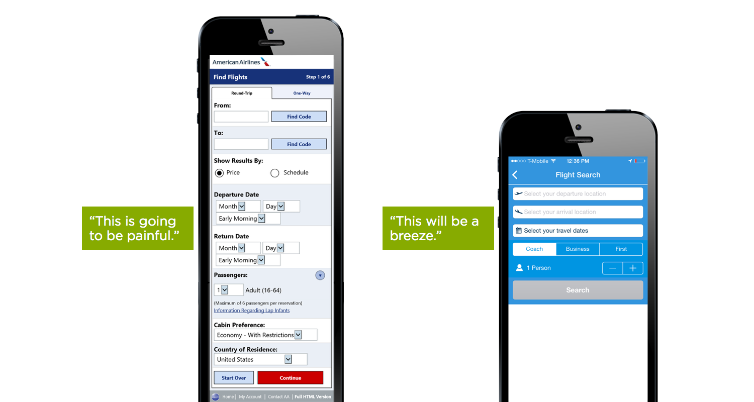