In my other life I'm an artist, with a lot of training and experience in color theory and painting.
I'm honestly a bit surprised that this whole thing is confusing and dividing so many people. This seems like a straightforward demonstration of Color Constancy (http://en.wikipedia.org/wiki/Color_constancy) and the distinction between local color and perceived color (http://practicalpainter.blogspot.nl/2010/05/local-versus-per...). I had thought that this kind of thing was more widely understood outside art education, but perhaps I'm wrong.
The short version is that the dress could be either and the photo doesn't really give enough context to say anything definitive. The longer version is that all color perception is relative. Light of a particular makeup of colors hits an object, it absorbs and reflects different amounts at different frequencies, and that's what hits your retina. Our brains then attempt to "reverse engineer" the "local color" of the object by comparing it to the surrounding light (presumably because local color is more useful for identifying and discriminating objects), and that's what we "perceive". In normal conditions we do this really well. But when you strip out the context, our brains keep trying but are easily fooled.
James Gurney tends to do an excellent job dissecting this phenomenon:
I completely agree that's what's going on. But what's fascinating here (to me at least) is how individual our interpretations are.
Can you see what assumptions the gold/white crowd is making in their interpretation? Even with the slider in the OP I can't see it. :) And even worse: I can't understand what assumption I need to make (about the color of objects in the background or shadows or something) to be able to see a gold/white dress.
Phrased differently: I can't imagine how I would construct a scene with a gold/white dress and then take a picture that looks like the one in the OP (regardless of the position of the slider). Scary! :)
Exactly. For most optical illusions you can switch between interpretations, but in this case I only see black and blue (yes the black is gold-ish). But the frustrating thing is that I saw it as white and gold for a moment yesterday, but I can't anymore. I'm starting to question my sanity.
I'm the opposite way. Even if I push the slider all the way to the left, I still see it as a white & gold dress, but in a nearly monochromatic blue light.
I put an orange light in my bathroom so that night-time visits won't affect my sleep more than necessary, and notice that the cap on my antifungal powder bottle, which I know to be orange, reflects that light as a similar color to the bathtub, which I know to be white. If I put the bottle on the tub, I can flip-flop between deciding that the bottle-cap is white, and that the tub is orange. When doing so, my perception of the colors change. The orangeness appears to fade in and out.
Not so with this picture. I can't push my brain to accept any other conclusion than the slider is changing the color of the illumination from blue to yellow, and the dress color is constant.
I'm in the same boat as you. I saw it white and gold for about 5 minutes yesterday, and then it gradually transitioned to black and blue, in a "well, I guess that's blue" sort of way, until it was "no way that's white and gold".
I saw it as white and gold originally, but later when I looked at it I had scrolled down the page so that the top part of the picture was hidden, and I saw the dress as blue and black.
Now I see blue and black if I view the whole image or bottom 2/3rds of the image, and white and gold when viewing the top 1/3rd of the image.
As a photographer I'm seeing the middle version as if it's lit with daylight blue, the yellow version as if it's overexposed with indoor tungsten, and the blue version as a cold underexposed flash shot.
What people see depends on monitor quality. Most monitors are nowhere close to neutral, and cheaper monitors still aren't neutral even after calibration.
But on top of that, colour perception is notoriously individual. Men and women have different colour perception, and many men are somewhat red/green colour blind.
FWIW, personally I have trouble seeing this as a white/gold dress.
I don't think that your monitor determines whether you see a white/gold dress or not. At first the picture looked blue to me, no matter where I placed the fader.
I left the fader on the right, continued browsing and somehow I forgot to close the tab. When I eventually came back to this tab I asked myself: "Why did I open a picture of a white/gold dress? Oooh..." However, when I then moved the fader to the left it quickly became blue again.
I could imagine that there are two effects at work.
1. My brain has some kind of caching-error when I slowly slide the fader to the right as it refuses to update all information necessary to see the real colors.
(not white and gold but the actual blue tone)
2. The bright white spot on the right hand side is sort of a focal point. When you look at it first it alters how you perceive the rest of the picture. (causing an afterimage-like effect)
if 1 doesn't happen (i.e you see the photo of the right hand side first) and 2 does happen, then the picture looks white/gold (to me)
> I can't imagine how I would construct a scene with a gold/white dress and then take a picture that looks like the one in the OP
I can. To me, this initially looked like a situation where the background is lit with incandescent bulbs with the dress being in sunlight. In a photo where you have parts of the scene that are lit with incandescent bulbs and other parts are lit with sunlight, correcting white balance for the incandescent part of the scene (yellow -> white) will make anything that's white in the sunlit part of the scene very blue. That's what I was seeing here.
It's easier to understand the gold part than the white part to me. But I think I assume that the goldish hue comes more from the light, since the further down on the dress I look the more black it seems.
Phrased slightly differently: The yellow-brown (gold) color is most visible on the upper torso where the fabric (to me) is likely to reflect a light source specularly. On the lower part of the dress (where I assume) light is more ambiantly reflected I see black.
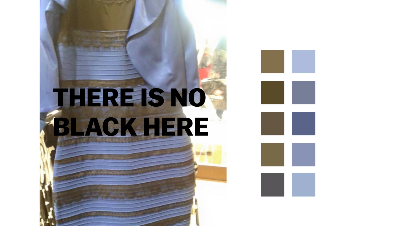
Looking at your color squares to the right it's quite clear to me what my visual cortex is doing: It's assuming that specular reflection expains the difference in color in the left column. So each color there is a superposition of two: the ambient color of the dress and the specular reflection of the light source. Separating those two gives me black dress and yellowish lighting.
UPDATE After writing the above I think I understand why it seems so weird to me to see white: I parse the light source as yellowish, so a white dress would never look blue in that light. To me seeing a white/gold dress requires contradictory hypothesis: the light source needs to be blue to explain bluish tint on white stripes; but it also needs to be yellowish to explain the "gradient" in gold/black stripes from top to bottom of the dress.
When i turned the picture upside down with the light source in the back now at the bottom, which couldn't be the sun anymore, my perceived color changed from very very light blue to blue instantly. And now I can't unsee it:)
People are not correcting blue to white. The image is measurably white and not blue. Some people may be correcting back to blue but regardless of whether or not the original dress is blue there is no deep blue of the original dress in the image being displayed. We can measure the RGB or HSV or whatever of every pixel and see that objectively
I'm the same as your update. I tend to enjoy these sorts of illusions and normally can see them "both ways" for some specific illusion. Not so on this one. The rest of the image (i.e. beyond the dress) leads me to also perceive the light being yellow-ish, in which case a white dress would certainly not appear blue.
Ha! I just had a moment where I could perceive it as white/gold: It was a cropped version showing only the belly portion of the dress with no background, displayed in isolation as a thumbnail on a news site. When cropped like that it made perfect sense. :)
I'm one of the light blue/gold people and couldn't image seeing black anywhere. But when I look at the picture upside down I see it as blue/gold and when I mask the lower half, as blue/black with a gold touch.
Looking at the different things around and behind the dress, everything dark has a similar golden color. Maybe some people correct that to black in the same way most do with the light blue to white
Why the condescension? Did you even read the top comment in this thread? The whole point is yes, some people do in fact perceive black in that picture. Because color perception is relative.
I find it funny that the HN crowd is arguing over this, given how in our line of work, I'm sure many of us have looked at an image on several different devices and have seen different shades and colors. Someone's monitor might have a higher contrast setting than your smartphone. And you're condescending to someone for perceiving a color that isn't objectively there.
>Why the condescension?
Was not my intention. I'm not a native speaker.
Honest question, to learn:
How would you rephrase the post to remove "condescension"?
The words 'really' and 'objectively' in your post give the reader the sense that you think what you see is the correct way of seeing things and anyone who perceives it differently is wrong and somehow lesser.
I first saw it on a friends laptop which has a shitty screen with the brightness cranked too high and it looked gold/white to me. When I looked at it on my desktop (which I have set so that blacks are as black as the monitor gets) it doesn't look anywhere near white/gold.
I saw it as white/gold until I saw one of articles showing better pics of it in blue/black. Now I can only see it in blue/black, even in the original photo I saw that I swore was white/gold.
I couldn't see the white/gold until I saw a much smaller and heavily cropped version of the picture. After it enlarged some, it just became the blue/black dress again even in the smaller form.
Likewise, I cannot see a white dress in that. Even with the slider all the way to the right, it is still a light blue in the image, and makes me think it's a blue-of-some-shade dress in real life.
My perception of the dress's color has flipped from white/gold to blue/black and now back to white/gold again over the course of the last day.
I can say that, in my case, there's been a fairly strong correlation between my own ambient lighting conditions. I've only seen white/gold in well-lit settings and I've only seen blue/black when I was laying in bed with all the lights off. Whether that's coincidence or not I cannot say, but I felt it was an interesting data point.
I think it's reasonable that we would have a default light-color model for illumination by natural sunlight, and that our brains would use that model to subtract the color of natural direct and diffuse sunlight from an objective color measurement upon the retina to determine a perceived inherent color for an object, which is then held as a constant. This would allow the same rock or tree to be recognized as a landmark at both noon and civil twilight.
Since the invention of artificial illumination (starting with fire), humans have had access to multiple light sources, which may be of different colors and coming from different directions. The default illumination model is insufficient to handle this without ambiguity.
This phenomenon is also used for dramatic effect in The Abyss, wherein the only light source available in the bottom of an oceanic trench is a monochromatic glowstick, and to disarm the nuclear bomb, Bud has to cut the blue wire with a white stripe and NOT the black wire with a yellow stripe. The actual wires used in filming were both black with a white stripe.
I really agree with the essentials of what you write:
- "surprised that this whole thing is confusing and dividing so many people"
- "the dress could be either and the photo doesn't really give enough context to say anything definitive"
I have used the same two arguments to explain why this hype appeared in the first place, and why the "scientific" analysis many people try to follow is conceptually wrong. Blog post and corresponding discussion can be found here:
Just a silly anecdote but a friend of mine had a room painted "this exact same pearl grey" used in another room. After having it grey, he realized it did not look grey but blue (I know why it was, because the only window of that room got the light reflected from a large bronze-green roof). He had it repainted a different tint. That was amazing.
Hey, I'm currently researching color theory. If you don't mind: Except Realist painter by Gurney, what are some other great resources about color theory that you would recommend? My main paper will be about color in marketing. Cheers, and good to see another scholar of colors!
I know this is 8 days old but the picture of the real dress is irrelevant. The image of the dress is objectively white and gold regardless of whether or not the original dress is blue and black. Both colors can be measured and shown objectively be white and gold. They can not objectively be shown to be blue and black.
If I take a picture of a flag and then in photoshop rotate the hue 180 degrees I'll get an aqua-ish and gold-ish-green flag. http://imgur.com/HkzeCU2 The fact that the original flag was red and blue is irrelevant. The image itself is aqua-ish and gold-ish-green
What people mean when they say the dress is blue and black is that they are inferring from the photo that the dress is blue and black under natural lighting. They can perceive that the black is not a true black, by pixel value, but in order for the brownish color to "make sense" alongside the blue in the photograph is for the brownish areas to be representing black.
Even in the highest white gold setting I still see the dress as being blue and black - just with low saturation. I don't get it, but this helps, thanks.
From my quick accidental experiment, I think that what you see is related to your visual experience in the preceding minutes.
I too was looking at this and thinking, "How can anyone say that that dress looks white and gold?" I could only see blue and black.
I went outside to get lunch, came back, got yet another dress picture in my social feed but lo, it was white and gold...!
My immediate assumption was that I had seen a doctored image but having gone back to this post, where I previously could only see blue and black, I could now only see white and gold.
My hypothesis is therefore that the type of light you've recently been experiencing influences how your brain interprets the colours in the dress image.
Going from daylight into artificial fluorescent lighting gives White/Gold. But, after some time under fluorescent lighting it turns Blue/Black. For me this hypothesis is somewhat supported by the fact that now that I've been back inside for 20 minutes the dress is Blue/Black again.
I'm suddenly reminded of my experience of the Chromosaturation installation by Carlos Cruz-Diez that I saw at the Hayward Gallery Light Show Exhibition. [1]
This was a trio of rooms which were saturated with either blue, red or green light. On entering each room everything appeared tinted with the colour of the light. However, after 5 minutes the brain had restored the perceived balance to normal. You could entirely forget that you were in a colour saturated room.
When moving to another of the rooms the effect began again but with everything tinted whatever colour the new room was saturated in before gradually adapting back to "normal".
I think this supports my above hypothesis. The brain takes some time to adjust to new light sources and will skew perceived colours for a short time after changing the ambient light source.
I used to work in a dark room used for silkscreening, where the only lights in the room were yellow. After only a few minutes I'd stop noticing the yellow light. When I'd leave the room at the end of my shift, everything was extremely blue for a few minutes before returning to normal. It's neat how we are able to quickly adapt to such situations.
I am in the opposite situation. I've tried all the tricks/explanations and different monitors and devices. I don't understand how the dress could be black and dark blue.
When I saw the actual picture of the dress in good lighting I questioned my sanity. :)
Thanks for explaining. I question my sanity when I see lots of comments and can't tell what's so exciting about a black & blue dress you can change the lighting for.
I'm here as well. I've seen tons of adjusted versions at this point (25+) and zero of them have had white.
I do get a gold tint on the black, for sure, but if I were asked the colors of the dress, it's still unquestionably blue & black, the whole photo just looks like it has a sickly yellow tint on it.
Edit: I should have said I get the gold tint when I slide the slider to the yellow (right).
I was seeing white and gold this morning. Read the reddit post, somebody had done a contrast adjustment showing the black/dark brown and blue and when I saw that, front that point onward I only see blue/brown (still don't see the black, it's a dark brown to me).
The funny thing is, this morning when I first "got it", the blue was very light, and I've been looking at the original tumbler throughout the day and I swear it's getting darker blue every time.
Now I can't even see the white and it's kind of blowing my mind. I remember the WTF moment when people said it was blue/black and only seeing white/gold, but I just can't reverse it and see it again.
Objectively the photograph is light blue and brown. It's not even a proper optical illusion, it's just what your assumptions are about lighting and exposure, if you're trying to determine the colors of the actual object from a bad photo.
I guess I understand what you mean. I can see the brown when it's pulled off to the side with a hex code, but in the context of the picture, I would always answer that the (brown) part of the dress is "black."
Making the image smaller/cropped/etc doesn't really change that, for whatever reason. Maybe my brain is remembering the context.
Have you tried it on different monitors? I have a UX303LN monitor (notorious for bad rendering of yellow colors) and the dress is very hard not to see as white/gold.
At least for me, today's xkcd [0] does much better job at explaining the problem.
I wasn't able to see gold/white before seeing it with dark background.
I see it as white/gold. The background is lit so brightly that it seems backlit, and the dress is in shadow. The shadow has a bluish tinge, and my eye is also correcting for the shot which appears to be white balanced to the background.
The shirt in the sun is white, the shoulder in the shade is blue. There's enough info in this image that everyone should be able to mentally balance the whites. In the case of the dress, some are applying this white balance without a strong reference point, others are not.
This demonstrates that the brain literally sees different things, on a completely pre-conscious level, based on contextual assumptions.
If you assume that the scene lighting is warm/gold, you see a blue/back dress. If you assume the scene lighting is cold/blue, you see the white/gold (I am unable to do this, personally).
Maybe it is the way these colors are represented on screens? If we were to see this dress in real life would there be any argument? Or are there any real world objects as simple as a dress that aren't designed as optical illusions that would evoke the same response?
My opinion is the picture is just terribly poor quality. Maybe that has something to do with it.
If you are "blue and black" person and can't understand how somebody could see "white and gold", here is the best explanation I have seen so far:
"I think my brain is interpreting the bluish part as a white surface reflecting some indirect blue light."
I personally can under no conditions see "white and gold", I always see just "blue and black" (I tried different ambient light, different screen brightness, different screens, Photoshop manipulations; my brain can always mentally subtract artefacts of shown physical RGB pixels and decode true colors of the captured scene, I can't force my vision not to do these corrections).
But at least this explanation made me understand how somebody else's vision could get "white and gold" perception (even if it's incorrect interpretation of the real world scene captured by that photo).
And on the other hand, even when I move the slider over to "Blue/Black" all I see is white and gold. Even knowing that the dress is really blue, I can't help but interpret the adjusted version as having its colors tweaked from white/gold.
The useful thing you should take away from this? Other people do not see things the same way as you do. Remember that the next time you're insisting that the only "rational" answer is your own.
Unfortunately since the dress actually is black and blue I'm pretty sure the "lesson" I'll internalize is just that my perception is correct and some people are dumb :(.
I was thinking WTF myself until seeing a heavily cropped and shrunk version on Google News. Once it grew, it just became the blue and black dress even when it shrank back down.
I can only guess that those who do see it as a white and gold have a brain the is wired to analyze areas smaller than the dress or in low detail.
Yes, and I am very glad I came to read the comments. I could see both as I moved the slider and was wondering what was generating so many comments. Otherwise I would have entirely missed the fact others did not see the white/gold or blue/black.
My wife sees white/gold, I see black/blue on the same exact screen. Observations:
I did not know there was a contraveesy when first shown the image. She did. I am 100% sure I am seeing the correct image (I am since color dropper verified). She is trying to figure it out. Can this be the power of suggestion since the initial person she saw it from said gold/white?
I tried zooming in on parts of the image to show her that it was indeed black/blue. She saw the blue at high zoom but as soon as any color variation to the blue or a little of the black started to show, she said it flipped back to gold/white for her. When zoomed in on the black she cannot see it as black, and I start seeing a gold tiny to it.
She saw the decomposed color swatches and acknowledged them as black/blue.
When looking at pictures in better lighting of the supposed same dress, she sees it as black/blue.
Hypothesies: (1) this is the case of the power of suggestion. Once you are told it is a certain color you cannot unsee it.
(2) this has to do with poor quality of the image. Is the image on the cusp of some uncanny valley where most people's brains try to fill in the missing information? I say most because apparently around 70% of people see it as gold/white (Sploid poll).
(3) Maybe this has to do with some type of screen refresh rate? Would have been a lot more likely with CRT screens, but don't know if there is some tech on LCD's that can have this effect.
Someone please explain this. I am losing sleep here.
Your brain does a lot of work when you look at things. You don't perceive exactly what your eyes see. You will use context to see something one way or another. [1][2]
The dress photo is deceptive because of the exposure, levels, and cropping. When some people look at it, they see a lot of light behind it, and subconsciously assume that the dress is probably in shadow. A white-gold dress in shadow would look the way the image does, so their brain says the dress is white and gold.
When others look at the dress, they instead see a dress that is illuminated by light probably behind the photographer, or maybe an over-exposure in some other way. Either way the dress is washed-out, and a blue-black dress would look that way if it were washed out. So their brain says the dress is blue and black.
In reality the dress is blue-black, but the photograph is essentially an optical illusion. Within the context of the photograph only, both ways are valid. You can even switch the way you see it if you can get your brain to "reset" the assumptions it's making about the image. For those of you seeing white-gold, try looking at an upside-down version of the image. [3]
Here is an image that might do a better job at demonstrating what I'm trying to convey. [4]
You have to distinguish two questions:
1) what color(s) is the represented dress?
2) what absolute pigments are present in the physical image?
These are very different questions. Painters know this distinction, at least implicitly, since a big part of painting is producing illusions with the clever application of color. The checkershadow illusion is a similar demonstration of the distinction between medium and message (or sense and reference, to borrow Fregean language).
Phenomena like this reveal that color isn't something known purely by sense perception and that some reasoning is required to conclude what the color is. (A superficial analogy may be made with the theory-ladenness of observation perhaps, though that is a different phenomenon). I wouldn't be surprised if there is a relation between the differences in colors perceived and the ability to reason contextually. Indeed, autism and Asperger's have been characterized as entailing "context blindness".
I can't see black and blue for the life of me. I even ran some computer vision algorithms on it (none of which said the lighter image had black, or any sizable amount of blue).
My guess, some people are either color blind, dimming their screens trying to see it, or they are seeing a different image...
Given that everyone who is seeing it in black and blue is seeing the correct image (as later verified), it's a bit odd for you to suggest they're the ones with problems with their sight.
Which is exactly the colours it looked like in the original image, to me, and to I suspect everyone else who can't make it look anything other than black and blue.
Part of the problem is from that image everyone started sending around a billion copies of the wired image. I agree that dress is blue and black and I think everyone else would to.
The problem seems to be people changing the white balancing.
I wrote a quick write up, but my computer never identifies a black and blue dress. Even the one you linked would be indigo (not that it maters that much).
I simply opened the file up in an image editor and played around with the eyedropper. It seems pretty clear that the two main colours are white with some blue tint, and a yellow. When the exposure was fixed, the colours weren't even close to black and blue.
I was able to see it b+b when I first woke up this morning. Last night I only saw w+g. But, no, it's not the screen. Two people looking at the same screen will see different things.
The lesson here is that while there is an objective reality, our minds do A LOT of post-processing on our sensory input without our knowledge, so we don't have unfettered access to it.
Yup. Light in the shade is bluer than direct sunlight. This is because our atmosphere diffuses blue light (which is why the sky looks blue) -- so blue light comes from every direction of the sky, and other wavelengths of light come only from the direction of the sun. Anything in the shade (shadowed from the sun) receives only that diffuse light from the rest of the sky -- which is in fact bluish.
There's no "looking at it wrong". If you take a photograph of something, there's no way to tell from the photograph what color the thing is. That's because the raw visual data (light of wavelengths x, intensity y) depends much more strongly on the lighting the object is subject to than on its inherent optical properties. But your visual system is designed to ignore local lighting and extract the inherent optical properties, which are what you mean by "color".
I don't think so. I've looked at 'color-blindness' tests quite a few times and can always distinguish the numbers.
I can see how someone might think the black could be gold, due to the shimmer in some places (although it still mostly looks blackish). I don't see how anyone can see the rest of the dress as white though. It looks like dyed blue fabric...taken with a horrible camera/exposure.
My initial reaction was white and gold. However, I can see that it is a light blue (periwinkle?) and gold if I try (especially blocking out the top part of the dress and only looking at the lower 1/3 of the photo). I am not able to get myself to see black no matter how I try.
I see the white, but if someone wants to say "it's light blue" I won't fight. There's a house in my parent's neighborhood that is somewhere between a light-grey and a pale-blue, and it sometimes looks "grey" and sometimes looks "blue."
Although the debate is how the dress looks in the picture, the dress is actually blue/black. BBC ran an article here http://www.bbc.co.uk/newsbeat/31655696.
I can't see it as white/gold at all. Today's XKCD does a good job of showing me how it could appear that way to others though. http://xkcd.com/1492/
My wife and I started very divided. Blue/black for me and white/gold for her. A few hours later she only sees blue/black.
The interesting/funny thing is we just started watching Brain Games on Netflix and the first episode was about colors and perception. They very visibly demonstrate this with the color gray. https://www.youtube.com/v/BnPbT3wgfG8
Suggestion: put a thick (100px or so) border around the image that changes from white (for blue/black) to black (for white/gold). Alternately change the background color of the whole page. It makes a big difference perceptually.
I wonder if the reason this dress color thing has been spreading around so fast is because of the different devices everyone is using to view it. When I first saw the dress on my Macbook Pro screen (non-retina) the dress looked white and gold. Then I checked on my iPhone 6 in the dark later on and it looked blue and black.
I've been seeing articles about how the reason people are seeing different colors is because of different types of eyes, psychology, etc...maybe the answer is much simpler.
I had initially thought the same about different screens but then I saw it change on my phone.
The first time I passed by my friend's post with the photo on my facebook feed, it was white and gold. I ignored it and scrolled on. A few minutes later while scrolling back up to the top, that same exact picture (same post) was blue and black.
I've seen it switch a couple times since on my phone (nexus 4). Although on my desktop it's always white and gold.
People very rarely see true white or true black, so what we common call "black" is a whole bunch of really dark thinks and "white" is really light things.
I'm sure people will come up with really fascinating ideas on why some people see the white gold and others as blue black..
Even my desktop and laptop screens have their own opinion. I think the image is mainly a good test for calibrating your screen. http://imgur.com/Agxo20K
Am I missing some sort of context? Everyone is talking about this thing like they know exactly what is going on and they have a very strong opinion one way or another. I can't even tell what is supposed to be happening. Okay, there is a slider. It changes the colors. Why?
In my very limited sample, if you invert the image colors, you'll see the same colors in the different parts of the dress.
I see it blue-black, inverted it looks like blue lace with dark fabric. If I saw this first I would think that the original lace would look yellow and the fabric light.
The pixels are objectively blue and brown. Our brains are guessing at what "true" color we're supposed to infer from the pixel values. Some people infer blue/black and others infer white/gold.
at first I saw it white/gold .. but then it became blue/black
and then my girlfriend came, and we were talking about the dress (ATM she hadn't ever seen it) and to my surprise she starts seen it as white/glod!!! -- and I was (puzzled) seeing it clearly blue/black
after some 2 o 3 minutes, she started seeing it was starting to _change_ .. and then boom! all she sees is a black/blue dress, and also she notes that the image has background, before she was only seeing the dress and backlight .. before she could not recognize anything in the background as there was too much lightning
is this something the brain could "fix" and after that period, you cannot unsee?
Light is weird! Here’s an essay from a dilettante with too much time spent in Lightroom…
Everyone (including the Wired people in the submitted article here: https://news.ycombinator.com/item?id=9117137) seems to be trying to white-balance the image as if it has only a single light source. "He saw blue in the highlights, telling him that the white he was seeing was blue, and the gold was black. And when Harris reversed the process, balancing to the darkest pixel in the image, the dress popped blue and black. “It became clear that the appropriate point in the image to balance from is the black point,” Harris says."
I don't understand why. The blown out highlights of the background (which seems to be people carrying bags outside a window?) seem to make it clear that whatever's hitting the dress is a different light than what's filling in the background.
The hardest question I feel remains, then, is: if the dress is white, why is the foreground light blue-cast? Generally indoor lighting is yellow than outdoors... possibly a flash? The quality of the image is so poor that it appears that there was still not nearly enough light hitting the front of the dress, but on the other hand I don't spot anything on the front of the dress that I'd say was definitely a flash highlight... my best theory is that it's a 100% crop of a bigger image and the flash isn't sufficient because the photographer was actually quite a bit further away (and had a poor camera/cameraphone).
But that light temperature question is a problem the other way too: if it's a blue dress under warm indoor lighting (hence the yellow/gold-ish tinge to the 'black' parts), what's up with the particular shade of blue the light part of the dress is rendering as? That doesn’t look like blue in warm light to me. That's a really weird shade for blue to render as, I see that shade far more often when looking at white objects in cool light.
People also tracked down (don't have original source, just people reposting on Facebook) this site which sells a very-similar-if-not-exactly-the-same dress in both a blue and white variant (hard to be sure of the details with the poor quality of the original pic)! But neither secondary color (seems to be untinted black in both cases): http://www.romanoriginals.co.uk/invt/70931?colour=Ivory - and in none of the “corrected” blue images I’ve seen does it look like that shade of blue, without clearly crushed shadow detail indicating underexposure. But if that is exactly the same dress, than I honestly can’t say, since there are weird things about both color rendering options! (Why wouldn't the dark lace be blue-cast too? Alternately, why is the blue less gold-cast than the lace if the dress is really blue?)
EDIT: another option for how the exposure got so weird in a blue-dress scenario: there could be another item in the hypothetical uncropped original photo that is not overexposed that explains how both the dress and the background are overexposed? If just the dress was the original subject of this photo I'm surprised by how poorly the camera picked the exposure/white-balance.
I created the blue image myself by guessing at the color of light that was hitting the image and subtracting it using GIMP (#524922 FWIW). It's not entirely scientific, but the resulting blues match very closely to the picture of the dress on Amazon [1], despite the image feeling a bit too dark.
The yellow one in your simulation is the one I feel is off, and was referring to with the blue removal. That's not how I perceive it when doing my mental white-balancing attempt (and I can't speak to how blue-dressers perceive it originally). I see that the pixels are light blue, but assume that the material is white. Lightroom does a much more convincing blue-cast removal -- looks pretty similar to this, where the gold is preserved but the white doesn't become yellow: https://pbs.twimg.com/media/B-0WdySWwAEqiDR.jpg (I would upload my version from lightroom, but I didn't bother to save it and I've spent far too much time on this subject for one night :) ).
I'll see if I can figure out a good color to subtract to get a better yellow one. IIRC, it was cribbed from one of the news articles on this that showed up tonight, but I'm not sure which one.
EDIT: I'm thinking that the right move might be adding #392c00 (rather than subtracting!).. And I've updated the final image with that instead of the one from before.
It is clearly the ivory dress; the negative and positive of the original image will show nearly the same colors simply swapping places ('gold' stripes become 'white' and vice-versa) which is only possible if the two colors are opposite each other. Black and blue are not. Black and near-white are.
You're right. But it's already known that the actual dress is "blue and black" as someone found it on amazon. It's essentially the picture that is creating the ambiguity.
For the love of God, hold a 50% neutral grey card next to the dress and take a picture with proper white balance so that we can all continue with our lives!
Not really. I mean, when you put the same object under yellow light or blue light, the physical photons going into your eyes will be different. It would be like being someone who didn't hear the Doppler effect when a police car drove past.
Maybe because I'm a photographer and I understand colors better? there is NOTHING about "white and gold" in this photo, no matter where you put the slider. I really don't get it at all! :)
not sure how many people are aware of the eclipse of mars illusion: http://www.moillusions.com/eclipse-of-mars-illusion/. but basically digital screens have trouble and variances in displaying cyan. is the dress possibly cyan?
I'm honestly a bit surprised that this whole thing is confusing and dividing so many people. This seems like a straightforward demonstration of Color Constancy (http://en.wikipedia.org/wiki/Color_constancy) and the distinction between local color and perceived color (http://practicalpainter.blogspot.nl/2010/05/local-versus-per...). I had thought that this kind of thing was more widely understood outside art education, but perhaps I'm wrong.
The short version is that the dress could be either and the photo doesn't really give enough context to say anything definitive. The longer version is that all color perception is relative. Light of a particular makeup of colors hits an object, it absorbs and reflects different amounts at different frequencies, and that's what hits your retina. Our brains then attempt to "reverse engineer" the "local color" of the object by comparing it to the surrounding light (presumably because local color is more useful for identifying and discriminating objects), and that's what we "perceive". In normal conditions we do this really well. But when you strip out the context, our brains keep trying but are easily fooled.
James Gurney tends to do an excellent job dissecting this phenomenon: