Interesting. Being partially colour blind I would have thought that the original was much greener, while the re-release is a lot bluer and bumped up the brightness contrast.
For example, most of the agent scenes in that comparison the left frame appears "greener" (but also more washed out in terms of brightness contrast) than the right.
I'm in the same boat: it's weird seeing the comments describing the blu-ray as "green-ray" and that things are SO GREEN when I literally can't see it. For those of you with decent color sight, was the original... more orange?
There was a bit of a green hue in places in the original, but not as pronounced as in the "green-ray" version.
When I first saw the blu-ray version I had to check my TV colour settings to make sure no-one had been fiddling with them (colour saturation, temp etc). It was quite jarring on the eyes, and that was even after three or four years of not having watched The Matrix. As a non colour blind viewer my reaction (after checking the TV settings etc) was, "yeesh".
The original looks more green-orange and flat. The blu-ray looks more green-blue and contrasted. The original feels 'warm' and the blu-ray feels 'cool.'
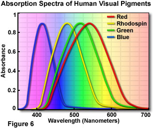
Ah, that explains it. I'm technically green deficient. Because of how colour vision works, green perception partially overlaps with red perception[0], so I tend to think of green as more of an "earth tone" (essentially brown).
Colloquially people with normal vision tend to say "green" when they refer to teal (i.e. green-blue or just generally green with some blue in it). Because I don't actually perceive the green part of the hue, the blue is much stronger for me.
I absolutely agree with the "warm" vs "cool" thing, though.
> Because I don't actually perceive the green part of the hue, the blue is much stronger for me.
Interesting. Yes that's the opposite the effect it has in me. Teal is a washed-out blue...
The original/DVD release of the Matrix did have a visually distinctive green tint in the scenes taking place inside the Matrix. But it felt soft, warm, and flat. It was also subdued in some scenes, such as the training dojo. The scenes in the real world lacked the filter and felt harsh, cold, and rigid by comparison. It was a great artistic choice.
The new blu-ray release (and the sequels) have the entire movie feel like the harsh, cold, rigid reality, and have heightened the contrast to make it worse :(
For example, most of the agent scenes in that comparison the left frame appears "greener" (but also more washed out in terms of brightness contrast) than the right.