The widgets examples do not look good, unfortunately.
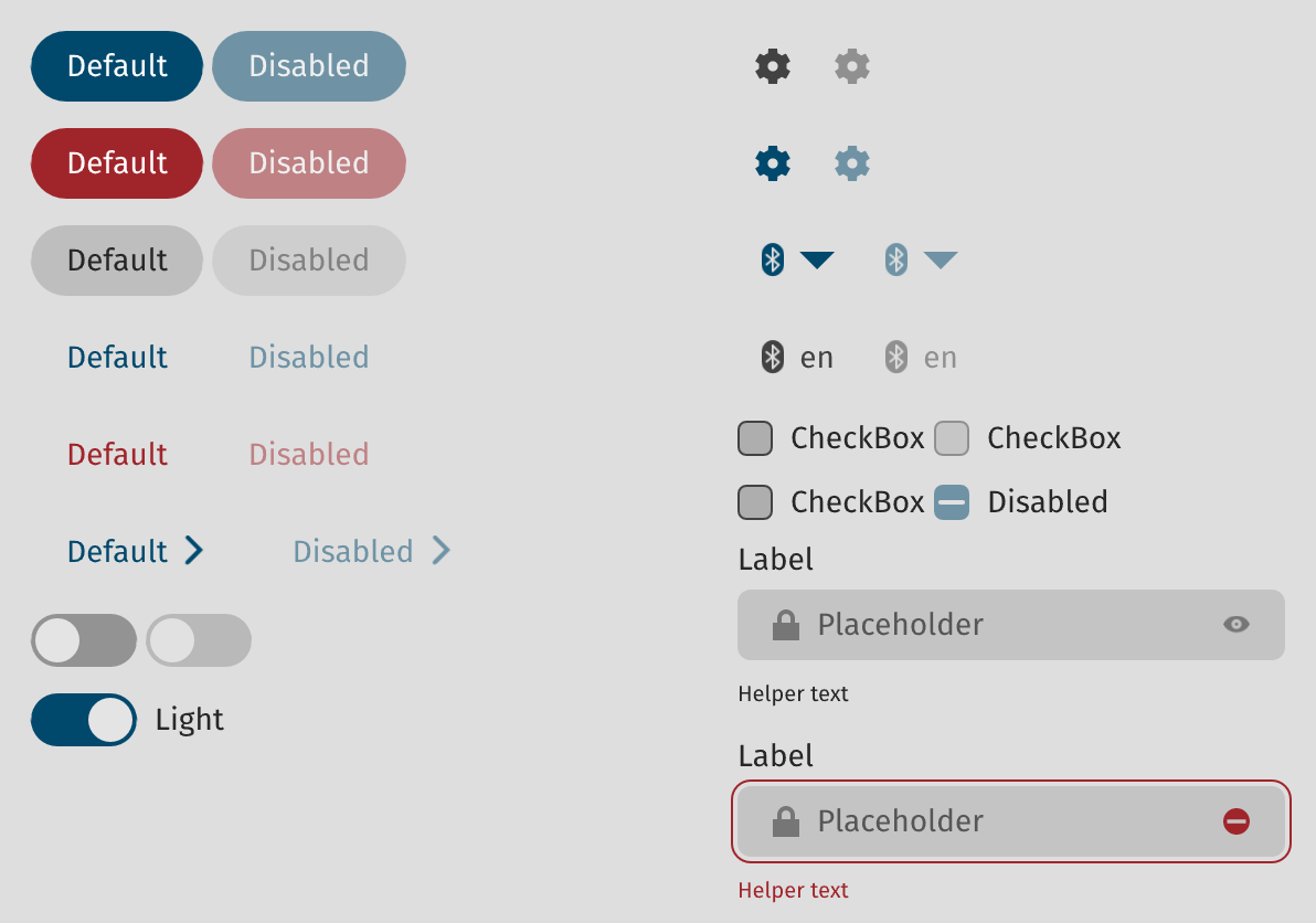
Let me elaborate: they seem aliased (everything looks like sampled with nearest neighbor), spacing is non-uniform and overall the style chosen looks somewhat outdated.
For the story, we initially had screenshot of an actual commercial desktop app, but we were asked to remove it by the author until the app is actually released. So we went with that set of of widget instead, which is a prototype of the Cosmic style for Pop!OS)
I am not a designer (not for 20 years now) but that desktop image (rotating gif of different styles) is not a good advert. There are many, many layout issues with those that I would really spend time to try and make "default" look right out of the box (and in line with platform HID guidelines). I am a Rust developer, and I think Slint could be amazing, but those things will put off people who are driven by design quality.
Let me elaborate: they seem aliased (everything looks like sampled with nearest neighbor), spacing is non-uniform and overall the style chosen looks somewhat outdated.