Some of us grognards would argue that if you're having trouble finding buttons, they really shouldn't be on the screen at all. Seriously, why must IDEs look like this? Why is there screen space dedicated to documentation when I'm not reading docs?
Why are there multiple horizontal bars at both the top and bottom of the full-screen display when the single most important activity in the app is scanning very long text files often dozens of times "higher" than the screen. Seriously, every line of text is precious, why must we steal them from the editor with a title bar and a menu bar and a tool bar (thankfully they now have only one toolbar) and a tab bar and a status bar. Why does anyone think this is a good design?
I'm no longer a .NET developer. But I was for about a decade and I got to the point that I removed all toolbars from Visual Studio. I had nothing but the text editor and solution explorer (docked and only opened when needed). I'm surprised to read many comments here where people talk about finding icons and getting lost in the toolbars. Power uses of tools like Vim, Photoshop, Illustrator, etc use the keyboard for everything, I'd have thought most VS power users do that too.
I think most VS power users do that as well. I honestly can't remember the last time I clicked an icon on the toolbar.
One of the really nice things about pair programming is the number of times I've started hunting through a menu for an option and the other dev will say "Oh, just hit <chord>".
If you spend a great deal of time in ANY application you owe it to yourself to take one day a month and force yourself to use it without ever clicking a menu or icon. You'll be delighted at how much more productive you'll be.
I no longer have VS available to check. Is that "no chrome mode" or really just "fullscreen" mode? I seem to remember this mode made alt-tabbing to other apps problematic for some reason. Maybe I'm wrong. I also never maximize my windows, which I believe is another reason I didn't like this mode.
You're right, it's fullscreen, I actually didn't entirely realize this. (I was sort of thinking of OneNote which has its own "full window for content" toggle which isn't fullscreen)
Windows in VS10 behave oddly in general around alt-tab and other things, I haven't managed to form a mental model of how/why they do.
I've used Qt Creator only once or twice, but my memory (and the handful of screenshots I see on google image search) is that it's pretty much the same. An editor rectangle embedded in a bunch of other crap with way too much vertical space above and below it dedicated to things that aren't very important.
For reference, my emacs window has the gnome 3 panel and the window manager title bar as waste and that's it. And for years I ran a custom metacity theme which turned off the title bars entirely (haven't managed to port that to gnome shell yet).
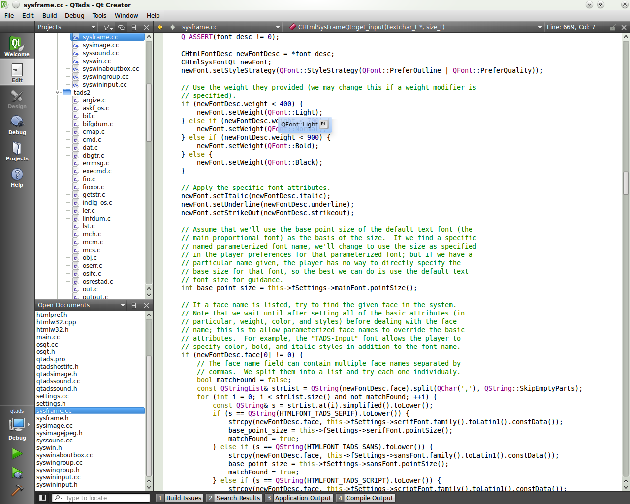
I think your recollection/search is incorrect. Qt Creator has a menu bar, navigation bar, and output selector etc. bar, all the height of a single line of text. There are no toolbars at all - none that can even be turned on. Much of the status and control interface is in a vertical bar on the left.
A typical session looks like this [1]. With the documentation window open, it looks like this [2]. The GUI designer looks like this [3] (there's also a second "designer" for Qt Quick). The debugger looks like this [4]. With the compile log/error log/search results window open, it looks like this [5]. About 80% of the time, when I use Qt Creator, especially if I'm not developing a GUI application (in which case I also use the designer), my screen looks like [1].
On the other hand, to my eyes at least, most other IDE's look something like this [6], [7] or very very extreme cases [8]. That is, they lose a lot of vertical space to tool bars.
When I'm developing on Linux and I'm not developing a Qt GUI application in C++, I use a mixture of text-mode vim, geany and gedit in a tiling window manager (that is, the "dock windows" in most IDEs are windows that I have tiled, or vim panels) with no window borders or decorations whatsoever [9].
Wait, what? You use four different editors? How can you stand that? How could you be good at any of them? I can barely type into a text field on a web page without pasting from emacs.
I don't use vim on windows. On linux, I use geany for Python code and plain text. Sometimes I also use gedit, but its rare. I use Qt Creator for all Qt development and for non-Qt C++ development if I'm not using linux.
So, most of the time I'm using Qt Creator, some of the time I use geany and the rest I use vim. I probably sholdn't have mentioned gedit as I really don't use it often. I'm planning on dumping geany in favour of vim next time I have to set up my development environment (basically when I get a new laptop, hopefully real soon) as I've been meaning to practice my vim skills for a while now. I was real good at it a few years ago, but then I got a little rusty, which is why I ended up using geany for python and plain text instead...
Actually, to be completely accurate, I use MPLAB too ;) I use it exclusively to program C for the PIC24 microcontrollers. I also used Notepad++ for AVR development a few months ago - if I had been developing on linux, I would have used vim, but I really dislike gvim, so do not use it on windows. I use MPLAB for PIC development because it integrates with the hardware programmer, the remote debugger and saves having to set up paths for a gcc thats not compatible with the one I use for desktop C++ development (though I plan on switching to clang, so I won't have any gcc clashes anymore then).
As someone who's an IDE "beginner" (I usually code in Vim, recently started using IDEA) in my opinion there's nothing at all about this that "helps beginners get going". Instead of having a useful toolbar with a few of the most common operations on it I have a double or triple stacked bar with dozens of icons, panels coming from every side, etc.
It's basically impossible to find even the easiest of IDE functions in that mess. One of the purported advantages of GUIs is the discoverability of the interface. When I have to visually search through hundreds of UI elements to find what I need, that is all lost.
The monolithic IDE concept really needs a fresh breath of air. I do like the fact that they come with a lot of integrated tools for a programming environment, but they shouldn't clutter the UI because of it. Ideally I think an IDE would start off looking mostly like a text editor and give you clearly delineated views of different activities once you need them.
%20-%20Microsoft%20Visual%20Studio%20(Administrator)%20(5).png)
Why are there multiple horizontal bars at both the top and bottom of the full-screen display when the single most important activity in the app is scanning very long text files often dozens of times "higher" than the screen. Seriously, every line of text is precious, why must we steal them from the editor with a title bar and a menu bar and a tool bar (thankfully they now have only one toolbar) and a tab bar and a status bar. Why does anyone think this is a good design?