I'm not sure the reviewer has a good understanding of how to interpret the Siemens star chart (referred to as a 600 dpi test image). I'm not entirely qualified to interpret the results either, but I know that differing anti-aliasing and image processing routines can produce significant artifacting in this type of image. This must be factored in to any evaluation.
My point is that the better perceived image quality of the star chart on the iPhone isn't necessarily an indicator that the "screen quality" is better. It's just as likely that the image processing in the iPhone has been tweaked to produce an image more in line with what we'd expect to see, at the price of accurate reproduction. This type of trade off is made all the time in image processors found in cameras, televisions, and computer displays.
Your preference for one or the other has to do with your priorities. Do you value rigid accuracy in reproduction, even if it results in some artifacts, or do you prefer an image that is free of artifacts at the expense of accuracy?
I am pretty certain you're correct. Those Moire patterns were the ones you see when a fast image-scaling algorithm is taking every nth pixel, not what you should see with different underlying pixel layouts.
In fact, looking at the iPhone zoom, it's blurred in the middle -- it's absolutely had a filter applied to it. You still see some Moire in the center of the image, but that could be a filter artifact.
You'd need the chart rendered at exactly screen resolution, with proper filtering for that resolution (so that it doesn't end up with Moire patterns inherent in the image), and then to display it using code that's guaranteed not to apply a filter. He seems to be using the built-in slideshow apps in all cases (or maybe a browser?), and it looks like the iOS one has a better scaling filter. Which is interesting, but not what he's trying to prove.
On top of all of that -- his photographic resolution can also be coming into play, adding more Moire patterns than you'd see in person. The lower resolution iPhone screen may not have had as much interference with his camera resolution.
what we'd expect to see, at the price of accurate reproduction
Can you explain what this means. Since our eyes are the only reference we have for interpreting colors (the other being wavelength, and that's just a number) I'm curious what an accurate color really means. I know that we can see billions of colors but only a thousands at the same time.
Those curves are an illusion. They don't actually appear in the image. We see them because of the tiny, staggered parallel lines required to reproduce an angled line using a grid pixel array. You can optimize to reduce this effect by using different anti-aliasing techniques that are specific to the type of display you're using. Apple tends to favor "soft" anti-aliasing techniques over accuracy. They also have the benefit of controlling the entire software stack, so their image processing can optimize for the IPS display used in iOS devices.
Some people find the softness downright obnoxious, while others think it results in the most pleasing image. I prefer Apple's method.
Color perception is a very broad topic. It's one of those "why is the sky blue" questions that we've all pondered (and frequently arrive at a false conclusion). I'm not nearly knowledgable enough to talk about it with authority, but you should definitely do some Googling, and be sure to keep an open mind. The answer is probably not what you think.
I thought the same, but it seems they display the image 1:1, so no scaling is applied. If that's the case, then I doubt any of the phones will process the image. (Though there might be reasons to do that, which I'm not aware of)
The fact that the author references 600 dpi, then displays the image at 1:1 reveals that he really has no idea what he's dealing with. To further complicate matters, the author's source image is an already anti-aliased bitmap. Re-sizing this image in order to test appropriately on varying screen resolutions will result in anti-aliasing errors. The test images should be rendered at target resolutions from a vector based format like SVG.
This is what the test image looks at zoomed to 400% with no anti-aliasing and no additional processing. This is a pixel-by-pixel resolution of the mess at the center of that image:
When displayed 1:1 on a device, that mess will show up.
DPI is dots per inch. This is an indication of resolution density. When you scale the display of an image on a fixed size screen, you also scale the DPI. That is to say, you could use a 1 million DPI image, and still, when displayed at 1:1 on a smartphone, the DPI of the resulting image is the same (the extra pixels are clipped outside the boundaries of the screen).
Keep in mind that this test pattern should appear like a fractal. No matter how far you zoom in, the pattern will look the same. The points at the center should scale down to near infinite resolution. The resolution limitation is only that of the display device.
A more suitable test that gets closest to the hardware would work something like this:
* Start with an SVG test pattern
* Record the native resolution of each device in pixels
* Render the SVG test pattern with no anti-aliasing (or at least consistent anti-aliasing) at each target resolution
* Display the image on the device using a custom developed application that disables or avoids any internal scaling or image processing capabilities of the software
* Observe the results
If you wanted to test the rendering capabilities of the entire software stack, you should still start with an SVG and use whatever built-in components will render SVG.
Starting from a large bitmap tells us how well the bitmap scaling software works, but you shouldn't zoom to display at 1:1. You should allow the software to resize and see how well it scales.
Each of these is another step removed from the core question asked in the article: Does the pentile screen impact image quality? To answer this question, we must rule out other factors, such as software rendering capabilities.
The final error made is that of attempting to capture the results with a finite resolution capture device (a camera). At a pixel level, your capture would need to greatly exceed the resolution of the target display in order to examine the results at a pixel level or to reproduce the image in a way that objectively represents the perceived result to an audience not present at the time of testing.
They're intended to be printed at high-resolution, then captured (photographed) at a distance where the fine lines at the center of the image greatly exceed the resolution capabilities of the capture device (usually a camera).
With a film camera, you could test the limits of the lens and film. With a digital camera, you test the limits of the lens and sensor.
The regularity of a pixel array in a camera sensor or display results in the Moire pattern you see in these test images.
The real downside of OLED, as used in Galaxy Nexus and lots of other places, is the screen noise when the brightness is turned down. Intermediate brightness solid colours look textured, like very high weave linen. It's most noticeable when I'm using the Galaxy Nexus in bed, with the lights off. Worse, this linen texture remains in place even while the displayed image is being scrolled; it's a bit like the screen is permanently dirty.
It doesn't really bother me much. The Nexus One was similar, though with the larger pixels, the screen visibly "fizzed" in dark environments - you could see the noise continuously.
A bigger downside that does bother me is how much the extra pixels reduce smoothness in the majority of apps that are not hardware accelerated - I replaced the launcher with LauncherPro to get rid of the Google search bar - and now scrolling between home pages is visibly jerky, compared to the Nexus One.
Another downside is all the application failures and silent terminations owing to (what I believe are) the extra video memory requirements. It used to be that e.g. after navigating to a web page from the stock news widget, pressing back would reliably take you back to the stock news widget page that you came from. But now, if you navigate to a large web page, it's quite likely that the news widget will have been evicted, and restarted when you press back; and you end up on the wrong tab of the widget, and have lost the scroll position. Similarly, switching between tabs in the browser, or reopening the browser after switching to an app, is much more likely to cause a page refresh. It all feels like a very memory constrained device, much more so than the Nexus One was with Gingerbread.
My personal verdict: if I could have gotten the Nexus One with larger internal memory (i.e. OK for apps to use) and a working power button, still running Gingerbread, I would prefer it to the Galaxy Nexus running Ice Cream Sandwich. Biggest thing I miss is a reliably located menu button.
> I replaced the launcher with LauncherPro to get rid of the Google search bar
Isn't the Google search bar just a (removable) widget?
I agree with your points about application eviction causing them to restart in a different state. I don't know why Google isn't stricter about requiring their applications to save state and restore to same (as iOS apps are supposed to). At least their first party apps should do this.
OTOH, I'm not sure that it is the extra video memory requiring this. I think it may be that they have increased the heap memory allowed for each application significantly. I'm not sure, though... I haven't used ICS yet.
> Isn't the Google search bar just a (removable) widget?
On the ICS launcher, no. It's a built-in on all home screens. Don't ask me why they ignored their nice widget system in favor of inflexibility, but there you have it.
Wow, that is really lame. I'm liking the idea of ICS less and less each day now it seems. Its ridiculous that they've gone so far backwards on both this and the voice search functionaity with this release.
Thanks for your insights..
Actually, i seem to be in the same position as you are.. I love the Nexus One form factor (it's a good size.. Nexus S has a nice size, too).. But after all that flashing i have a very, very low in-call volume. Now, i was looking forward to the Galaxy Nexus.. Where is there no current smaller mobile with decent hardware? Now i'm alternating between Nexus S and Galaxy Nexus... perfect size vs newer hardware... mhh, tough.. :(
(In the end i hope Googlorola will release a smaller ICS mobile soon enough ;) )
The technical quality of the photos is quite poor. They're way too bright if we're looking for subpixels, since all we see are full pixels, smeared together into blooming white. Also, looking at the HTC Rezound's standard color test, the Verizon logo on the phone is blurred just like the display itself.
It would help if the photos were re-done to actually show subpixels, sharply. (Edit: unless I missed the point, in which case the Settings menu shot should suffice: "It's PenTile but it looks pretty nice in actual usage!")
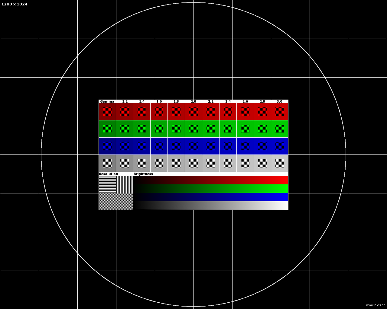
OP's understanding of these test patterns is incorrect. 'bradleyland' has already commented on the star chart. I'll talk about the second set [1, 2].
>> As you get closer to the end of the spectrum, you can see that the color depth blends together
These images are not testing the "spectrum". These test the gamma curves of the display. With reference to [1], the center squares with checkerboard patterns spatially mix two sets of colors to check if the mixture matches the color shade in the surrounding box. If the gamma curves are tuned correctly, all of the outer and inner boxes should blend. Nearly none of the displays I have tested achieve this and calibration is quite involved.
My biggest beef with AMOLED displays is that they require more power. True, at all black they consume less, but in normal use it's more compared to LCDs. I just got a Nokia Lumia 800 and I'm down to one day of battery instead of two with the iPhone 4. The same issue was present with my previous Nexus One. Displaymate did a test to quantify this: http://displaymate.com/Smartphone_ShootOut_1.htm
Also when displaying text you are more likely to notice the pentile pattern which makes the text unclear at small sizes. Granted, it may not be a problem at 316 ppi of the Nexus, but it's noticeable at 252 ppi of the Lumia 800
My point is that the better perceived image quality of the star chart on the iPhone isn't necessarily an indicator that the "screen quality" is better. It's just as likely that the image processing in the iPhone has been tweaked to produce an image more in line with what we'd expect to see, at the price of accurate reproduction. This type of trade off is made all the time in image processors found in cameras, televisions, and computer displays.
Your preference for one or the other has to do with your priorities. Do you value rigid accuracy in reproduction, even if it results in some artifacts, or do you prefer an image that is free of artifacts at the expense of accuracy?