Q: I'm a student of visual communications and asked myself why links are blue. I found some answers that might be, for example blue is a color of learning, but I'm not sure what is right. Is there any reason, why links are colored blue ?
A: There is no reason why one should use color, or blue, to signify links: it is just a default. I think the first WWW client (WorldWideWeb I wrote for the NeXT) used just underline to represent link, as it was a spare emphasis form which isn't used much in real documents. Blue came in as browsers went color - I don't remember which was the first to use blue. You can change the defaults in most browsers, and certainly in HTML documents, and of course with CSS style sheets. There are many examples of style sheets which use different colors.
My guess is that blue is the darkest color and so threatens the legibility least. I used green whenever I could in the early WWW design, for nature and because it is supposed to be relaxing. Robert Cailliau made the WWW icon in many colors but chose green as he had always seen W in his head as green.
One of the nicest link renditions was Dave Raggett's "Arena" browser which had a textured parchment background and embossed out the words of the link with a square apparently raised area.
I believe this is the correct answer. It was the default for Netscape navigator back in early 90s. If you wrote an html page without styles it gave you a white background, blue hyperlinks, and times new roman font. As for why the default for NN was blue, I really don’t know other than the juxtaposition of it vs normal text. To claim it was mosaic would align with my history of it with NN though.
If someone in 1989 handed you an article with occasional markings added indicating important terms or concepts, it was probably a blue underline, which contrasted and stood out nicely from the black photocopy or print.
I've wondered this before, but never found much concrete--except that being picky about rendering serifs on "low resolution" screens is a very modern thing in itself!
My intuition is that it comes from books/newspapers and nascent desktop publishing universes; sans-serif fonts being used for large amounts of body text anywhere, on paper or not, is relatively new as a mainstream thing. (That isn't to say it never happened, just that it's historically rare.)
Blue is the least dense rod cell, so shows up best against white over any other color. Green is the most dense rod cell, so shows up best against black.
This is why Apple makes Android users have white on green text, the least readable choice.
Given the author's "conclusions" about Windows's influence here, it's probably worth mentioning that Windows 3.x (including both 3.0 and 3.1) used green for hyperlinks in its help system by default (which was hypertext but not HTML): https://i.imgur.com/ZjX5xIW.png
Green hyperlinks stuck around in the Windows 95 help system, and were eventually replaced when Windows 98 switched to Microsoft's new HTML Help system which defaulted to blue hyperlinks (inherited from Internet Explorer).
I always assumed that the green help links color was intentionally differentiated from regular blue web links to clearly imply that they remain within the "Help" universe.
I don't think the timeframe's right for that-- were there ever even any web browsers that ran on Windows 3.0?
At any rate, there wouldn't be any need to distinguish internal help links from web links, because neither Windows 3.0 nor 3.1 ever shipped with a web browser-- can't link out in your docs if the tools aren't available to follow the links. Early versions of Windows 95 didn't, either, with IE 2.0 being bundled with the OS for the first time with OSR1.
Nor did 3.1. Windows for Workgroups 3.11 did eventually get a first-party TCP/IP stack from Microsoft (as an add-on), but TCP/IP was largely the domain of third-party products up until Windows 95.
It's likely this person came across this during their research, but decided to omit it because it didn't fit in with their already weak and speculative narrative.
Mosaic was the first browser I used, and the first I wrote websites for (I still only test in one browser ;) ).
Something the article doesn't touch on is the fact that there wasn't really such a thing as hex colors like "#0000ff" back then. You could use them, but no one did because they weren't guaranteed to work properly. There was a list of 256 "web safe colors" that you could use that were the 8 bit palette that most computers supported in VGA graphics (at 640x480 resolution), and then a further list of HTML colors that could be used if the user had a graphics card that could use 16 bit SVGA graphics. Using 24 bit hex code colors didn't come along until a little later, when computers were likely to display them properly.
In other words, links weren't #0000ff. They were "blue".
One underappreciated aspect of paletted computers is that you couldn't just take the whole palette for yourself, you have to leave some colors for the OS and for the other applications running alongside you. Palette management gets really complicated when you have multiple applications trying to share one. Even though it takes three times as much video memory, you save considerable complexity when you go true color.
Yeah, it really was a hindrance to multitasking. Your palette would sometimes reshuffle as you switched applications, making it seem like your screen was about to explode.
216 = 6 * 6 * 6 -- That's a "Color Cube": a 6x6x6 3D cube of 216 equally spaced colors. Not necessarily the colors you'd actually want, though, just mathematically convenient. Figuring out the closest color in the cube to any color is quick and easy (so you can do a quick 24=>8 error diffusion dither, for example, which needs to do that every pixel), but lots of the colors suck.
Yes, people did use the hex codes back then. You just had to take care that the ones you used were on the list of 216 (not 256) web safe colors. The VGA palette was programmable and supported up to 262,144 colors, but a standard set of 216 was used in browsers to allow Windows, Mac OS, and other programs color table slots with which to draw their standard colors.
I think some browsers understood X11 color names like "blue" or "DarkSlateGray", but there are more than 216 of those, so same caveat applies.
This still exists in some weird places. For example, I have a Hue portable light that connects to Alexa and can change colors. But I can only tell it X11 color names...it doesn't understand anything else. Which is funny given that both devices are fairly modern.
Around that time I brought a magazine to the web as a paid job and had endless discussions about the fact that the colors were "not accurate" and "not following CI".
I remember those days! Cue a design editor holding Pantone cards up to the screen and scowling.
That also led to interesting things like websites telling you how to calibrate your monitor so that they'd render correctly, e.g. http://sasg.com/help.html .
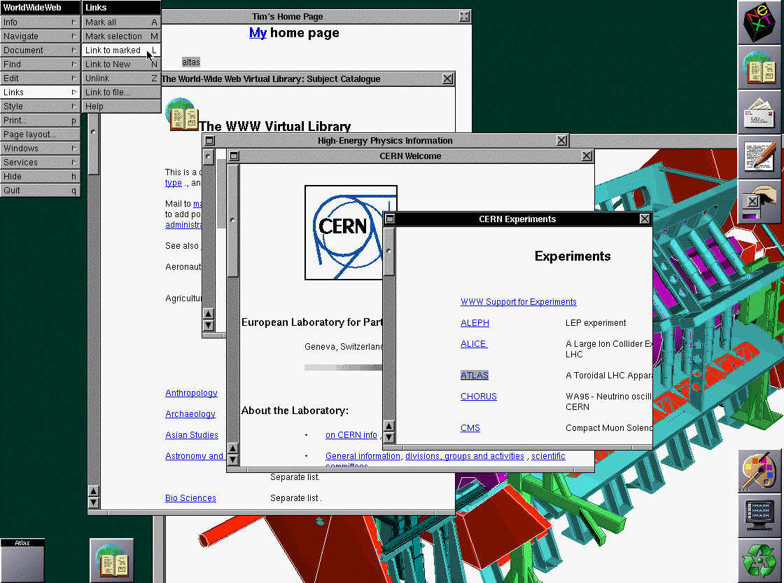
In 1990 NeXT released the NeXTstation Color. There are screenshots online of WorldWideWeb.app running on the NextStation Color, and the hyperlinks are all blue. It's true that Tim Berners-Lee wrote WorldWideWeb.app on monochrome NeXT cubes, but it seems reasonable that the default underlining he used (in the Text object) may have been blue when displayed in color.
Very strange that this article didn't bother to even consider or investigate this, simply dismissing the NeXT as monochrome.
Those screenshots are from 1993 ("This is a (242kB) screen shot of the browser, taken when things had got to the point that Communications of the ACM was interested in an article, in 1993."[1]), which matches the year the blog post settled upon for when blue links appeared, but that still doesn't answer why they are blue.
Can you find a screenshot definitively from before 1993 that shows blue hyperlinks?
Nope, can't find any color screenshots earlier than 1993. But WorldWideWeb.app would have run just fine on the NextStation Color, and NeXT machines elegantly provided a path to color from the very beginning, even when in monochrome. I don't know if pre-1993 links were gray or blue, but one would have thought the author would have bothered to investigate what color the links were. My money is on blue. I'll bet Tim could say for sure.
EDIT: as of 1991 (the earliest known code), it was still a black underline in the code. See line 640 of
Changed anchor highlighting from dark grey to underline, now underline
is available. (I may make underline &/or colour a user preference
or style later.)
So we know that in March of 1991, links were underlined with a thought toward color in the future.
well. hrm. my hunch is still that it comes from the next (default colors, high visibility colors on b/w and color, etc), but maybe not... has anyone actually considered just reaching out to tim berners-lee and just asking?
it's also pretty amazing when you think about it, what the next inspired...
carmack wrote doom on a next, berners-lee wrote the first web browser. a beautiful piece of engineering and craftsmanship inspired more beautiful pieces of engineering and craftsmanship that ultimately changed the world.
My two cents: I think, it's mostly due to grey background color, text contrast and CRT rendering.
In reverse order:
* Not all colors lent themselves equally well to a CRT, especially to the more cost effective ones. Green, esp. when in multiple shades, didn't render well (or, the other way round, issues with green are more easily detected by the human eye), so you won't see much green in early color UIs (or rather bright single-color expressions in elements like bars).
* Also, CRT specific, you want to stick with primary colors (RGB), since even a small misalignment of the cathodes will result in blurry text in more evenly distributed hues. (Same is true for the outer regions of larger color CRTs with shadow masks.)
* Monitor calibration wasn't always the best, shades of grey often exhibited a red hue, esp. on systems with a gamma of 2.0.
* Considering what we have established, we are searching for a color which consists mostly of R, G, or B and renders well on an average color CRT on top of a grey background of #C0C0C0. (Also, mind that in 1993/4, we're probably not speaking of millions of colors to choose from, but rather more of a 4-bit color palette, if we're looking for robustness.)
- Green, as already established, is somewhat complicated. Also, a mostly green color of comparable intensity is perceived somewhat brighter than, say a blue one. It will stand out against black text, probably more than you want, and it's contrast ratio to a light grey suffering from a red tint isn't great.
- Red may not be the best choice either, as its contrast to grey isn't the best (ask your printer) – and its use may be best reserved for representing an active state. (There's also the cultural issue with red usually signifying limits or even off-limit areas, which isn't especially inviting.)
- Which leaves blue for a passive state, which is actually a good choice. It's perceived slightly darker than the other primary colors, which is favorable for rendering text, it has a good contrast against light grey, and isn't affected by any missalignments or color calibration issues (as it doesn't share with red), and, while visible, isn't too distracting in what is mostly black text (you still want to provide for fluent reading of a given text, even, if it embeds a link). Moreover, it is more friendly to impaired vision than green or red (which are actually used in diagnosing defective vision). Properties, for which it had been used as a favorite color in UIs already. Moreover, on the cultural side of things, where red indicates restriction, blue indicates recommendation and instruction (compare traffic signs).
This article is so strange, even though it is hosted by Mozilla. Here is straight from the horse’s mouth, I remember Tim Berners-Lee reminiscing about green links originally
A: There is no reason why one should use color, or blue, to signify links: it is just a default. I think the first WWW client (WorldWideWeb I wrote for the NeXT) used just underline to represent link, as it was a spare emphasis form which isn't used much in real documents. Blue came in as browsers went color - I don't remember which was the first to use blue. You can change the defaults in most browsers, and certainly in HTML documents, and of course with CSS style sheets. There are many examples of style sheets which use different colors.
My guess is that blue is the darkest color and so threatens the legibility least. I used green whenever I could in the early WWW design, for nature and because it is supposed to be relaxing. Robert Cailliau made the WWW icon in many colors but chose green as he had always seen W in his head as green.
One of the nicest link renditions was Dave Raggett's "Arena" browser which had a textured parchment background and embossed out the words of the link with a square apparently raised area.
One thing that's always bugged me about the HN interface is that visited links are basically the same color as the metadata below them. Makes it hard to just glance at a screen and see the stories you've already clicked on.
No, visited links are grey. That's the default. I've seen "new" stories appear that are grey links because they were popular weeks earlier and I had already read them. Maybe reset your defaults?
There is also a level of hell where reified retired 3D company logos swoop around booming out thumping techno trade show floor music, spinning, bowing, and pirouetting around with each other. Somewhere the old SUN and SGI and DIGITAL are still dancing.
I'm a little surprised by some basic facts the article gets wrong.
- WorldWideWeb was not created in 1987. Tim Berners-Lee released it in December 1990, based on a proposal he developed in 1989 [1].
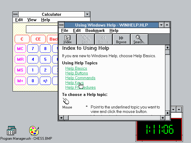
- Windows 1.0 in 1985 did not have hyperlinks. It also did not have overlapping windows. [2] That second screenshot is of Windows 2, (from December 1987) showing the "Help" system, which did use underlined hyperlinks, from 1989.
It makes me question the thoroughness of their research at all.
> What happened in 1993 to suddenly make hyperlinks blue? No one knows, but I have some theories. ... I like to imagine that Cello and Mosaic were both inspired by the same trends happening in user interface design at the time. My theory is that Windows 3.1 had just come out.
What? No! These are grad students working at the National Center for Supercomputing Applications in the 1990s on big powerful Unix workstations [3]. I highly doubt the UI choices of Window 3 were relevant or closely watched by that team.
“ Gopher Protocol was created at the University of Minnesota for searching and retrieving documents. Its original design featured green text on a black background.”
Yeah, I think the point that @setpatchaddress was trying to make was that the author is confusing the color of the monitor itself with the color prescribed by the software. Thus, take the accuracy of the entire article with a big grain of salt. That's how I understood the comment....
Monochrome monitors were often either green or amber or white. If the monitor used P1 Phosphor, then it was green, P3 Phosphor was amber, and P4 Phosphor was white. So the color of the text on the screen was a reflection of the hardware spec/design, not of the software.
There were also monochrome flat-panel displays, either LCD or plasma. My first¹ computer was a 25Mhz 386 lunchbox luggable with a plasma (amber) display. It was portable-ish and ran on AC power only.
---
1. Well really my second. The first was a Spectravideo computer I got for writing demo programs for the midwest distributor when I was in high school. It wasn't very useful though.
Something similar was the first computer I used too. My answer would.be: My dad bought it. This was a common form factor for personal computers back then, and they were sold in stores to to the general public.
At the time I periodically travelled to give LaTeX workshops. I wanted something that I could set up in my hotel room to be able to work on course prep. Laptops were much more expensive and this came out to be competitive, if not cheaper than buying a desktop plus monitor.
Green phosphor coating was cheaper and had a longer "glow" time so it worked better on lower refresh rate equipment. Why they weren't all white later, once that all mattered less, is a good question. I do know that HP charged us more for the white ones...that never changed.
I wonder..."once that all mattered less".... I wonder if, by the time that white CRTs were cheap enough, if color CRTs were also cheap enough (albeit, more expensive than white monochrome), that most consumers just said "f-it, for an extra X, I can have full color instead of _just_ white?"
Blue-green. It was used mostly only in oscilloscopes [1] because the persistence time was really long - good for instruments where the signal might be changing faster than a human can perceive not so much for low latency inputs.
My first response was ¯\_(ツ)_/¯ -- but I dug some more and found out that P2 is a Blue-Green color used in oscilloscopes, but it doesn't look like monochrome computer monitors were ever made for it though [1].
P2 was a long persistence phosphor. It was used in analog oscilloscopes because those couldn't be refreshed -- the waveform was drawn onto the display as it was received, and the phosphor was responsible for making that visible.
You wouldn't want that in a computer monitor. The computer is perfectly capable of refreshing the monitor, and the long duration of the phosphor would make anything rapidly changing (like a scrolling display) impossible to read because all of the previous contents would interfere with the current image.
I was "that guy" during those days and insisted on buying a monochrome CRT (which at that time was just a CRT, since your only choice WAS which "chrome" you chose for your monochrome) whose text was kind of pastel white. It was glorious.
Yes, now that you mention it. MS-DOS 5.0 (which predated the first Linux release a few months in 1991) had a nice grey text on blue background for EDIT.COM (or was it exe?) and QBASIC.EXE. and NC.EXE (Norton Commander). Netscape and Mosaic inverted this color scheme with a grey background and blue hyperlinked text. COINCIDENCE? PERHAPS NOT!
I grew up with MS-DOS and 4M of RAM, perhaps I should make a tiny VM with Windows 3.11 and Netscape to revisit these days and try to get my Jekyll blog running on it (served from CERN httpd or the popular webserver at the time). Not sure if VirtualBox virtual network adapter can be recognized by Windows 3.11. Perhaps someone can backport a Gemini browser to Windows 3.11.. perhaps someone can backport a modern WWW browser to Windows 3.11!
edit: someone provided VM's already! Just 33M for DOS622+WIN311 (but still a lot of floppies). I disabled the default USB support and the startup to GUI is ~5s. EDIT.COM has a "hypertext" links in it consisting of 2 little green arrows, 1 triangle rotated left on the left side and 1 right on the right side. The grey on black text is not underlined.
http://virtualdiskimages.weebly.com/virtualbox.html
Someone purportedly writing authoritatively for an audience. You don't get to just invent history out of whole cloth because you "don't have time." If you don't have time to write a factual article, you don't have time to write an article.
So now this piece of crap is out there on the internet for the rest of time, permanently memorializing completely nonfactual statements. Fake news. Literal definition of. Wonderful.
They're also pretty seriously wrong about HyperCard:
> Apple brought color to its HyperCards, but notably, the text links were still black and not blue.
HyperCard never natively supported any form of "text links". You could make a button with a text label, or a transparent button hovering over text, but there was no way to attach a behavior to a span of styled text without a lot of custom scripting.
(And, for what it's worth, the color XCMD for HyperCard never really caught on. It was a late addition, and never felt entirely like a native part of the application. Even when it was available, most users kept on authoring stacks in black and white.)
> However, some UI elements did have blue accents when interacted upon
I have no idea what the author is referring to here. Possibly the blue tint in the system UI (like window titlebars), which has nothing to do with HyperCard and didn't apply to its in-app UI?
> I have no idea what the author is referring to here. Possibly the blue tint in the system UI (like window titlebars)
I get the impression that the author was trying to answer two questions, the second being: where did the color blue come from?
I was also under the impression that the color XCMD was not a part of HyperCard and was created by a third party, but I could be wrong there since it has been over 20 years since I've used HyperCard.
There were a couple of different color solutions for HyperCard, but the official one (Color Tools) was released with HyperCard 2.3.
The window tint in System 7 was a user preference. The purplish blue seen in the screenshot was the default color, but there were about a dozen other options. In any event, it seems a stretch to assume that Apple's choice of this color influenced Mosaic in choosing a different blue color for a different purpose.
This article is poorly written, I was expecting an interesting investigation but stopped reading halfway through. Here's a bunch of underdescribed things with non-blue hyperlinks, and some completely unrelated ones that didn't even have hyperlinks. The answer to the headline could have been made in one sentence and there would have been no loss of value.
> The answer to the headline could have been made in one sentence and there would have been no loss of value.
That sentence would be "I have literally no idea, it seems completely arbitrary." There really isn't any value worth preserving, it's just misinformed commentary on a bunch of screenshots taken while the author was probably in diapers.
I guffawed at "I do not believe that this is the first instance of the blue hyperlink since this color is cyan, and not dark blue."
No Blue Scotsman!
Tim Berners-Lee told Ben Shneiderman at the time that he was influenced by the design of the HyperTIES-based "Hypertext on Hypertext" project from the 1987 HyperText conference that the ACM published, which had light blue links.
>My students conducted more than a dozen experiments (unpublished) on different ways of highlighting and selection using current screens, e.g. green screens only permitted, bold, underscore, blinking, and I think italic(???). When we had a color screen we tried different color highlighted links. While red made the links easier to spot, user comprehension and recollection of the content declined. We chose the light blue, which Tim adopted.
>His systems with embedded menus (or hot spots), where a significant user interface improvement over early systems such as Gopher. But Tim told me at the time that he was influenced by our design as he saw it in the Hypertext on Hypertext project that we used Hyperties to build for the July 1988 CACM that held the articles from the July 1987 Hypertext conference at the University of North Carolina. The ACM sold 4000 copies of our Hypertext on Hypertext disks.
Windows help functionality has been declining ever since. Those old help files were so clean and snappy, well-organized and searchable. Now, I dread accidently pressing F1 in any major windows app.
I'm quite sure that students, even grad students, at UIUC, had lots of access to windows based computers in 1993. Just because they weren't doing their work on them didn't mean they didn't have PCs running DOS or Windows (and maybe dual booting Linux).
I don't know about UIUC, but I was at university in the UK in 1993.
We had "labs" with about 30 Windows/DOS PCs in them that were for general use (meaning word-processing). Probably 1 in 100 students had their own computer (and if so it was more likely to be an Amiga or Atari ST).
My course wasn't computer-related, but I took a few computer-based modules (graphics, vision, AI, intro to programming). All of these apart from intro to programming where done on university SunOS/Solaris or Irix machines (and Intro to Programming was in Turbo Pascal for DOS on those Windows machines).
The SGI Irix machines (made famous in the original Jurassic Park) were really nice.
Not in my university, i had a used toshiba 386sx25Mhz as a laptop with Windows 3.11. The fastest public desktop computer was a 486DX2 running at 66Mhz, around 6 of them on the 4th floor from the physics faculty, that was early 1994. It was running Mosaic and Netscape 0.9 or so with Win 3.11, no dual boot. When I got my own room and built myself a 486DX5@133 Mhz I got RedHat linux on it, dual booting, I think it was '95. My roommate had a pentium with Windows98SE running Moria, he was quite addicted to it.
Perhaps some very adventurous types were trying out Linux on their own machines in 1993 but distributions were all pretty new, I am not sure it was written about in Byte or C'T magazine in 1993. Perhaps it was discussed on mailinglists or usenet groups, but it was not really findable on the www I think. I frequented a site called 'on the bleeding edge' featuring a picture of a knife (or so I remember) and a list of kernel version numbers and patches. Not sure what date, but might have been '95.
I remember downloading and compiling kernel 1.1 or 1.2 - which were released in 1994. In 1995 I bought the offical RedHat CD's, I might have tried Slackware or Debian floppy disks earlier. A friend was running Linux with X-Windows, Emacs and Mosaic on his Pentium with WindowMaker or AfterStep. No dual-boot. He was on usenet (with the built-in netscape usenet reader) and played with Lisp, he had studied physics (or was it philosophy) at the Utrecht University. Heaps of Byte and Astronomy magazines and SF books littered in his room where he enjoyed a glass of wine and a cigar. I occasionally dropped by for a chat about linux, SF, astronomy and the meaning of life and my own troubles. I think he had dropped out of college for some reason years ago but I never dared asking why. He was brilliant and stayed in the student dorm as a senior. Unfortunately at 45 or so he died in his sleep I heard later when I wasn't living there anymore. He had a good job at the municipality and was well respected for his knowledge, seriousness, dry and dark humor and wit and was still living in the student dorm.
At 64 MB, you wouldn't have a whole lot of space for data and applications / utilities, but you could certainly cram a couple of OSes on it.
The first "user-installable" linux was arguably SLS, which came on 24 1.5 MB floppies. I'm unsure what the installed size was, but likely in the 24 -- 48 MB range.
250MB was common by then and Linux distros only took up a dozenish MB. Lilo existed by then and everyone dual booted to DOS/Win3. If you didn't want to modify the MBR you could boot Linux from DOS with loadlin.exe.
1993 is roughly when I bought my first computer and it came with 120 MB HD. I dual booted Linux (Slackware) on it in 1995. Still on Win 3.11 though, I believe I bought a bigger hard drive before upgrading to Windows 95, but still dual booting with Linux on another partition.
You could fit a lot more OS on an HD in 1993 than you can now!
> Windows 1.0 in 1985 did not have...overlapping windows.
Actually Windows 1.0 did have overlapping windows.
They just weren't the default style for application windows.
But there were popup windows that overlapped other windows on the screen. These were typically used for dialog and message boxes, for example the End Session message box midway through that filfre.net article.
There was nothing stopping anyone from using a popup-style window for their application, and adding a titlebar so you could move it around on the screen. It just wasn't the custom, and people would think your app was weird if it did that. And on a typical system of the day (no GPU!), dragging your window around on the screen would perform rather poorly.
I had read that Digital Antiquarian piece a few months back and had remembered about the "sub windows" that an app could have. But I had thought they were scoped to just be on top of the window for the app that spawned it, and couldn't leave that "tile."
However, you are totally right. This image right here clearly shows it overlapping another application's tiled window.
The part about project xanadu is also shady. They list it as 1964, but first paper was published 1965, while their idea of hypertext was born 1960, with the word choosen 1963. Not sure where the 1964 comes from. Not to mention that this wasn't even an actual implementation. It's disputable whether xanadu really should be the first one to mention here. The ideas of referencing documents is older and has previous implementations in analog world. It they wanna go just about hypertext, they should at least started with memex.
WorldWideWeb was created by (mostly Republican) computer engineers who broke from IBM in Silicon Valley in the 1980s, forming little democratic circles of twenty to forty people with their laptops in each other's garages.
This is a reference to a bizarre anachronism in David Graeber's writing. The conflict over this passage once carried over to the comments here on HN while Graeber was still alive, and he and a longtime foe quarreled about it to a fairly unsatisfactory conclusion.
> Here Microsoft uses the “hyperlink blue” for active states when a user clicks on different drives, folders and icons.
Hyperlink blue was a much brighter blue (pure blue, on the interfaces I used, but I was a litter later in the timeline) than Window's blue, which was a (noticeably) darker blue.
Yeah, if I were to 'pick' a reason it would be that it worked in the EGA colorspace. You did not exactly get a huge range of colors there. While in 1993 256 (small screen res) or 'truecolor' (very expensive vid card) was not unheard of but it was decently uncommon on low end hardware.
So, is there somebody there who knows Marc Andreessen or Eric Bina and could aks one of them to confirm they choose blue because it looked good on white while red or green were obviously too much loaded ?
This looks simpler than listing a bunch of other UI, many non influential and none of them giving the answer.
My boss did UI/UX on Mosaic (we are both at NCSA today). I will ask her on Tuesday when I see her. She has lots of wild stories about why things are the way they are.
> they choose blue because it looked good on white
Websites back then did not have white backgrounds, they were all gray. In fact I’ve always wondered why the default background was gray more than why the links were blue.
Because window backgrounds were gray in NeXT, because buttons used both white and black to create beveled "3d" borders, because beveled buttons were a fancy upgrade compared to simple borders in 1-bit graphics. Screen resolutions and drawing speed weren't good enough to waste on thicker borders, so 1px lines had to stand out on their own.
Back then, most people used CRT displays, and just like today, tended to have the brightness turned up too high. And it was fairly common to have a 30 Hz refresh rate. The refresh might even be interlaced!
A white background in this situation could lead to noticeable flicker, especially as you moved your eyes, e.g. look away from the monitor and look back at it.
The gray background made this flicker less noticeable.
this is the perfect example of how to write something wrong on internet, so you can get all the correct facts for free from strangers and you can write a correct article
Man what a weirdly speculative article. Is this what Mozilla employees are being paid to do these days?
It's basically a tour of old hyperlink and windowing systems... with lots of guessing and maybes. I'm not sure why it's relevant that Win 3.1 had blue titlebars, for instance. The author never actually answers her question but I imagine the obvious guess is the correct one:
Black text on a white background was the predominant GUI style at the time (probably due to Mac OS and Windows) and the software designers needed a visual cue that the hyperlink was clickable. Just underlined wouldn't have worked because underline was already a popular style in text processing. So they decided to give it a different color too. Blue is the most logical choice as it has good contrast against a white background, and has a neutral meaning (compared to say, red). There weren't really a lot of color choices back then, the largest palette you could count on at the time was 16 colors.
This was what Mosaic did and most browsers that came after it (including the most influential: Netscape) did what Mosaic did.
And there certainly were browsers of the era that didn't use blue underline for links, the next most common paradigm was some kind of bordered box around the text (usually the same color as the text).
> Is this what Mozilla employees are being paid to do these days?
Mozilla amazes me with their org-bloat-to-products-they-sell-for-money ratio. They have programming language teams, research bloggers, occasional splashy products, an in-house bug tracker, and oh yeah, they make a web browser.
I don't know how they do it, but it seems to be working out for them. If I was the CEO of a company that only had one customer, I would probably not be hiring software engineers to write a programming language that's not even used for the core product. But, I guess that's why nobody ever asks me to be the CEO of a company!
I'm really glad that Mozilla is developing Rust. Even though I'm not using it (and haven't even learned it), it looks like a net positive for the world of software development. This is exactly the kind of thing that a nonprofit should do.
I agree, I don't think there's enough research here. If it were just one browser, perhaps designer choice.
But it is two browsers that chose blue, so perhaps there is some underlying Unix-y reason. Maybe early ncurses had chosen that blue for something unrelated to the web, and the decision goes back further.
Or maybe it was just lack of choices. For example, of the 16 original hex colors, blue & purple IMHO look the least like crap when mixed in with black text. Maybe its just that simple? red is too alarming, green is too bright, yellow/magenta/cyan/grey are too hard to read... now I'm speculating, but I think the answer might be an unrelated pattern in some other color-related origin.
“Black text on a white background was the predominant GUI style at the time (probably due to Mac OS and Windows) and the software designers needed a visual cue that the hyperlink was clickable.”
For a comment complaining about unsubstantiated speculation this struck me as exactly that…
The default background was gray for Netscape, even on Windows, presumably because that was the default background for common Unix toolkits like Motif/X. Even Internet Explorer defaulted to gray. See these Wikipedia articles containing screenshots:
In particular, notice the IE2 screenshot, which shows it displaying the more modern Wikipedia website using a gray background. IE2 doesn't understand CSS, so just displays the source. The CSS declares a white background, so we can infer that the HTML probably does not declare a gray background using the long forgotten BODY tag BGCOLOR attribute. (Rather, almost certainly the HTML doesn't use the BGCOLOR attribute at all.)
It's possible that Mosaic defaulted to white on Mac OS, but I doubt it. Netscape didn't back then, IIRC.
For a long time gray and gray-toned backgrounds were ubiquitous on the web. It was nice because white backgrounds are difficult on the eyes, especially for prolonged periods. Unfortunately, white eventually began to dominate, as it already did for most Windows and Mac applications. Now we're coming full circle with dark theming, though dark theming is typically much darker than the old web and old X applications.
Reads like a really young person who is overconfident in their abilities and lacks any actual experience with any of the things they mention. Every geezer on here knows Mosaic had blue links because they used it.
Blue has an established connotation for marking up text. E.g once upon a time a newspaper editor would scribble notes in original copy before sending to the printers. It stands out against black text but is unobtrusive.
That was a particular hue called “non-photo blue”. It photographed as white when using the common photo-offset printing process. So you could make comments, on the camera-ready copy, that people could read, but that wouldn’t reproduce. I’m old and had proofreading jobs in high school.
It’s camera-ready but might get some comments from a last-chance lookover: “Should this be capitalized?” written in the margin, for example. If the answer is no, it’s OK as is, then the copy can go to the camera without having to be set again. This is more a proofreading stage than an editing stage; that part is long over.
EDIT: Also used for printing instructions, to make sure that things come out in the right order, for instance.
My understanding was in those days copy and paste was a literal thing, so I guess what eventually went to the printer might end up being a frankendoc of sorts …
There is a neat technique called ”stripping in” that lets you cut a word out of the page and replace it with the corrected word from another page. You can use it to correct a misspelling if the length of the corrected word is the same as the wrong one; it avoids having to reset the whole page.
You put the page with the correct word underneath the copy, on a light table (a real one). With an exacto knife, carefully cut out the word, cutting through both sheets. Now the correct word fits exactly in the hole. Hold it together with a piece of white tape (standard supply in all these shops) on the back. The mend is invisible.
It was also the color in which TSR would print maps for old Dungeons and Dragons modules, so that players couldn't photocopy them and pass them around. Functioned as copy-protection.
That's really speculation but there are certainly reasons against it. Mostly that red-green blindness is the most common color blindness and that blue is considered a more serious color. For instance banks often choose blue as predominant color. Maybe that's also something worth considering for an experimental technology.
For the same reason they didn't use red. Red and green have meaning in many cultures, especially the one that invented the web. As stated by the parent commenter, blue is more neutral.
Maybe people back then want something different because the most common monitor back in the day was a green on black monitor. Having blue is refreshing looks new.
Apparently the author has never used a monochrome interface if they think gopher is “green” and Linux (which has nothing to do with hyperlinks either) is “white”
The simplest explanation is that blue is the darkest of the primary colors (at full intensity, think 8/16-color palette) and hence has the best contrast on white or gray background (after black). It also helps that it isn’t a signalling color like red (important/error) and green (good/go).
Another curiosity related to this one is why <h5> and <h6> have smaller default font sizes than <p>, given that they are headers and should therefore "head" a section of text [1].
Interesting topic, for sure, but the info on what colors were used by "Gopher Protocol" and "Linux Kernel" are pretty silly. Those colors would vary by what real or emulated terminal somebody was using.
I would love if links to the same domain would have another color, so that you know if e.g. a news site just links to own content or the source, without clicking all the links in the articel.
I miss blue for links and purple for visited links. I think Google still does it (which is great for the nostalgic of the webs), but today links are mostly buttons/images and not text anymore.
I remember also, in the 90s, was quite popular yellow text against a black/dark blue background. The old days!
The fact that the :visited state of links was gimped due to privacy issues doesn't help much either.
It used to be any visited link would look visited, regardless of the website. This made it possible to see where a user had visited across the web, and so visited links only apply to the current origin now.
At some point it also became hip to remove the underline from links, and links rarely have underlines anymore.
anchorColor: color
Color to shade anchors whose corresponding documents haven't been previously visited. Default is blue3.
visitedAnchorColor: color
Color to shade anchors whose corresponding documents have been previously visited. Default is violetred4.
activeAnchorFG: color
Color to shade anchors that are in the process of being activated. Default is red.
activeAnchorBG: color
Color to shade the background of anchors that are in the process of being activated. Default is grey80 (the same color as the application's background).
> Another interesting thing about Windows 1.0 that still appears in modern websites is the underlined hyperlink. This is the first example of an underline being used to indicate a hyperlink that I have been able to find.
I'm confused, what in Windows 1.0 is, or is being called, a "hyperlink" that's underlined? Is it shown in the screenshots? I wouldn't have expected there would be such thing as a "hyperlink" in Windows 1.0, and am not sure what the author is referring to.
It's the window with the caption "Microsoft Help". (And it's actually Windows 2, not 1 as the article claims.) A help file was a bunch of hyperlinked rich-text documents in a single file. The hyperlinks could even span help files, though I don't know which Windows version introduced that.
Interesting article, but written by Americans it necessarily missed another ancestor of the blue hyperlink, Teletext. Given that Tim Berners-Lee is English, it's relevant.
Given that numerous early Web clients were text-based (especially www and lynx), there's the question of what colours were available on a (possibly) colour-capable display, or a colour-aware terminal emulator.
These would have been provided through ANSI escape sequences, which allowed for white, black, red, green, blue, yellow, magenta, and cyan.
With a bright background (white), blue is the most clearly-visible non-black colour, and avoids R-G colourblindness issues. On a dark background (black), cyan is light enough to be readable, but not as glaringly distracting as either red or yellow.
Given the prevalence of green and amber phosphor displays, and some adoption of that colour scheme for terminal colours, yellow and green might have been avoided due to conflicts with standard text.
The next question is when colour support was added to terminals. I'm confident that xterm could have foreground/background colours specified by 1997. Support for 16 colours didn't hit xterm until 1996:
Ben Shneiderman developed "TIES" aka "HyperTIES" at the University of Maryland Human Computer Interaction Lab, and here's what he recently wrote in response to a question about hyperlinks, in which he mentioned the origin of blue as a highlighting color.
Also here's a link to an article about the NeWS version of HyperTIES that we developed at HCIL, and some demos of HyperTIES and its Emacs based authoring tool, which had pie menus and embedded interactive PostScript "applets" in 1988.
John Gilmore via Internet-history <internet-history@elists.isoc.org>
Date: Mon, Apr 13, 2020, 11:56 PM
To: Brian, internet-history, Jeff
I forwarded this question to my friend Don Hopkins, who was a student of
Ben Shneiderman back in the day. Ben ultimately responded:
From: Ben Shneiderman <ben@cs.umd.edu>
To: Don Hopkins <don@donhopkins.com>
CC: John Gilmore <gnu@toad.com>, Ben Shneiderman <ben@cs.umd.edu>
Subject: RE: [ih] origins of the term "hyperlink"
Date: Mon, 13 Apr 2020 15:15:52 +0000
HI Don (and Jack Gilmore),
Thanks for including me in this conversation.
I do not have a claim for the term “hyperlinks” and don’t know when it
came into use. My claim is for the visual interface for showing
highlighted selectable links embedded in paragraphs. This is what we
called embedded menu items in that I think is an influential paper on
the topic, which was peer-reviewed and published in the CACM in April
1986.
While Engelbart had shown a list that could be selected by pointing
and clicking in 1968, I claim the idea of embedded highlighted
selectable text in paragraphs. This was implemented by grad student
Daniel Ostroff and described in:
Ewing J, Mehrabanzad S, Sheck S, Ostroff D and Shneiderman B (1986),
"An experimental comparison of a mouse and arrow-jump keys for an
interactive encyclopedia", International Journal of Man-Machine
Studies, Jan., 1986, Vol 24, pp. 29-45.
[Abstract] [BibTeX] [DOI]
Ostroff D and Shneiderman B (1988), "Selection devices for users of
an electronic encyclopedia: an empirical comparison of four
possibilities", Information Processing and Management, Nov., 1988,
Vol 24(6), pp. 665-680.
[Abstract] [BibTeX] [DOI]
I think the 1988 paper was the earlier study, but the publication took
a while.
My students conducted more than a dozen experiments (unpublished) on
different ways of highlighting and selection using current screens,
e.g. green screens only permitted, bold, underscore, blinking, and I
think italic(???). When we had a color screen we tried different color
highlighted links. While red made the links easier to spot, user
comprehension and recollection of the content declined. We chose the
light blue, which Tim adopted.
His systems with embedded menus (or hot spots), where a significant
user interface improvement over early systems such as Gopher. But Tim
told me at the time that he was influenced by our design as he saw it
in the Hypertext on Hypertext project that we used Hyperties to build
for the July 1988 CACM that held the articles from the July 1987
Hypertext conference at the University of North Carolina. The ACM sold
4000 copies of our Hypertext on Hypertext disks.
So in summary, I don’t know who coined hypertext, but I do think our
work visual and interaction design was influential.
Our Hyperties system was picked up by Cognetics Corporation (around
1987) who made a modestly successful commercial run with it, doing
dozens of corporate projects, most notably the Hewlett-Packard user
manual for their Laserjet 4 was distributed as a Hyperties disk.
Hyperties was the name we shifted to after we got a stop and desist
order from a lawyer because our TIES (The Interactive Encyclopedia
System) conflicted with an existing product. By then “hyper” was a
growing term.
Let me know if this helps, and what other questions you have…. Ben
Hmm. I don't see any discussion here, but weren't BBS links typically blue? I think I remember that being a thing, and that was well before 1993...
Also, cyan is a much better color for text on a black background. Dark blue is almost invisible. This makes some of the early examples a little complicated since we moved to white backgrounds around the same time as the web came to fruition.
> we moved to white backgrounds around the same time as the web came to fruition
‘We’? Document-oriented workstations, including the one WWW was developed on, routinely used black-on-white back to the Alto, or NLS. (CAD stayed white-on-black due to the history of vector displays.)
It was working as designed. If you already visited that page, you don't need to go there again. Time was precious on dial-uo connections, better go visit some new page instead!
I was kind of surprised the article didn't discuss the BBS culture that existed before the internet. The blue link may have started after this but maybe it borrowed a bit from the colored keyboard characters used in text-based menu systems.
I also used the something-folio hypertext system before I used hypertext on the web. Did it have blue links? I can't remember.
I was looking for information on BBS culture also, but in my fuzzy memory of those times, the vast majority were very much a dark color scheme, black/dark background with light text. And there was a lot of customization going on as well, but I don't know if I can see BBSes as a place the link color came from. It's also probably one of the most obscured and overlooked part leading to the rise of the internet, I rarely see it mentioned in "history of" articles.
Semi-related: I recently learned [1] that there is a third color associated with links: blue for standard, purple for visited, and red WHILE actively clicking the link (I don't think I noticed this before).
Seems pretty obvious to me that blue is the color that gives best contrast to a white background, while not being black or being so dark a color that the hue doesn't stand out. This is why blue pens are considered the only acceptable pen for writing (such as filling in a form, or a school paper) other than black.
Similar to the reason to use yellow for highlighter and otherwise for changing the background color, you want a light color whose hue is detectable, but it similar enough to the white background that text is still easy to read.
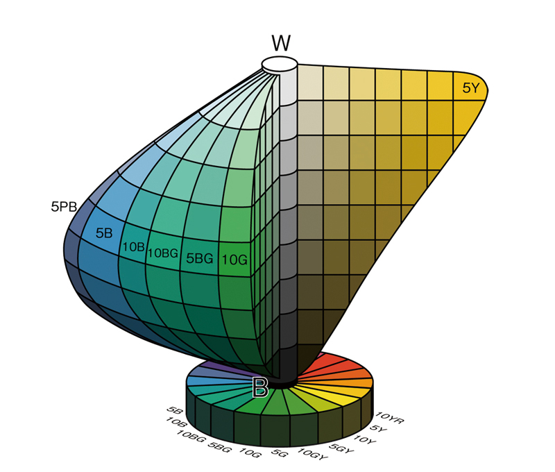
The Munsell color solid is distorted to show that pure yellow is light, pure blue is dark.
Yes. If you were handed a printout or photo copy in 1980s with some terms or phrases manually marked to stand out, it was probably with blue underlines. Black didn’t stand out, red was for corrections.
Only ~33% of my 27", 1440p display is used for this article, which makes the images very unclear unless I zoom in, since they don't get their own paragraph and the text wraps around them. Not sure if this qualifies as irony for a blog article on UX.
Some websites have been playing with this in recent years. Fast Company uses an orange color (with no underlining) [1] and Wired experimented with thick underlining, which I always thought looked terrible. [2]
Even though some facts might be wrong as others have pointed out, I just love reading about the history of the internet on a higher level and how it came about. I wish I could have been involved in that in its early stages. Truly transformative.
> What happened in 1993 to suddenly make hyperlinks blue? No one knows, but I have some theories.
I doubt that no one knows. They found the smoking gun in the Mosaic release notes - the people who worked there are probably still alive and might remember why!
It is similar to why we chose gold to use as “gold” as humanity. Not all elements are suitable to be used as a store of value and physical currency.
Let’s look at the primary and secondary colours.
Yellow: Bad contrast.
Red or Green: Action colours, would be bad to see them everywhere. Plus there might be accessibility concerns.
Orange: Mostly used as “Not as urgent as red”.
Purple: Not as neutral as blue, yet it is the second best option, that’s why visited hyperlinks are purple I assume. It is the logical choice.
We are left with the colour blue. Also, a plus that it is a primary colour; I would assume it is easier to display primary colours in earlier tech.
The answer is "Mosaic", even if someone can find some other earlier use of blue. They chose it, and Netscape kept it, which meant that everyone was trained to expect it.
Surprised this doesn’t mention visited links turning purple to mark that you had been there. I remember coding link, alink (active link during click), and vlink attributes.
I first used the WWW in 1995 (after seeing a fellow student in a computer lab looking at sports scores in a browser and asking him what he was looking at) and, of course, it used blue for links at that time. That fact that it took this article, 26 years after I first saw the WWW and 25 years after I built my first web page, to question why hyperlinks are blue makes me laugh. What else have I never questioned because it was always that way?
I remember when a friend of mine in middle school fired up the first version of Mosaic on his mac. I could hardly even tell what the point of the application (as they used to be called) was. He was also really into hypercard. We actually did a school project together in hypercard. I had really no idea at the time that such technologies would become so widespread and important. They initially seemed really arbitrary.
I find myself touching any piece of text that is blue, for example an AD in my local newspaper that has some text in blue. This is due to an ingrained pattern of behavior and the result of being decades on the web.
In the future when augmented reality becomes the norm, it could be possible that clicking this blue link actually brings up a webpage, either on my phone, or broadcasted into my retina.
this is a really long clickbait-y/listicle type article that I wouldn't have expected to be on mozilla. Despite it's "deep dive" it barely answers it's own question and just beats around random browser/computing history like we can't see that anywhere else? Weak.
IIRC, Dan Connolly, when he was at Convex, wrote an SGML viewer that used blue hyperlinks. He did this work in 1990-92. At the same time, he was collaborating with Tim Berners-Lee in his spare time.
I knew this was introduced by NCSA Mosaic. I remember it well.
It was actually a very good browser. Not as many features as Netscape but it was very fast. Netscape added too many fluff features like backgrounds and moving GIFs which were abused way too much (see any "1990s retro web site" for what I mean), so I often opted to using Mosaic even after Netscape became mainstream.
It makes sense too, black doesn't stand out enough from unlinked text. And can be confused with regular non-link underlining. It could have been any colour but it's a good convention. After all we could also have used green for stop and red for go (like in the first episode of "Sliders" :) ), but at least everyone around the world uses the same.
> Interactive states should always be styled in your stylesheets. Examples include: touch, visited, hover, active and focus.
Agree in general, but I wonder if a separate style for visited hyperlinks is still useful these days? Does anyone benefit by visited links being differentiated (by colour or another means) from unvisited ones?
When I'm at a site with many different topics in a list, it's nice to see which ones I've already visited. Links that don't show this or (even worse) don't differentiate as a link until they are moused over are one of my pet peeves.
dunno, but I wish we'd started out with all browser default CSS looking like twitter bootstrap 2.3.2 rather than the bevelled tables and clunky buttons there were, and which took ages to shake.
I'm rather fond of buttons that look like buttons, rather than colored rectangles or buttons that look like links, because they have affordances to what they can do.
Bootstrap is a good tool for CSS, but I think it also over-legitimzed restyling and reinventing native HTML interactive elements.
TL;DR: Mosaic 0.13 introduced the blue links because it had to distinguish visited and unvisited links. Just paraphrasing article here, not sure about it's accuracy since many have pointed out its inaccuracies.
Mozilla didn't fire Brendan Eich. He resigned of his own free will, against the Mozilla board's request that he stay. His own words and the Mozilla FAQ quoted below, I'm not just making this up.
Down the following thread, Brendan suggested googling "constructive separation" -- but I'm not sure if he meant for that euphemism to apply to how he left his job at Mozilla, or to how he wanted to cancel and destroy existing happy same sex marriages in California against their consent. All of the google results have to do with marriage, not employment. Brendan, care to clarify?
DonHopkins 3 months ago | on: Mozilla lays off 250 employees while it refocuses ...
Eich was not forced out or fired. In fact, just the opposite: the board actually tried to get Eich to stay, but he decided to leave all on his own. Don't try to rewrite history to make an ideological point. It's all very well and unambiguously documented what really happened, and there's no excuse for you spreading that misinformation.
A: No, Brendan Eich resigned. Brendan himself said:
“I have decided to resign as CEO effective April 3rd, and leave Mozilla. Our mission is bigger than any one of us, and under the present circumstances, I cannot be an effective leader. I will be taking time before I decide what to do next.”
Brendan Eich also blogged on this topic.
Q: Was Brendan Eich asked to resign by the Board?
A: No. It was Brendan’s idea to resign, and in fact, once he submitted his resignation, Board members tried to get Brendan to stay at Mozilla in another C-level role.
It's a common misconception which is a key part of the narrative that Brendan's Alt-Right Incel GamerGate supporters were doing their best to spread at the time (GamerGate was in full swing when he resigned, and the Alt-Right jumped on the issue at the expense of Mozilla), in order to help Brendan play the victim (instead of respecting Brendan's own victims and co-workers whose marriages he wanted to terminate) and make him a martyr. (Not that I think you're one of them, but they unfortunately succeeded at spreading the misconception that Brendan was fired far and wide, in the service of their cultural war.)
Edit: And do you acknowledge that Brendan wanted to cancel many same sex marriages in California? And do you agree or disagree with him that those marriages should have been canceled? Because he got what he paid for, Proposition 8 passed, and those marriages WERE canceled. Which is worse: canceling one job, or thousands of marriages?
Edit 2: It's pretty rich that Brendan would claim to be the one suffering from a hostile work environment, when he was the one who wanted to destroy the marriages of his co-workers and users. Was it too much for him to bear facing the dirty looks of his co-workers who he didn't believe deserved the same rights as he enjoyed? Bullies are always playing the victim.
Breaking apart other people's marriages sounds more like "destructive separation" to me.
This is a wonderful example of how much more effort is required to counter a false claim than to make said false claim. Thank you for putting in the effort.
That is not quite true, DonHopkins only quote about the technical details of the separation, which does not relate to the real reason of the separation. But it is telling what lead to it.
I quoted and linked to Brendan's and the Mozilla board's own words and blog postings. What better proof do you require, Brendan's long form birth certificate?
Are you saying that Brendan and the Mozilla board are liars?
What is the evidence of your conspiracy theory that Brendan and the board lied, or are you just making it up without any evidence because the facts contradict what you want to believe, and why do you support someone you claim is a liar?
You're just proving my point that Brendan's Alt-Right Incel GamerGate supporters still regularly lie to spread the baseless conspiracy theory that Brendan is the victim and a martyr, but not the people whose marriages he successfully and willfully canceled and destroyed.
So thank you for being such a wonderful example and so aptly personifying and illustrating exactly what I mean, by moving the goalposts when the facts prove you wrong, by posting yet another baseless conspiracy theory that your wanna-be martyr is actually a liar.
If you were actually against "cancel culture", then you would be much angrier at Brendan for involuntarily canceling thousands of other people's marriages against their will, than at Brendan for voluntarily canceling his own job of his own free will, yet here you are defending him by spreading lies and baseless conspiracy theories, and defending him even though you believe he's a liar.
Not sure why you are so aggressive.
If you have worked for any reasonably big company you know that the official language does not necessarily matches the truth (and sometimes has 0 relation). I did not say any conspiracy, but even on the link you have attached Brendan says that you should look up the meaning of 'constructive dismissal' if I recall, that means the view you want to force on others is half truth at best.
Edit of the previous comment:
"which does not *necesarily* relate to the real reason of the separation"
.. ok this word was left out
Don't even bother responding. Consider my questions rhetorical. You've already more than proven my point and illustrated precisely what I mean. We all know where you're coming from, and it's crystal clear what kind of person you are and what your bigoted outdated attitudes towards LGBTQ+ people and same sex marriage are, and that you're just here to spread baseless misinformation, conspiracy theories, lies, and have a flame war. The vast majority of people here strongly and rightly disagree with you: my post was meant to counter blatant misinformation that you're just parroting and amplifying without any evidence, and it received 24 upvotes and several positive replies. Your bigoted opinions and baseless conspiracy theories simply aren't welcome here, and violate the rules of conduct. So go back to your Alt-Right Incel GamerGate web sites like Parler and Gettr and 8chan where you got your vile opinions and conspiracy theories and found other similarly small minded bigoted Neanderthals like yourself, and don't try pedaling that shit here any more. End of discussion.
I'm orders of magnitude less aggressive than Brendan Eich was in his successful attempt to destroy thousands of other people's marriages. I haven't destroyed anyone's family, but Brendan has destroyed many, on purpose.
Do you agree with Brendan that gay and lesbian people don't deserve the same rights as straight people do, and that their marriages should be canceled and prohibited, and do you believe that was not at all "aggressive" of him to have done that, so you give him a pass on his hostile behavior?
Of course you're pushing a baseless conspiracy theory that Brendan Eich conspired with the board of Mozilla to lie about the reason that he left. He says he was not fired. They say he was not fired. Apparently you believe and want other people to believe they are all liars, and you are claiming they conspired to publicly agree to official language that was not true. Yet you have absolutely no proof of that. And why are you supporting someone you believe is a liar? Pretty inconsistent of you.
You ARE a conspiracy theorist, no matter how much (and because) you believe those baseless lies for which you have zero evidence, yet you try to spread. The view that you want to force on others is nowhere near half true, it's completely false and unsupported by the facts, and internally inconsistent, and aggressively homophobic.
The best rationalization you can come up with is your wild guess that Brendan was not able to tolerate the hostile work environment at Mozilla, which is unmitigated bullshit, and you know it. But as I already pointed out: it was BRENDAN who was deeply hostile towards his co-workers and users, not just by his words, but by his ACTIONS. That's a well documented undisputed fact.
Do you have any shred of evidence that any of his co-workers tried (or even succeeded) to destroy Brendan's marriage, the way that Brendan successfully tried to destroy their marriages, and the marriages of thousands of other same sex married Californian families?
Do you have any proof that Brendan was not able to do his work because of hostility in the work environment that was in any way comparable to his own aggressively homophobic anti-gay hostility, and his intentional actions (not just his words) of canceling many gay marriages?
Why are you trying to cast him as a martyr, by parroting tired old Alt-Right Incel GamerGate lies? Is that the kind of person you are? Do you disagree with the Supreme Court but agree with Brendan Eich that gay and lesbian people deserve fewer human rights than straight people because they are wrong to be who they are and love who they love, and do you also believe that his hostility towards gays and lesbians was completely and morally justified and excusable, and should be applauded and defended, as you're trying to do?
Why are you so aggressively against cancel culture, unless it is directed at gay families? And why are you so tolerant of hostility towards gays and lesbians, while so intolerant of anger towards homophobes who actually cancel marriages, that you spread baseless conspiracy theories to justify Brendan's hostility and aggressive acts of cancelation?
Cancelation is something that happens to checks, waves, or events, but not people or groups of people. You probably mean "ostracize", "shun", "repudiate", "boycott", etc.
Excellent comment. For "constructive separation", if giving him benefit of the doubt, the relevant employment term seems to be Constructive Dismissal (or discharge or termination).
https://en.wikipedia.org/wiki/Constructive_dismissal
"when an employee resigns as a result of the employer creating a hostile work environment. Since the resignation was not truly voluntary, it is, in effect, a termination. For example, when an employer places extraordinary and unreasonable work demands on an employee to obtain their resignation, this can constitute a constructive dismissal."
Presumably he is desperately trying to keep his own fragile and inextricably existentially doomed straight marriage together, now that he lost his holy war and all those pesky homosexuals are busy undermining it by sinfully getting gay married legally now.
Q: I'm a student of visual communications and asked myself why links are blue. I found some answers that might be, for example blue is a color of learning, but I'm not sure what is right. Is there any reason, why links are colored blue ?
A: There is no reason why one should use color, or blue, to signify links: it is just a default. I think the first WWW client (WorldWideWeb I wrote for the NeXT) used just underline to represent link, as it was a spare emphasis form which isn't used much in real documents. Blue came in as browsers went color - I don't remember which was the first to use blue. You can change the defaults in most browsers, and certainly in HTML documents, and of course with CSS style sheets. There are many examples of style sheets which use different colors.
My guess is that blue is the darkest color and so threatens the legibility least. I used green whenever I could in the early WWW design, for nature and because it is supposed to be relaxing. Robert Cailliau made the WWW icon in many colors but chose green as he had always seen W in his head as green.
One of the nicest link renditions was Dave Raggett's "Arena" browser which had a textured parchment background and embossed out the words of the link with a square apparently raised area.
[See also https://www.crazyegg.com/blog/why-hyperlinks-are-blue/ which links to the answer above but also contains a few other references.]