A generation was raised on usable designs which clearly communicated interactability with a consistent visual language. It is only natural that they would come to think of computers as inherently ordered, understandable devices. Machines had always been this way.
It was obvious to this new generation that the affordances of youth were purely redundant. Clutter. Overhead. Junk! Widget by widget, pixel by pixel, bevels were smoothed. Tasteful gradients and transparency replaced harsh outlines. Explanatory text was tucked away. Manuals became brochures, then a lonely slip of paper with a URL. Maybe a QR code.
Now my screen is the very picture of elegance and sophistication. There are no extraneous details. Indeed, there are no details. I caress my phone's surface gently, hoping to see a sliver of its rapturous visage peel back, hinting that I have found the first step in the puzzle box of its interaction model.
Alas, no dice. Maybe I can hunt down a how-to video... to show me how to hunt down a video...
Compounding this frustration (on iOS at least) is stuff like "force touch" and hidden toolbars. Depending on how hard you press a button you might get a totally different UI interaction.
Are others good at knowing exactly how many newtons of force it takes to follow a hyperlink instead of triggering this horrid mini-preview window? Maybe that's why Jonny Ive made millions of dollars while I work like a stiff for a living.
Want to open a new tab in mobile Safari while on a webpage? Oh I must tap the invisible button bar at the bottom. So obvious.
I just wish Apple et al. didn't force these choices on us, that we could disable silliness like force touch and hidden toolbars. But alas one cannot.
Force touch is the best evidence we have that designers have lost their power at Apple.
The best thing Steve
Jobs did was hire serious designers and defend their ideas against the rest of the organization. That’s clearly not happening anymore.
My guess is that “Designer at Apple” became such a desirable title that the design roles have been taken over by wannabees.
Force Touch is on its way out. Has been for about two generations of iPhone. There's now Haptic Touch which is nothing but a long-press with better feedback.
It has the same problem: invisible, undiscoverable UI driven by seemingly random gestures. Who cares if you long press or press harder? You still can't tell it's an option unless you try it on everything.
I agree, and like the right click, force touch options were always accelerators for more confidant users (rather than being the only way to complete some task).
Personally I loved force touch and a few months on iOS 13 I’m still struggling with transition to long press gesture instead.
The problem with long press as an accelerator is that it’s triggered by a deliberate pause. It might just be a few hundred milliseconds but the perceived time is very frustrating.
Opening a Context menu was never a destructive action though, so you could click that other button on your mouse all day without risk. You have to be taught that a context menu exists once, but it's safe & consistent from then on
But if you "hard-press" a button that doesn't support hard-pressing, won't it just detect a normal press? Depending on what the button is, that might be destructive or at the very least time-consuming.
Newbie Windows 95 users would quite frequently hide the entire start bar because they accidentally moved the mouse while trying to click on an item, and the system interpreted that as a drag intended to resize the start bar to a zero height.
At that point they could no longer use their computer at all until they got external help.
Yes. That was one of the worst parts of Windows 95’s interface because it wasn’t discoverable.
A context menu is fine when it provides shortcuts to functionality also discoverable elsewhere. Windows 95’s context menus were full of functionality only available through them.
I don't think right click is in the same category. For one thing, the right mouse button is prominent and next to the left one. For another, there was a pretty well established language that right clicking either did nothing (was harmless) or brought up a contextual menu of advanced actions you could then read.
And Apple UI designers (IMO rightfully) were against exactly these hidden context menus. You can see in the older versions of Pages/Keynote/Numbers how UI was meant to work: Instead of right-click menus there was the Info button (promimently found in the shortcut list), which opened a non-modal context menu that could be placed anywhere on screen in a persistent way. This then allowed manipulating all the detail object settings with minimal mouse travel and clicks.
I'd say the one thing that MS Office always did really well in comparison is the format paster. Cmd-alt-c/v just isn't as intuitive and discoverable.
Not always. After working for years at Apple I was told (in response to a bug report I filed about missing menu items) that Mac menus might totally change their contents if you PRESSED A MODIFIER KEY. WTF!
So every Mac menu conceivably had (has?) 7 sets of contents, 6 of which are essentially secret. Idiotic.
totally agreed there - these modifiers should go away.
edit: with my post I in no way wanted to indicate that Apple's UI is the pinnacle of design - just that they IMO made the right choice at first by avoiding context menus, or at least keep them optional.
Well, there is this "move to trash" menu item that turns into "really delete" on many file managers. I find it not bad.
If you really need it, you will discover it. Otherwise, you can still go to the trash and really delete the file from there. It's safer than having the really delete item by default, and it's there if you need it.
> I'd say the one thing that MS Office always did really well in comparison is the format paster. Cmd-alt-c/v just isn't as intuitive and discoverable
Office products have the worst copy/paste of any software I use. Somehow their rich-format copying never does what I want it to do, despite fussing with setting default paste options and learning the advanced keystrokes.
> Somehow their rich-format copying never does what I want it to do, despite fussing with setting default paste options and learning the advanced keystrokes.
I was like you, until I learned what each of the pasting modes are meant to do, and in particular that it works different if you copy/paste within the same document or from an external source.
agreed on copy/paste, though I think that's a problem in general in Microsoft-land due to a lack of standardization across their products. what I meant was specifically the format paste feature (the yellow paintbrush icon in Office apps).
Worth noting they also disabled the feature on older hardware in iOS13 for feature parity. So even if your device can detect pressure it no longer bothers.
Not true. Force touch works perfectly in iOS 13 on my XS. As does long pressing. It is true though that they had disabled force touch altogether in the iOS 13 beta.
Doesn't work the same as it used to on my iPhone 7. You don't get the feedback as you force press an icon on the home screen anymore, you can tell its just the same simulated algorithm as on the new phones.
All this means is that instead of people accidentally discovering the obscure behaviour as they do now (and then working out how to carefully tap out of it), they'll just never find it. That's certainly less annoying to me, who has never used any of these weird popup menus, but doesn't seem a massive improvement overall.
Why not? People always complained about accidentally activating Force Touch when trying to long press. Long press has a precedent in iOS; 3D/Force Touch never did.
I have no idea what I should be long pressing (there are no affordances that I know of other than randomly trying it) and I’ve only ever accidentally activated force touch. Perhaps I am unique.
I'm pretty sure invisible UI started very much while Jobs was in power. Hiding the scrollbar, for example.
I think it's quite a myth that Jobs knew good design. Jobs had a fetish for minimalism. For simple, single use, UIs that's often a good choice. I think that's what made iPods and the first generations of iPhones so well designed. But as smartphones have transitioned into being primary use devices with greater abilities, hidden UIs and extreme minimalism because a worse choice.
Well, they didn't hide the scrollbar on desktop until Lion, at which point Steve was in quite poor health.
On mobile, and particularly on screens the size of the original iPhone, hiding the scrollbar is a necessary tradeoff for screen real-estate. It also doesn't necessarily hurt usability if you know the exact screen size you're designing for, and can ensure elements are never fully cut off on your initial view.
It hurts usability in several ways. For example, you can’t click on an iOS scrollbar to jump to a specific part of the document. Nor can you use it as an instant reference to determine how long the document is.
> For example, you can’t click on an iOS scrollbar to jump to a specific part of the document.
How would you propose doing that on a 3.5" screen without a mouse or stylus?
> Nor can you use it as an instant reference to determine how long the document is.
You scroll the screen a tiny bit and the scrollbar pops up. Again, keep the size of the screen in mind—making the scrollbar persistent would be a poor use of space.
iOS isn’t just used on 3.5” screens, though - my 8” iPad mini screen could certainly accommodate a scrollbar. I also frequently interact with controls smaller than a scrollbar - apple's 'finger resolving' algorithm seems more than capable of this.
I know it’s still there - that’s why I said “instant”. It’s a very minor concern, I’ll grant you.
I recently discovered that on iOS, you can press on the scrollbar to get direct control of the scroll knob. That allows you to quickly jump to any part of the document without having to thumb scroll through it page by page.
Yes, the original Mac had invisible UI: the double click. It's an undiscoverable operation that people had to be taught, and invented so that Jobs could squeeze two operations onto one button because one button looked cleaner.
In 1983 the best number of buttons was not clearly established. PCs (the few that had mice) were tending to two according to the reference, while workstations were tending to three.
You can set the amount of force required for 3D Touch in settings. It’s a feature I liked, it behaved like a right click in many instances. Also its double action made text selection easy.
This made me think, how long did it take for cars to acquire basically their modern standard interface, and have personal computers been around that long?
Apparently, the Austin 7 popularized what are now standard controls for cars in 1922 (although it wasn't the very first example), and the IC auto was patented in 1886, which means it was about 36 years before people mostly settled on one interface.
By comparison, microcomputers have been around longer, but if you consider the GUI personal computer as a separate class, the Apple Lisa came out in 1983, which was...36 years ago! But it doesn't seem like we are converging to one standard.
Without exception, laptops are two panels connected by a hinge, with the top containing a screen and the bottom a keyboard and trackpad. The “desktop” metaphor is universal — draggable, tilable windows adorn a hierarchical filesystem.
Basically all modern phones are rectangles dedicated entirely to their screens, with which you interact using your fingers. Turn them on and you get a grid of app icons, each of which takes up the full screen when launched.
Sure, there’s a lot more variation on top of these foundations — but then, computers are way more complex than cars.
Me and the wife have a car each. The reverse gear is in a different position in each. On mine the headlights are controlled with a rotary switch at lower right of the steering wheel, in hers you twist part of the left stalk. If you accidentally press the centre of my headlight control you raise or lower the lights - hilarious. Some cars have the handbrake on a stick behind the steering wheel, some have it as a lever in the central console. Some have a small paddle.
Then there is the which side of the road do you drive thing ...
Those are minor. As late as the 60s motorcycles had non-standard controls. Standard:
Right hand - throttle and front brake
Left hand - clutch
Right foot - rear brake
Left foot - gear shifter
You have to use the clutch and gear shifter together, and you have to have at least one foot down when you stop. This layout makes a lot of sense.
Back in the day you had things like suicide shifters: you shift gears with your left hand and the clutch is at the left foot meaning that you have to take your hand off the handlebars to shift gears (hence “suicide shifter”), and as you come to a stop you have no foot to put down since you should be using bother the clutch and the rear brake. And that’s just one of many examples of weird layouts. Basically imagine driving a manual car where the gears are shifter with your left foot, the brake is hand operated and the clutch is a part of the steering wheel.
There's also the increasing number of weird controls for automatic transmissions.
However, I think the last major difference in the basic controls of a car was automatic vs. traditional manual, and that seems to be resolving.
I can imagine things that nobody seems to be doing - like what if you have a CVT, but manual control of the gear ratio through a lever with no detents?
> Want to open a new tab in mobile Safari while on a webpage? Oh I must tap the invisible button bar at the bottom. So obvious.
... I didn’t know there’s a button bar there until just now, and I tend to think that I know what I’m doing. I’ve always scrolled all the way back to the top of the page to get to that bar. I genuinely wonder what else I’ve missed now.
They've still kept the functionality AFAIK - you could just long-touch for force touch menu. Instead of pressing hard, you're now pressing longer to invoke the 3D touch menu.
I know why Apple got rid of force touch - BOM cost. Not that I condone the concept of Force Touch, but some wizbang designer pitched to the management that hey "We could solve this using just the UI with long press, and save $$$ in LCD costs to put a force sensitive layer". That's exactly how this happened.
Edit: Just checked on iPhone 11 Pro - yup, just long touch an icon to popup a contextual menu which used to require pressing with force.
The main reason they got rid of it because it was a gimmick that never really panned out and having two different ways of invoking a context menu based on force was a UX disaster for the novice user.
I'm glad Apple was able to swallow their pride and drop their "breakthrough innovative pressure sensitive screen" - reducing BOM costs was the icing on the cake, although it seems like they have just replaced that space with more battery so I wouldn't be surprised if the BOM difference was negligible in the end.
I suspect it was also a disaster for older people. The delicate touch just seems to go away at some point. My mom for example can't do a half-press-to-focus on a camera. She just doesn't feel the extra step. I've seen older people doing force-touch gesture by accident and get confused why it happens.
I’m not sure if I buy that - Apple makes millions of iPhones every year, shaving off a part from the BOM has huge impact. I worked in manufacturing for 10 years where we made 6 million things per week. It was a big deal.
Can confirm. I use to work in hardware before and the pressure was to reduce BOM costs whenever possible and compensate via firmware. BOM cost is also why Apple's top €1000 device is stuck with an 18W "fast charger" while the competition is eons ahead. If they can save money and line their margins and people will still buy it why not do it?
Except, long press has been a gesture since the earliest days of iOS. They’re simply reverting back.
I think you’re correct that cost was a factor, but more likely that the marginally utility of force touch over long-press wasn’t worth the trade-off. (Both gestures have to be learned, but force touch is faster once learned. But probably not enough people used it to justify the extra layer of technology.)
The UI is totally new in iOS 13, it’s descriptive and more explicit about what’s happening, looks a lot like a right click menu. Try holding down on an app icon in the home screen to see.
> Now my screen is the very picture of elegance and sophistication.
Is it? Windows 10 looks like installing a custom skin on Windows XP went wrong and now you're stuck with "Windows Classic (Flat)" set up for weird colors.
Thank you. I feel like the world is taking crazy pills. Windows 7 was gorgeous. Windows 8 was a mess but at least the were trying to do something bold with consistency with their Windows Phone Look and Feel.
Then Windows 10 shipped and I thought I got some pre alpha developer build accidentally, and it just... Never updated.
I've heard iOS be criticized for being overly flat these days but I just got an iPad and found the clickable areas at least visually pleasant, if a bit hidden. Windows 10 is undiscoverable AND ugly.
I hope Compiz et al didn't inspire anyone, the low point of linux UIs (and that is saying plenty!).
Thankfully Microsoft showed restraint. Windows Vista got a GPU accelerated 3D workspace but the only real showcase for it was the very gimmicky and useless win+tab feature.
For me the savior of Linux is the niche tiling window managers.
Personally I'd go back to the Windows 95 era and use that as a starting point for a new, consistent, predictable, ergonomic, universal, and aesthetic GUI framework. I don't think any of what we have today is the ideal.
Maybe I just don't remember enough about Windows 8, but how is Windows 10 that much worse, in your opinion? I feel like it's the exact same as 8 sans the Metro Start section and a few minor (in my opinion) UI tweaks.
Idk, my mom found windows 95 etc very hard to use but has no trouble with her iPhone, iPad or even a Mac (let alone the TV or can-speak-to appliance). Maybe part of is it is that a lot of problems that required UI solutions before just work magically now. Like file sharing, networking or dealing with different document formats. You don't need nearly as many controls for the most part so the UI can be simpler.
Simple UI is better when you have consumer grade "simple" but problems starts when complex pro app start to do "simple" and you get "simplistic stupid"
We have gained many, many features between 95 and today. Your phone does many things (mapping, notifications, cameras, various permissions/access, etc) that your computer did not in 1995.
The degree of complexity that can be adequately conveyed graphically on a single screen though is fairly constant.
I am embarrassed to say I hadn't considered this actually; and it's a good point. But considering it, no, I don't. She simply doesn't have the mind for it, as far as I can tell.
My grandma worked on typewriters, and then word processors in the 70s/80s. She had no problem doing her job.
She’d been using a Windows laptop since the mid/late 2000’s, and it’s always been a huge struggle for her. She’d frequently enable/disable features without noticing, etc.
Her tablet has been, as they say, like a glass of iced water in hell. She is far from a power user, but there is not a single thing she did on her laptop that she cannot do on her tablet.
> Her tablet has been, as they say, like a glass of iced water in hell
TBF tablets do a fraction of what regular computers do.
I find it hard to believe that she finds hard to do the things she does on her tablet on her the laptop.
Like, for example, working with excel file (spreadheets in general) on a tablet is excruciatingly hard, while I've seen literal computer illiterates fly on their keyboards
It was a crossroad of limited computing affordance and abstraction necessity.
I grew up in CGI land, basically high end CGI programs were what the latest web app is. Reactive redrawing of free form geometries. I wanted this to be mainstream so bad. I got old and it became slightly true. Not keeping aside the drift of website content and pop overs.. something hit me. My brain doesn't want real time and free floating. I want abstraction, solid, and patient. It even contradicts my love for lisp repls (another form of low latency feedback). I look at 90s desktop GUIs with a bit more love and appreciation. They were limited just enough, the limitation forced abstraction and organization. And most of the time it was just right (you could remove spooky side effects, and add a bit of genericity it wouldn't hurt).
I myself can't tell if this feeling is just me getting older. I liked the shiny dynamic stuff when I was younger. Gradually I found myself ignoring more of it and developing more specific rules for what I wanted out of the UX. When a recent thread on "calm computing" mentioned Fraidycat I took to it immediately. It's nearly the antithesis of the news feed - there's no repetitive rhythm to it, although there is a bit of clicking around. There was a time when I actually wanted news feeds, I would cycle through a few sites and F5 constantly.
I know a few twenty-somethings who are still falling for shiny stuff. I don't think that's going away, but I do think the overall culture will come to realize that it's junk food computing.
I do think it's both side of the getting old coin. In one way we're getting cranky. But we're also getting wiser. We don't want more data, we want better signal (quantity/quality).
I've noticed this happening as well, but I guess every system is built on the affordances and cultural knowledge of the time it was built.
The original Macintosh (and Windows before 95) were built for people who were more or less familiar with computers already BUT who didn't know so much about the mouse, etc. (And even if the Mac might have been "easier to use" people wouldn't just jump into an expensive machine without knowing what they would be getting). Hence they would "handhold" more. Even the 1st iPhone was more user friendly (design wise) than the newer ones.
Now kids know how to swipe "intuitively" and design will seem less obvious (for people unaccustomed with it) with time.
The stereotypical "old people with tech" shtick is that they don't know how to do things we contemporaries seem trivial.
Considering the trend maybe that isn't too unexpected, and I'm also worried that when I get old I'll feel left out and abandoned by this growing tend towards oversimplification
To be fair, the Bsod does try to make crashes ordered and understandable. It's a terrifying blue screen that communicates fairly clearly that 'something done gone and fucked up' on your computer. The ui served its purpose so well it literally became a meme.
Come on, UI design and the OS crashing down are two separate orthogonal issues. Yes, they culminate at the end as “User experience”, but the OP is clearly talking about UI elements and how their functional design is eroding away. What’s that to do with BSOD!!??
I don't like to downvote comments, but this one is particularly bad.
First of all, BSOD where not that common, and for sure they are not what all of "us" remember about Windows 95.
Secondly, Amiga and Mac had their own version of the BSOD, there were just far less Amiga and Mac around.
Third: Windows 95 bootstrapped the PC gaming era, having the GUI code in the Kernel (for performance reasons) and not having the WHQL to test third party drivers yet, made BSOD popular, because many saw them when they were kids playing some game on their parent's computer.
Of course you can do what Apple does, forbid third party drivers and give up to Nvidia cards on your OS.
It is not a big deal, right?
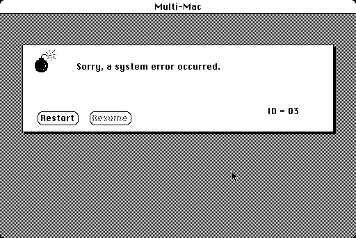
I'm assuming you also never used a Mac with Mac OS classic and never saw the sad Mac...
Agree with your comment, but a minor correction. The sad Mac was rare, only happened at boot, and was caused hardware problems (equivalent to a POST failure). The equivalent to a BSOD was the "Sorry, a system error has occurred" message:
> The ellipsis hints that this button opens a dialog, instead of immediately executing an action.
That's not exactly what the ellipsis is intended to communicate.
Have you ever wondered why File/Open... has the ellipsis, but in a properly designed app, Help/About does not have it? Even though Help/About opens a dialog too?
The distinction is that the ellipsis indicates that a command will take some action after further user input. The user input may be anything like text entry, selecting from a list, or just a Yes/No or OK/Cancel confirmation. But the key point is that the command will do something after that user input (unless the user cancels).
An About box should not take any action or cause any change to the state of your document or system. It's just information displayed that the user can dismiss with the OK button or close icon. So it doesn't get the ellipsis.
Search for "ellipsis" or go to pages 91-95 of the PDF (labeled as pages 67-71), in particular:
> The ellipsis character doesn’t simply mean that a dialog box or window will appear. For example in the Finder File menu, the Get Info command doesn’t have an ellipsis character and shouldn’t. When you select a Finder object and choose Get Info, a window appears displaying information about the object. The window appearing simply completes the command. The command doesn’t require additional input from the user before it executes.
Also in the Windows 95 Interface Guidelines (PDF):
Again search for "ellipsis" or go to page 109 of the PDF (labeled along with several other pages as page 143):
> If you provide access to copyright and version information for your application, include an About application name command on this menu. When the user chooses this command, display a window containing the application's name, version number, copyright information, and any other informational properties related to the application. Display this information in a dialog box or alternatively as a copyright page of the property sheet of the application's main executable (.EXE) file. Do not use an ellipsis at the end of this command because the resulting window does not require the user to provide any further parameters.
According to Apple HIG plain confirmations did not require an ellipsis:
"Don’t use an ellipsis character if the command displays an alert box to warn the user of a potentially dangerous action, especially if the command displays an alert box only sometimes. In this case you are simply giving the user an
opportunity to cancel a potentially dangerous action (such as causing a loss of data), not asking for more information."
Before Windows 95 was released there was CTL3D.DLL which gave a NextStep-like look & feel to Windows 3.1. See this image for the improvement made by CTL3D.DLL: http://www.win3x.org/screens/15nvtbm.gif
To think we used to worry about VB programs needing a separate runtime to distribute them and Delphi programs, while stand-alone, took up almost 200KB for a minimal app!
Hahah, yes! I was obsessed with THREED.VBX, but because I was learning C at the time ended up writing a whole library of Windows custom-drawn controls that looked exactly the same. I guess it was only later that I learned there was nothing special about VBX libraries and that you could (with some boilerplate) make them work from C.
Kids nowadays have it so easy with their Electrons and QTs...
I think it improved on NextStep by adding things like the underlines for keyboard accessibility, but the basic style (i.e. buttons that look like buttons) is very similar.
b) The Windows 95 UI looks nothing like NextStep (or SGI IRIX and the other X Windows UIs of the time) to my eyes. In particular, they made a distinct move away from the drab grey look of all Unix UIs, which was a really welcome splash of color. I still find that grey look reminding me of my days in the Unix lab at college, and I find it hard to relate to the enthusiasm of Apple fans for the boring grey look of macOs, which is clearly a '70s Unix look!
most apps didnt, but the consistency was much better with 95. The major user-facing changes was the taskbar and right clicks. It felt really consistent and made sense as a whole remarkably better than previous versions.
While RISC OS was influential, the 'app bar' idea mostly came from Windows 1.0 with minimized apps at the bottom of the screen. It went through several iterations and for a while it was a storage location for documents with no apps at all. Eventually the simple app list tested best so that's what stuck.
[I worked on parts of the Win95 UI although George Pitt I think did most of the work on the Taskbar itself]
Here is something else: The interface was "responsive". And I don't mean the responsive designs we have today for HTML but that when you click a button, you get a "response" very fast from the monitor.
Now, with these new interfaces and stuff, most of them are so lag-y that you can notice them with your eyes. It's very frustrating.
I tried Bisq a couple days ago. The application was apparently made with Electron and HTML/JS. First, it used around 4.1Gb of memory. The interface was not responsive and then it crushed.
I'm using a 16Gb/i7 2018 MacBook Pro and there is lags for most of the buttons in the Finder application.
> but that when you click a button, you get a "response" very fast from the monitor.
This was important enough back then that some of the UI was implemented in kernel mode on NT-class operating systems, specifically in order to preserve that responsiveness. AIUI, Win9x did not have a complete user-mode/supervisor-mode distinction, but the UI code was written on a very low level and tightly coupled with the OS itself, for similar reasons.
Photoshops "New" dialog in newer versions takes seconds to show up. It's horrific. Someone should get fired. I am both distracted and irritated by it every time I create a new file.
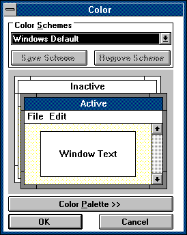
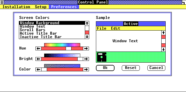
Back then you also could create your own theme. You could set the colors for text, backround, buttons etc. and every App did respect and use it. Today you can choose dark or light mode and almost no App does respect it, instead they bring there own colors and options.
I've been a theme creator for a few decades now, and modifying how programs looked is what got me into development in the first place 30 years ago. The constant stripping of user definable visuals in modern computing is a legitimately depressing thing for me to see happen. It's just another step along the "you don't own the device or the software, we're just letting you borrow it" path.
The constant push with SAAS and cloud-based data and all the rest, just makes me think we're heading back towards a terminal/mainframe environment and soon we'll be "consuming" the Internet in the same way we consume interactive Cable TV.
FWIW, one redeeming characteristic of SaaS web apps is that most of the time, you can fix up their crap UIs with liberal application of CSS (via e.g. Stylus extension). It's something I find myself doing increasingly often - usually not to make things look different, but to undo some dumb design decisions like low density, whitespace-rich presentation, or hidden video controls.
Unfortunately, this does not give the ability to do system-wide restyling of the kind _trampeltier mentioned. Despite professions to the contrary, almost nothing whatsoever on the web is in any way semantic. Each website is its own assortment of CSS hacks hooked up to a tree of randomly nested, randomly named divs. You can't just write one style that says "please stop with the whitespace around media boxes", you have to unbreak each site individually, because a "media box" isn't really a website-independent thing, and neither is a button.
An alternative to the Stylus extension that the parent comment mentions is the Stylish extension, which has a "marketplace" almost exactly what you're looking for. You don't even need the Stylish extension as each theme is also offered as a userscript.
Yeah, there's that; I wasn't sure about affiliation status between userstyles.org and Stylish.
FWIW, I still recommend installing Stylus instead of Stylish - the difference is that at some point, Stylish changed owner and acquired analytics; Stylus is a fork that's free of privacy-invading antifeatures.
agreed man, have fond memories of tweaking themes for daily drivers like irc client, winamp foobar2000, compared to like spotify or discord now feels so neutered and limited in terms of customizing appearance.
Yeah and everything now is so disjointed. It shits me. Eg not only can’t you customise Spotify or Discord visually, but they don’t even respect the OS controls. You can’t resize them properly to fit windows 10 tiling, the menus are a broken mess, etc.
They insist on doing everything themselves and ignoring all standards which just ends up looking ugly and broken.
One of my main passions in theming is making your entire system look cohesively styled. Hell, I’d rather have standard Windows look but every program using the system UI so at least it all looks the same. I despise Spotify, Discord, and all Electron apps for this reason. They look so amateurish.
Same here. And it's not just theming. Windows has always had a lot of small, lesser-known conventions around UI elements, some accessibility features, and a way for additional software to hook up to the UI. None of that is respected when an application decides to draw its own UI on a canvas.
Yeah and with Windows 10 you can't even set the title bar color to be black unless you either download 3rd party tools or hack around in your registry.
On the bright side, with native Linux you can customize everything. It's so fun to customize your window manager, status bar, etc. and have everything look and work exactly how you want.
In early 2000s, I used to make Windows applications with embedded IE browser and used system colors for CSS to make the whole UI look native. I believe it still works [0] but I don't think I've seen it in a long time on any site.
I tried it recently and its pretty random. The different names means different things depending on the os and browser combo and does not take into account user defined theme colors. So while the idea is great, the implementations are broken.
Under Windows I created and used a "dark" theme in 1991, nearly identical to what the canned Mac OS "dark" one is today. Used it well into the 2000s.
Microsoft REMOVED that capability in what, Vista? And now that everyone has finally realized how stupid inverse color schemes are, the color-scheme editor is totally gone from Windows. It was in there for a decade and a half or more.
They also removed the "blue background, white text" option from Word, just a couple years ago.
Windows is an execrable mess now.
Apple, which forced an inverse color scheme on its users for 30+ years, has at least granted them some relief. But it's still pathetic to hobble a OS's UI with hard-coded color schemes.
Do not worry for the market is ready for this. Iphone started with fixed backgrounds, then later they demonstrated the oh so amazing feature of custom backgrounds. In some 80s computer chronicles episode you can find the ex-act-same-speech from a windows sales rep explaining how win 1.0 was limited, but now you can set up your own background pattern. iOS 15 will introduce ML generated computer vision trained custom themed that fits the most seen colours in your rooms.
Yes, it's funny when some new app announces "now we have dark mode!" with much fanfare and commotion, when the ability to adjust the colours and appearance of individual UI elements across the whole OS was the norm back in Windows 3.
If the apps celebrating their new dark mode feature would use the OS GUI toolkit they wouldn't have to worry about that. Many "modern" desktop apps rely on web based technology which throws them back ages in terms of UI and UX
Many "modern" desktop apps rely on web based technology which throws them back ages in terms of UI and UX
For an even more WTF experience, look at how CSS had defined how web apps could use the system-defined colours for UI elements, but then it was deprecated due to a very thin "insufficient" and "security/privacy" argument:
Obviously they could be made sufficient (imagine if JS was deprecated because it was deemed "insufficient" for making applications behave natively...), and things like Electron could use them without worrying about "security" since it's not in pages served over the network.
(That "security/privacy" argument is really thin, especially when considering how much less customisable the colours have become in newer OSs!)
Unfortunately, "because security!" is currently a trump card that wins all arguments. On the one hand I get it, security has been pretty neglected in the industry over the past decades, but I think we also really ought to have a conversation about the costs of security.
The ultimate state of perfect security for a system is a dead rock. Everything that's interesting and useful can only happen in the state of some lack of security.
Strictly speaking, they also have to be compiled against a new enough SDK to get Dark Mode support via the native GUI widgets. For apps that need backward compatibility, that can get hairy. (But yeah, that’s nothing compared to what Electron has wrought.)
Dark mode is a single Boolean flag, which is much easier for application developers to follow.
The whole point is that application developers don't even have to care about it if they do things right, by using the OS's UI controls they will automatically be drawn with whatever colour the user has set.
But in reality, apps didn't perfectly follow the theme, and an attempt at "dark" theming resulted in big bright splotches of white on your CRT monitor.
That was a problem then, but today, you'd think cases like this would be immediately reported as bugs on the issue trackers. Unfortunately, while we've gained in the development support tooling and speed of software distribution, we've also lost the basic sanity of GUI implementation.
You could tell the ones who didn't know what they were doing by the invisible text littering their UIs under some color schemes. This continued into the Web era. There were tons of defective sites that overrode your system background color with a hard-coded white background, but didn't bother setting the text color to black.
The result was invisible text on any system with a "dark" (non-inverse) color scheme. DUHHHH
There are probably still millions of such sites today, but now UIs are so gimped that they hide the defect.
I forgot how nice it was to have underlined alt keyboard shortcuts. We got so much right so early in the age of personal computing. Goodbye to all that, hello Ribbon and flatness everywhere.
It’s as if we’re in the Middle Ages now looking back at the great ruins of ancient Athens.
Nah mate. Biggest issue I’ve ever had with the Ribbon is that 1. I didn’t have to use it very often and 2. It conflates menus and toolbars together and 3. The only time I’ve ever had to use it was when helping a friend find the action they are looking for.
It’s been around for 11 or 12 years and as recently as 2-3 years ago I was still helping friends out with it. The only reason I was ever able to figure out how to find what they were looking for is that I had what was essentially the trivia knowledge of what the Ribbon was meant to be good at rattling around in my head from reading about it years ago and what was left of my experience with the internal hierarchy of the apps from the late 90s. More often than not, it was some thing I knew used to be a menu item.
Menus and toolbars are a bit easier to figure out without prior knowledge, but where’s the fun in sticking with what is known to work well when you can reinvent the wheel and declare it to be a better wheel because it is newer and therefore must be better. Because it is newer.
Ribbons are far harder to scan than menus; text is easier to scan for new semantic associations (actions you've never performed before), and menus have a regular aligned layout, while ribbons inconsistently mix text and icons and use inconsistent action sizing requiring an irregular scan pattern.
If you're a repeat user, icons start becoming easier to find than text, and the inconsistent grid starts having a geographic element that helps with muscle memory. For a new user, I reckon menus are easier, especially if combined with status bar help text (remember that?).
Yes - you've just made me aware of how and why scanning a ribbon always felt somehow more physically exerting to me, the 'manual work' of dragging my eyeballs around and about, instead of in a straight line.
Plus with buttons of different sizes, you have to 'zoom' your attention in and out to catch them all; while the harder I try to find something, the more I naturally tend to lean forward and crane into the small details, and miss the wood for the trees.
In Microsoft office, I often found it hard to find the button I was looking for because the buttons weren't group with similar buttons in the toolbar, and were distributed randomly. I prefer the tabbed+grouped layout of the ribbon because it fixes that organization problem. All the basics are in "Home", if I need to adjust the layout I go to layout, etc. Then within those tabs, common actions/properties are grouped together. I never want to go back to the old toolbar layout in Office 2003.
Should be noted that the ribbon can be customized (in most apps I've seen it anyway) and hidden. Many toolbars are not very resizable (for good reasons).
The big difference is fewer clicks to do what you most often do (with ribbons). The cost is using more space and possibly cluttering the UI. You can also argue easier discoverability, but I'd guess that's up for debate (seems to for my old parents, but that's a quite small sample size).
Ribbon gets more useful once you have a device with a touch screen. It's like a toolbar, except the buttons are bigger and it has tabs. I started to appreciate it (particularly in Windows Explorer) when I got my first 2-in-1 device. That said, with a stylus, regular toolbars work OK too.
IME, ribbons are way too fiddly to work well as a pure touch interface. Toolbars with "large" buttons (as first seen, IIRC, in Win98) are a lot better.
Ribbon buttons are smaller than menu items and have no text until you hover over them. They're both harder to find and harder to press even if you know where they are. And somehow there seems to be less space in ribbon than in menus, because some commands are tucked away in second-level palettes. E.g. you need to open the "Reveal formatting" palette in MS Word:
1. Switch to Home pane.
2. Click the tiny icon at the bottom right corner of the styles section. It will open the "Styles" palette. The icon is unlabeled, of course.
3. At the bottom of the "Styles" palette there are three icons. One of them opens "Style Inspector" palette. It's hard to tell which one until you hover it to read the tooltip as they're pretty similar.
4. At the bottom of the "Style Inspector" we have two more icons. Again, hover over them to see which one opens the "Reveal Formatting" palette.
5. There you are. I don't know if there's a shorter route.
The old desktop approach had some cool things. List views tended to support common operations, e.g. sorting, drag-and-drop, multiselection, common ways to do renames and type-ahead-find. Tree views had some standardization, too. Crowded menus/toolbars could be ugly, but you could discover a lot of functionality going through them. Right-click tended to expose a set of verbs.
These things often exist now or have an analog (e.g. long press is right-click in mobile UI), but not everywhere and not always done the same way. Mobile has some inconsistency; the Web has a good bit.
The modern has plenty of its own UI/UX things--URLs and the Back button for the win, dev tools/view source are awesome, and certain cool things can come from services not living entirely on your device. Something like hiding clutter at the cost of discoverability is a win for many people.
Still think it's interesting to compare and think about what can be usefully brought forward from the past.
> Why is there no HTML tag for creating menu bar and nested dropdown menu?
because HTML was never designed to be a application interface, and I don't see a menu-bar nor dropdown as necessary for a document display.
What's needed for the web is a common and standarized (i.e., browser provided) library for application UI that's distinct from the existing HTML markup. They should not mix, and if you have a document (rather than a web-app), you use HTML, but if you intend to write an application UI, you would use that library.
I forsee something like WASM compiled QT or some such to be the beginnings of such an api.
flash was only bad due to the inherent vulnerabilities and capabilities that browsers werent expected to have (such as being able to write to disk directly).
There is the menu element, but I guess it was just meant to be semantic and didn't really catch on. I think JS killed the adding of more GUI elements to HTML. Developers prefer their libraries. It's weird how things progress in three steps forward, two backward kind of way. The web has certainly illustrated that in many ways.
IMHO it's closer to one step forward, two steps backward. There are plenty of other articles on HN about how annoying and unusable the "modern Web" has become.
I recently spent one week making a dropdown menu. Then I spent another week making it possible to use it with keyboard only and with a screen reader. There are actually standards on how a dropdown menu is supposed to work. But no easy way to implement one. Dropdowns are however very bad UI because it hides info and you need to click or move the mouse to certain places to see more. A unique feature on the web is the scroll to see more. Using the mouse wheel. So instead of putting info in one screen hidden behind menus, tabs etc, you just put All info in one looooong scrollable page. This works great when information is presented like in a book, eg. you read from top to bottom and rarely jump back and forth. So the challenge is to present the functionality in a way so that the user does not have to scroll back and forth to reach it. Key presses or gestures could instead be used to switch between different scrollable screens/pages. And each view should have an unique URL so you can link to it.
Just wait a little. Soon there will be a movement for UI consistency and they will reinvent a lot of stuff Apple and MS did about UI in the 90s. Just give it a fancy new name. You can see this on the iPad. Suddenly you have multiple windows, keyboard, just in slightly different form.
And absolutely no documentation on how it works. I've turned the multiple windows stuff off on the iPad because it's so damn inconsistent and incomprehensible.
Sadly , this is a theme with tech, it progresses in cycles. FB replaces forums which replace yahoo which replace newsgroups. In terms of ideas, there is very few that wasn't there in the 90s, (infinite scrolling maybe; afforded by increased RAM - i can't think of others). Since CPU performance has stangated, the last few cycles of generic computing have focused on design. That's the main selling point now, and you see that in the proliferation of UX jobs and attempts to squeeze the last drops of user engagement with things such as 'onboarding' etc. Design has become inane, of course, it completely ignores human capacities such as contour-perception, response time, consistency, but it doesn't matter, because the game has changed: it's now about how you capture the user faster and then lock her in. Wasting their time trying to figure out the app is now a positive sign: "the user is engaged".
I used to play with VB5 and VB6, the RAD process was better than any of today's separated backend/frontend antd CSS-layout scaffolding data binding frameworks bullshit.
The best part of the unified UI controls is you can use tools like Spy++ to discover programs on the fly. Today's Internet there are thousands of web frameworks and you need thousands of source mapping or else it's an ocean of minified gibberish.
I started my professional programming career in the Windows 3.x days. Some things that come to mind:
* The web solved the software distribution problem. There were some pretty good tools for building GUI apps in the 90s but the tools for getting software to the customer sucked. Complex installers, no autoupdates, "DLL hell" incompatibilities.
* There never really were any great tools for building cross-platform GUIs. You built for Windows on x86, that was it. Widgets were shipped as binary COM components. Now you need to be on multiple OSes, multiple hardware architectures, and multiple form factors. VB wasn't going to give you that.
* Formatting text sucked. Actually, formatting in general sucked - the RAD GUI builders built awesome fixed-size dialogs, but now screens vary from watch-sized to wall-sized. Embedded HTML components really made layout easier... and once you start putting things in HTML, it tends to take over.
* All those pretty 3d effects in Win 95 UIs? Those were a bitch to get right. Hours of trial and error drawing extra lines of black and white and grey pixels. It looked good but it was a lot of effort that would have been better spent building real features.
Cross-platform is more of an excuse than a reason. The idea is always that you write an app once, and it magically works on Windows and Mac and phones, and toaster ovens.
Except that never actually works, for anything but the lowest common denominator trash apps. Unfortunately people are convinced that this is something that should be pursued; the only real result is lowering the bar across the board and eroding compliance with long-established platform UX guidelines.
There are more or less 2 major modes of managing a product relative to the current technological zeitgeist:
- expand to consume every new use case and buzzword that comes along. Survive in some form indefinitely, while the product becomes less concrete and meaningful over time. The product continues to succeed not because it is technically best in class any more, but sheer momentum of the large base of existing users it serves adequately
- remain focused to the original mission, delivering iterative improvements over time. Watch waves of loyal users get eaten away one after another by the tide of the current technological buzz
VB was mostly the second case, although it did have many cousins in the form of VBA and ASP. The original tool - VB itself, was only ever relevant to desktop computing. By the time it got merged into Visual Studio, I believe the RAD aspect of the tool had already mostly disappeared (although VS even today still offers some variety of the original experience!)
VB in its prime was a beautiful thing, and the experience AFAIK remains unmatched to this very day. I've pined for a "client/server VB" on many occasions.
The powerful RAD from VB continued into C# and .NET. You could in first versions of VS.NET and still today with UWP just drag out a button, double click it to perform some action, hit F5 for close to instant compile and launch and then edit the code while debugging. As others noted, the problem is not the tool, the problem is the lack of interest in desktop apps today.
Agree about the experience being unmatched. Compare it to Android Studio which is supposed to be the modern flagship from the competition, even 15 year old versions of Visual Studio provides much smoother RAD experience. No matter how good code editing in IntelliJ is, everything around it with gradle slowness and app relaunches just makes you look back and wonder what happened to technological progress.
I guess, these application were oriented at single developers and small teams, which is also, why these found favorable access and controls in them. But this meant also that businesses had to own the technology, the know how, and the technology stack that come with it. Now, it's all about teams, favorably with interchangeable staff, who is hired on the fly, without a need to own localized know how, as anything is incorporated into the specific stack. (Owning technology is even a bit frowned on nowadays, as in the "not invented here syndrome" meme.) This is really, what facilitated the startup culture, we may observe today. On the other hand, this is also, why the stack is king and developers are to serve (insert Git, the JS framework of the day, etc).
The cheaper no-install/remote feature, regular subscription revenue model, and Agile dev cycle took precedence.
Even before all this happened I remember articles about software companies yearning/pleading for subscription revenue, but customers were not interested. The web allowed them to turn the tables on expectations.
A few advancements, such as excellent UI consistency were left behind though.
- Very few use the desktop as their primary computer interface now compared to back then.
- We keep abstracting. The web browser has almost entirely abstracted away the OS. You run Windows 7, or OS X? Who cares, just log into this web page and do your thing there.
The really-RAD thing doesn’t have a good equivalent today, but I also think developers asked for something that created slightly more maintainable code even if at the cost of slightly less RAD.
C#/VB with WinForms was the successor to VB6 and doesn’t sacrifice much in terms of development speed but added a lot of modern conveniences (high dpi etc..) that would have cost too much to add to VB6.
Adding HighDPI support certainly wasn’t the reason WinForms took the place of VB6, but it’s one of the things that VB6 doesn’t have that WinForms now does (it’s far from great but it’s something).
Perhaps better examples of things that were difficult to shoehorn into VB6 apps but first class in WinForms: multithreading, x64, Unicode.
For the developing perspective it's so much better, but consumers needs fancy login buttons and infinite scrolling instead of UI consistency and accessibility.
Also deliver binary executables has a huge attack surface of virus. Web is considered "safer"
I see a lot of designers who are very creative but are creating artwork instead of interaction designs.
The problem is: it sells.
Customer wants a website, designer makes a peace of art, customer thinks it looks amazing, contracts are signed.
The the trouble starts when it is getting build.
Real texts are much longer than designed, the available pictures don't fit as good as the hand picked stock pictures, and the interaction.. well it all looked great on paper.
I believe it's dumb to get contracts this way because the project always delays because the client doesn't get what works.
It's better to sell customers a moodboard and then design interaction as the project moves along.
I think about windows 95 at least once a month, wondering why the web apps I work on still can’t match it in terms of performance and usability, never mind resource utilization.
One thing that has been a staple since win95 days is the ability to resize windows, sidebars, columns; almost everything, really. Rarely is this found on the web today, or so poorly implemented that it’s thrashing the UI thread when one or more resize callbacks are triggered. Even without that, layout + painting alone would probably lose the race against 95 UI tech.
Another “legacy” UI that stood out to me is blender. It looks decades old (until it was revamped recently), is probably a hodgepodge of C/C++ but stays smooth as everything can be resized even on dated hardware.
I can’t help but think that the UI engineers of old were a much more professional bunch, and that the field has mostly regressed since then.
Even to this date, there is something oddly satisfying about clicking those buttons. It feels like I'm operating a machine and actually getting things done.
Windows 95 followed an extremely standardised approach to design. This allowed for incredible ease of use, but people get tired of standards and want to set themselves apart...
This is not always good for UX, but new and different GUI's are an inevitable progression from homogeneous ecosystems like; Windows 95, Bootstrap, Material...
People just want to be different from the standard
It looks a bit ugly but it is very functional and straight to the point. Needed just a little visual touch to account for modern monitors. Instead we have fucking light gray text on white background, window borders/title area that are indistinguishable from the rest accompanied by great hunting game of: find an interactive element on on a screen
All I can add to this is my experience with my daughter and the switch from iOS 6 to iOS 7. Our iPad was about a year old and I decided to upgrade to ios7. She was 3 and we would take her on walks and she’d hold her iPad and watch shows (bad parents I know). Anyways with iOS 7 she got so frustrated because she could figure out how to watch her favorite show (play button was nearly impossible to see and they started including shows that you need to be online to watch but with no clear indicator). She threw the iPad an amazing distance with unreal strength. I wished it was more obvious for her as ios6 a 3 year old could master...
I use Windows 98 quite often and it's sad how crappy modern UIs have become and how we just got used to it.. really feels like a huge step backwards and it only gets worse
Windows 95 had an obvious UI, but was rather cluttered.
The original Macintosh up through System 7 was perhaps peak of OS UI design, the simplicity and obviousness is a marvel. The modern Mac experience is no where near that simple, particularly since the Yosemite UI overhaul.
The original iPad had pretty great UI design too, until the iOS 7 redesign. Now I think it's probably the most confusing UI that exists on a modern OS. Nothing is obvious. Multitasking and copy/paste on iPad is befuddling to even the smartest and most technical people I know.
UI design that was perfected 30+ years ago has been completely shelved and lost by designers who are designing for other designers and their portfolios, rather than for users.
> "The original Macintosh up through System 7 was perhaps peak of OS UI design, the simplicity and obviousness is a marvel."
I first used System 7 after having used DOS, Windows 3.1, and Windows 95 and a bit of SunOS. With that background, I found System 7 and the silly hardware limitations to be anything but intuitive.
To this day I find it annoying to have to go all the way to to top of the monitor to get to a menu. Arguably that was less of a pain on the tiny screen of a Mac SE, but becomes real where than one app is open in a way that the windowed app feature is used in a meaningful way.
An example of silly hardware limitations includes substituting an eject button on the floppy drive for dragging it to the trash. The same action used to delete files or folders is used to regain possession of my precious files.
The single button on a mouse to make it simple sounds nice, but then there are modifiers using command - giving the same functionality a windows user would expect from a right click.
> An example of silly hardware limitations includes substituting an eject button on the floppy drive for dragging it to the trash. The same action used to delete files or folders is used to regain possession of my precious files.
1000x this. I remember using a Mac for the first time at school (1997-ish). I needed to put a file on a floppy, which was similar enough to Windows 95 up to ejecting the floppy. I ran my finger over the drive area and asked someone (a teacher, maybe), who said 'drag the floppy to the trash'. 'I want to eject it, not delete it!' I did it anyway (if it got deleted, just copy it again), and was surprised that it worked. I made another mental note that PCs were superior with their physical eject buttons, as I realized that a Mac could eat a floppy (like a stereo eating a cassette tape) if the drive (or OS or mouse) failed.
As a certified MSDE in the late 90s, I cringed frequently in the early 2000s as design guideline after guideline was violated and landed by the wayside. There was so much thought put into every element, and guidelines of placement down to the pixels. And you were tested on all of it to get/retain certification.
As others have said, targeting multiple resolutions and dpis, and supporting reactive/resizable canvases, has driven most of those guidelines to the curb. A different era.
My two favorite things to hate about the windows UI:
white on white text entry fields have been difficult to find since win 7 and have been held over into win10.
Now the scroll bars are white on white and you have to hover your mouse cursor over the invisible scrolling square button to reveal where it is in order to see how far along in the scroll you are instead of referring at a glance. What were they thinking?
I still make windows desktop software in my day job and a lot of these things are still there. Like ellipses for elements launching dialog. I also think resizable windows etc are still displaying a draggable corner as a hint?
All of this is pretty natural - so long as you design native desktop software using native controls.
I appreciate this analysis and agree with some of the points, although I have to add: for any interface that I use daily (such as a file management system), I prefer the modern version — flat design and all.
I don’t want heavy borders to show that something can be resized (just show me a different cursor when I hover), or column titles styled like buttons, or an always-visible scrollbar (I rarely need to know a “vague” measurement of files in a folder). To me, this just makes an interface more confusing.
Although I’ve been spoiled by Mac over the last few years, so maybe this argument is more about Windows.
The big innovations in Windows 95 UI were the Start Button and the Task Bar. Both were excellent additions proven most evidently by their continuing presence in Windows 10 today.
UI is different on the web and mobile devices but if you fire up the Win 10 file explorer, almost all of the items shown are still there or arguably better. Maybe resize (which you can now do from any window edge) is a little more finicky.
The most annoying thing about Windows 10 is how it makes clear improvements in some areas, but then decides to be utterly brain dead in other areas. The task manager is hugely improved. The file explorer is better. The copy/move file dialog is far more useful. But then they abandon the Control Panel and give us this flat UI abomination that doesn’t even support one of the original ideas that made Windows 95 such a hit: Multitasking. You literally can’t have multiple copies of Settings open to modify different parts of the settings at the same time. I can’t quickly open a new window to check something while keeping my focus on one main task ... as in, multitask. I’m forced to break my flow and traverse back/forward through a bunch of nested settings instead of letting me alt-tab between what I’m actually interested in. It’s terrible and infuriating and I have no idea how this got released in this state.
And that’s before even considering how incredibly wasteful it is with space. I hate myself and wonder where my life went wrong every time I have to open a Settings window on a device that doesn’t have full HD or higher, because it usually results in copious amounts of scrolling for information that could be easily displayed in 1/4th of the space. Hell, and you can forget about using it non-maximized, because then the “advanced” links on the right side disappear to wherever, because fuck showing you what you need at a glance.
And they keep changing how you reach the actually sane, usable and functional Control Panel windows (like the sound devices settings) and alternate between making it easier and ridiculously obtuse. It makes me want to bash my head against things really, really hard.
It's very frustrating when the hide elements that are very useful. They're trying to guide people away from what works toward things that don't work, in their quest to make PCs work like cell phones.
Sort of related: MS has done something that stopped my DVD function from working. My drive plays CDs, but it won't recognize DVDs. I uninstalled the latest update, but that hasn't fixed it. I've searched and found this problem has existed and been reported for years now, as though it's a continual effort to prevent DVDs from working on all Windows machines over time. There are a multitude of 'fixes' that have worked for some and not for others, because there are many different ways to create the same problem. It strikes me as Microsoft's attempt to steer people away from "legacy" hardware (my new laptop wasn't even offered an option for a DVD drive) and toward the cloud. Well, I paid a lot of money for my DVDs and I don't have the money lying around to purchase the entertainment that I already purchased just because Microsoft has seen fit to break a product that I paid for. I've already wasted hours of time trying to fix it and I'm resentful of these people who have no respect for their customers.
I share so your frustration with Windows 10. It’s reaching iOS levels of lack of discoverability of features.
I wrote to tell you that Control Panel itself still exists. You can get to it from using the hidden search in Start Menu. Open Start and begin typing Control Panel and it will show up eventually. Or you can right-click on Start button and select it. Or even type “control panel” in command prompt or powershell, without quotes. Apparently it shows up in File Explorer under Desktop as well, which makes the least sense of all to my intuition. Hope that helps.
Yes, I know it still exists. But they keep making you jump through hoops. There were major versions of W10 where the start menu search didn't list the Control Panel if you searched for it. Right-clicking the sound icon in the tray now directs you to the new Metro Settings, and they also keep changing how to reach the traditional Sound Control Panel.
Apparently, searching for sound now lists the old panel too, so at least there's that.
Since Win8, I've found that right-clicking the Start button gives you an actual menu of useful things instead of the ad-riddled abomination that they've decided to put in its place.
I'm mostly pushing back against the idea of some lost golden age of UI design. The file explorer used in this example is almost the same a quarter of a century later. And some of its deficiencies have lasted a long time - it took a couple of decades for explorer to learn to show a unified list of files and directories sorted by modification time. And it still doesn't have an inlined tree view making the basic task of moving files between adjacent directories clunky.
At the same time, for all of its fashions and foibles, the one-app-a-time, direct-manipulating touchscreen UI has made computers more accessible to all sorts of people to whom 'the desktop metaphor' was and remains confusing and unintuitive.
Young children, the elderly, the desktop-bewildered still use iPads and touchscreen phones more readily than they ever used desktop UIs. I think as experienced computer-users we easily miss that this has been a genuine revolution in UI reach.
I don't think we miss that. We're just paying attention to what that revolution cost us.
Part of the problem is the "winner takes all" dynamic of the computing sector. I'd be fine with simplified interface for children and elderly existing side by side with a properly deep interface for adults in full capacity. But currently, the market can only sustain one of these - and it chooses the one that can support more users, despite the total loss of utility this causes.
Porting an example I use in topics about accessibility: consider Braille. Everyone can learn to read Braille, but blind people can't learn to read regular, printed characters. But we don't try to replace print with Braille, because it would be ridiculously debilitating to the vast majority of the planet's population. We instead opt to run two interfaces side by side - we print both regular and Braille books.
I often hear this argument. It could be used to argue that comics are better than novels and overalls are better than regular clothes. Three year olds are three year olds - what is best for them is not necessarily best for adults.
Not necessarily, if it debilitates the majority of the user population (adults) - if it helps some people get more done, while making much more people get much less done.
Also, in some cases, we can make investments to get productive on the new UX.
I did that with Android. Have to be honest. I can fly on a reasonable Android phone. Apple, not so much. Didn't want to make two investments.
Content create, communications, programming, social media, all aren't a burden today. Function set is limited, but it's not as big of a deal as it was prior to really working the UX, just like many of us did with the other paradigms. And I often just do not need a deeper set of features / flows too.
Not saying it's better. It's not in my view. But, I am also saying, users can do better with it than they may think.
No, it's still a net gain. What you are talking about is a priority problem.
That problem is applying the right UX to more people more of the time. That costs more than just doing one size fits all, and we should be paying those costs more, in my view.
Many people probably didn't notice that Microsoft Office at that time used custom controls and was a little off from this design.
The design was very nice, but a bit over complicated. Things looked like a control panel, which maybe makes us feel like pilots, but intimidates most users. The open dialog is a good example. Drop down elements, lists, directory list, label for selected directory. Later iterations fixed this and nowadays apps try to avoid selecting files altogether if possible. Overall, design has improved a lot since then, maybe except for the touch additions.
it was easier to explain over the phone too. EXP: Click Start > Control Panel > Sound > Playback Tab > Right Click the Speakers > Set as default audio device. Grandma can hear her youtube videos again while i'm still at the beach.
I've been saying for a long time that one thing the free DEs have going for them is that they don't consist so much of separate parts, each of which needing to advertise for itself. No need for FooApp to look extra special, no need to shove the name into the user's face. Universal document readers with format plugins, such as Okular, are a nice example. Not great at most things not PDF but you can see the idea. A universal tagging and rating system kind of exists in KDE but somehow it hasn't turned out as useful as it promised initially (IMO).
There is still a lot of unrealized potential in that area.
The most common infection is the one where they turn your computer into a node of a botnet. From there it can consume your bandwidth, launch attacks on other people, or be used to distribute files, such as child porn.
Do you want to be implicated in a child porn ring, and have the evidence sitting right on your computer?
Chances are said Win98 box is off when not in use, and it is very unlikely that there is much of that kind of malware targeting Win98 anyway since it has a nigh-0% install base. What does actually run on it is probably going to be noticed because it's probably running on period hardware and the resource usage will not be nearly so negligible as it is today.
It doesn't have any connection to a network of any kind. I mainly copy stuff over on USB. GOG games don't install on Win98, but if you install them on XP you can often just copy the directory across.
Less cheekily, I recall joy of not needing to look to the bottom for more commands and tabs.
First encounter with that paradigm was iTunes. It took me a week to realize that half the functionality was in the nether reaches of the screen. I felt I was the butt of some joke.
I think, much of the recent developments in UI design (and its conceptual space) is owed to display technology. Modern displays have different contrast ratios from CRTs. Generally, fine details used to look softer on CRTs. So, when flat displays were introduced, bevels didn't look right, Apple got rid of realistic icons (formerly introduced in OS X), etc. On the other hand, extensive regions of flat color where always a bit of a problem on CRTs (too bright, maybe there were some artefacts from some interference – who remembers the stripes caused by a cell phone placed next to a CRT?), but rendered impressively on flat screens. Meaning, the old UIs didn't work like they used to be on the new technology, while the new displays provided for a few things which had always been a bit problematic on the old ones. Enter double resolution displays and the necessity to render the same content on varying resolutions. Flat design and parametric scaling seems to be the answer. However, there's now a limited range of ways to add unobtrusive visual clues and of compartmentalisation/grouping as compared to the old visual vocabulary. Moreover, with the old vocabulary, a single element could have multiple visual clues attached to it (e.g., a bevel indicated a button, the icon and its color a task and a category, an underline in the associated text a shortcut key, etc), while now a single element can have just a single clue added to it for the most. Reduced visual complexity, as necessitated by the display technology, also meant reduced conceptual complexity.
This is actually true for Win 95 / classic Win UI. (However, you may want to reconsider the bevels, since the graphics tend to be a bit too heavy on a flat screen.)
P.S.: Many (including them myself) consider Snow Leopard (OS X 10.6.x) as the epitome of a UI, which matched usability, conceptual space and visual design next to perfection considering the visual and stylistic preferences of the time. That said, I can also see, even if I do not appreciate the road taken specifically, why this wasn't sustainable with high resolution displays.
> However, you may want to reconsider the bevels, since the graphics tend to be a bit too heavy on a flat screen.
They looked "heavy" on pixelated, low-res flat screens (lacking the natural Gaussian blur that a CRT gives you) but it's not like there was an alternative back then. OTOH nowadays, with resolutions, DPIs etc. varying so much, pixel perfect design is not the sensible choice that it was back then.
Flat design is just a bad choice, though. You can have softened bevels/3d effects in a modern design such as Adwaita in GNOME/Linux, and that looks quite good - perhaps the best feasible iteration on a Windows 95-like design, all things considered.
Mind that in the mid 1990s color CRTs still tended to be quite blurry, if it wasn't a Trinitron display. (E.g., dithered colors were next to indiscernible from solid colors, especially on larger RGB displays.) Also, pixels used to be much bigger (starting at 72 dpi, eventually tending towards 96 dpi with intermediary steps on multisync displays). With this kind of resolution on a flat screen, the UIs do not look how they used to look on a CRT.
> Flat design is just a bad choice, though. You can have softened bevels/3d effects in a modern design (…)
I agree. However, I can see why we ended where we are now. Also, it's cheap (as compared to having to maintain various resources and various color definitions for various resolutions) …
It was obvious to this new generation that the affordances of youth were purely redundant. Clutter. Overhead. Junk! Widget by widget, pixel by pixel, bevels were smoothed. Tasteful gradients and transparency replaced harsh outlines. Explanatory text was tucked away. Manuals became brochures, then a lonely slip of paper with a URL. Maybe a QR code.
Now my screen is the very picture of elegance and sophistication. There are no extraneous details. Indeed, there are no details. I caress my phone's surface gently, hoping to see a sliver of its rapturous visage peel back, hinting that I have found the first step in the puzzle box of its interaction model.
Alas, no dice. Maybe I can hunt down a how-to video... to show me how to hunt down a video...