After working on http://roughjs.com/ I thought it would be interesting to create common sketchy UI components that worked like actual controls. Web components seemed liked the obvious tech for that. So, yeah, here's wired-elements.
Great job!. What is it based on Canvas or SVG? I had in my initial version of https://www.mockuptiger.com built sketchy components using Canvas. It was interesting and fun.
The fact that your designs "don't work" is very disconcerting - given that we've spent 20 years trying to separate function from design. Does this mean that after 20 years that we still don't have a good clean separation?
Another comment in this thread mentioned a similar project, a Swing "napkin" theme, which managed a rough look as normal styling. So I guess Swing did something better than HTML/CSS - from skimming the comments i gathered that this library had to reimplement everything from scratch using SVG/Canvas.
I think the point is that if the function and design were actually separate, a non functioning element would also be non functioning in plain HTML (no/little design). That would be much easier to spot, and wouldn't even really be the designers problem.
It's understandable why it happens here, the browser can't easily provide this design with pure HTML and CSS, so javascript and SVG are likely carrying some of the load, and bugs there are causing problems.
That said, one of the main benefits of separating function and design is that this stuff isn't supposed to happen, or be much more rare at least, so it is sad that to utilize this we have to introduce those problems again.
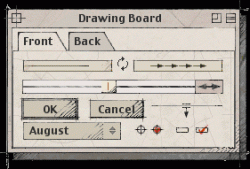
Also on Firefox (in Debian). It's not exactly that the slider starts at zero. It's that, when you grab it, the starting position becomes a pointer offset. You can set it wherever you like, accounting for the offset. It reminds me of capture failure in VMs.
It's actually related to where the slider control is located relative to the page. Chrome and Firefox return different coordinates for SVG node bounds when the node is transformed. Need to find an alternate calculation that works on all browsers. https://github.com/wiredjs/wired-slider/issues/3
Same on iOS.
Otherwise great job! I can easily see his being used for rapid prototyping so give clients the feel that the UI is not set.
Would be good to use the awesome font at the front as actual font face in text controls. Or perhaps some fixed width / typewriter font.
the controls inherit the font. So the person using the components can set them to whichever they want. I use 'Gloria Hallelujah' from google fonts' handwritten set on the website.
Reminds of the Napkin look and feel for Java Swing apps. I worked on a project where we only demoed the Napkin L&F to our customers until we were feature complete.
The idea was to keep them focused on functionality.
This is fantastic! Very useful to get a concept into the browser and hopefully minimize clients focusing on visual design preferences too early in the process.
I hadn't thought of this, but this is an excellent point! You can use this to make a functional mockup for a client/boss/whomever, and by using these they will completely ignore all styling and focus on the functionality.
Heck, I'm even thinking of using it now when we launch a beta, to get the users to focus on the functionality instead of the design. My only fear is that they will want to keep the design!
This is why I purchased Balsamiq when I was contracting, even the basic Bootstrap theme, even with bold text saying "ignore everything design related!!" I'd still get comments about button shapes, colors, complaints about shadows and graphics, etc.
Even with more "theme" stuff in a Balsamiq mockup like colors and images clients were able to focus much more on content, layout, and information architecture than design.
I've tried that, years ago, using a similar rough-draft kind of mockup engine. I still got comments on the styling, and comments along the lines of "this doesn't look finished enough for review".
We did that with The Sims. The programmers would sketch up stuff in Microsoft Paint as ugly as possible, to make it clear that it was just placeholder art:
Q: Were these screenshots taken when you were working at EA/Maxis?
A: Yes, these have placeholder "programmer art" that looks really shitty on purpose, so nobody mistakes them for final artwork!
Q: I thought as much; also noticed the 'Live' 'Buy' and 'Build' mode placeholder text on the UI ;)
It's harder to make ugly stuff in 3dsmax, so we had to make it inexplicable instead. Things tended to get weird when we were doing things like testing the 3D sprite exporter animations. I am at a loss to explain this, other than it's an experiment in post-transmogrification texture mapping...
You could place "spores" on the ground that would grow into big Mona Lisa Mushrooms!
Before that, I also used the same "programmer art" approach for some demos I made at Kaleida, when I didn't have an art department at my disposal to do my bidding, but knew just enough Photoshop and Director to be a danger to myself and others. (Some of it literally looked like shit and smelled like stinky cheese that made people scream!)
>To make any sense of this, you should realize that it’s live improvisational performance programming art. The graphical and audio artwork are just ugly placeholder “programmer art”. The references to “great content” are laughably ironic!
>I didn’t have an art department at my disposal, and I have terrible graphics design skills, but I didn’t let that stop me, because that wasn’t the point!
>The art is in how it works and what it does and how I use it, not how it looks or sounds.
>It was meant to inspire ScriptX developers as well as myself, and it led to me to later develop iLoci and MediaGraph.
The default color of TCL/Tk 3.6 and earlier used to be "Bisque", or #FFE4C4.
"Bisque is a smooth, creamy, highly seasoned soup of French origin, classically based on a strained broth (coulis) of crustaceans. It can be made from lobster, langoustine, crab, shrimp or crayfish."
>The procedure tk_bisque is provided for backward compatibility: it restores the application's colors to the light brown (“bisque”) color scheme used in Tk 3.6 and earlier versions.
TCL/Tk even provides a convenient built-in procedure "tk_bisque" to reset the application's color to the Bisque color scheme, which was documented with this warning:
i started working on a react clone of wired from a few months ago - kinda dont have time to continue on it but if anyone wants to take over please do: https://github.com/sw-yx/react-wired
>These are web components and work fine within React already
I tried with a simple CodeSandbox and they are not working for me. ( Unless I'm doing something wrong? )
https://codesandbox.io/s/pp4q7kw9q7
stuff like this is why i have trust issues with people who try to push webcomponents on me. I'm either not smart enough to understand why i dont get it, or its just not ready yet.
i don't know. wanna try putting up a codesandbox to use wired-elements in a react app? would love to learn. sorry i dont know your affiliation with the polymer project or react-polymer. it just didnt seem usable when i looked at it
Strange, that designer link doesn't load in Firefox Nightly, with this error:
Loading failed for the <script> with source “https://wiredjs.github.io/designer/bower_components/webcomponentsjs/webcomponents-hi-sd.js”.
But it works fine in Chrome. Regardless, it looks really useful but still very much beta. It could be a decent Mockingbird replacement if you could save the documents and export them as PDF/png. Plus it needs way more components.
I like it. The thing that I'm asking myself now is why do I like it (and other "humanized" drawings) ? I've always preferred accuracy over ambiguity, clean minimization over unnecessary clutter, shouldn't I prefer clean straight lines over something a human can draw on a sheet of paper? I'd never want to read a book written in human handwriting, so why is this appealing to me? Is it perhaps because the lack of optimization of the diagram contrasts and brings out the simplicity of the idea being conveyed? I could bring up some theories but can't say for sure.
Personal anecdote alert. Last year at work I had to design some process diagrams. I enjoy this sort of thing, but I was finding it very hard to get past that initial hurdle.
I found, by accident I think, Visio’s ‘hand-drawn’ template - and everything changed. Suddenly my nit-picky perfectionist mind could get past the fact that these diagrams, which I was in the process of drafting, weren’t perfect. The edges didn’t align, the connecting lines weren’t all on exactly the same horizontal, the boxes weren’t all exactly the same width.
I’m not kidding, I finished it within an hour. When it was done, I switched back to ‘square boxes and round circles’ mode, lined everything up, and was done.
> I'd never want to read a book written in human handwriting
well, fwiw, the randomness/uniqueness of the elements help to give them their hand-drawn feel, and the font on this link does not contain that randomness. All letters look the same everywhere. And the line height is constant and so are the vertical positions. It’s more like a stylized font than handwriting. And it’s actually quite a game / readable stylized font. It’s not as fast as the more mechanical / typewritten fonts that are prevalent, but it’s still an comfortable read.
Anyways maybe it’s the same reason we tend to prefer a human voice giving us directions over a robot voice
That's brilliant! One suggestion I have is to prevent rerendering when changing states, e.g. when checking a checkbox, draw a checkmark without changing the shape of the actual box it's in, or when selecting a dropdown item, to not change the edges of the dropdown even if the label displayed in it changes. Probably a lot more work though :)
It's actually simpler than that. Most of the time it should not re-render at all. Should only re-render when the size has changed - at which point one needs to recompute anyway.
I was just lazy and rendering every time.
This is amazing, I love the sketched feel to it. I started an open source project in the fall, PaperCSS, that’s in the same category as wiredJS. PaperCSS is like if someone quickly drew the page with a marker, whereas this is as if someone sketched it all with a pencil. Happy to see less clean lines on the internet :)
I tried to build an svg and web component app about three years ago and just had a devil of a time with compatibility. Are web components a thing again? I sure hope so.
What is the use-case for this? I read and agree that writing HTML or JavaScript is too costly for wireframes and this is why wireframe tools are handy, because you can cheaply sketch out plans or ideas. But this is in JS, so "drawing" with this would be costly.
I can see that it can be used for the fun look, but other than that, what's the point of this framework?
Might I plug in my other project: http://roughjs.com/ which is a generic drawing library for drawing sketchy shapes. I believe people have already tried merging it with some diagramming tools.
The shapes are calculated with randomness at every render. i.e. it's not a single image that I turn on or off. It calculates and draws it every time it changes.
Theres a stand alone drawing library roughjs.com that might be useful for more generic drawings. I believe people have used it with reveal.js to use them in presentations.
Is there any particular reason though why you didn't follow the aria standards for the controls? None of these controls can be used by a keyboard, and a screen-reader sees them only as text.
Love it! can't wait to incorporate into my project www.stretchsketch.com currently old fashioned jquery/javascript/html/SVG. Polymer is becoming a very strong candidate when introducing a new framework.
Your website looks fantastic. I'm just beginning web development and am new to HN. It appears I cannot PM you. May I ask, is that an in-house design? I would love to know what frameworks you may be using. What your website looks like is what I ultimately want to be able to create by the end of my web development aspirations.
The elements are drawn with enough randomness that no two renderings will be exactly the same — just like two separate hand-drawn shapes.
Awesome, but why go through all that trouble if the text is going to be the same? I know typography is another degree or two of complexity, but I think that would make this particular feature complete.
To be honest, I did think about accessibility early on but realized that the main use case was for mockups and it wasn't high on the priority list for that scenario. I do plan to make most of these controls accessible before 1.0 release. Thanks for bringing it up.